GRAPHIC ICONS. John Clifford. From the Library of Leslie A Cory
|
|
|
- Debra Powell
- 6 years ago
- Views:
Transcription


1 GRAPHIC ICONS VISIONARIES Who shaped Modern graphic DESIGN John Clifford From the Library of Leslie A Cory


2


3
4 GRAPHIC ICONS VISIONARIES WHO SHAPED MODERN GRAPHIC DESIGN JOHN CLIFFORD
5 Graphic Icons: Visionaries Who Shaped Modern Graphic Design John Clifford Peachpit Press Find us on the Web at: To report errors, please send a note to errata@peachpit.com Peachpit Press is a division of Pearson Education. Copyright 2014 by John Clifford Acquisitions Editor: Nikki Echler McDonald Production Editor: Tracey Croom Development Editor: Bryn Mooth Copy Editor: Elaine Merrill Proofer: Liz Welch Indexer: FireCrystal Communications Cover and Interior Design: Think Studio Notice of Rights All rights reserved. No part of this book may be reproduced or transmitted in any form by any means, electronic, mechanical, photocopying, recording, or otherwise, without the prior written permission of the publisher. For information on getting permission for reprints and excerpts, contact permissions@peachpit.com. Notice of Liability The information in this book is distributed on an As Is basis without warranty. While every precaution has been taken in the preparation of the book, neither the author nor Peachpit shall have any liability to any person or entity with respect to any loss or damage caused or alleged to be caused directly or indirectly by the instructions contained in this book or by the computer software and hardware products described in it. Trademarks Many of the designations used by manufacturers and sellers to distinguish their products are claimed as trademarks. Where those designations appear in this book, and Peachpit was aware of a trademark claim, the designations appear as requested by the owner of the trademark. All other product names and services identified throughout this book are used in editorial fashion only and for the benefit of such companies with no intention of infringement of the trademark. No such use, or the use of any trade name, is intended to convey endorsement or other affiliation with this book. ISBN 13: ISBN 10: Printed and bound in the United States of America
6 To my family, Tim and Will FRONT COVER, TOP ROW, L R: Milton Glaser, Herbert Matter, Muriel Cooper BOTTOM: El Lissitzky BACK COVER, L R: Saul Bass, Cipe Pineles, Theo van Doesburg, Paula Scher PAGE 1, TOP ROW, L R: April Greiman, Hans Rudi Erdt, Paul Rand CENTER ROW, L R: Herbert Matter, Bradbury Thompson, Stephen Doyle BOTTOM ROW, L R: John Maeda, Chermayeff & Geismar, El Lissitzky PAGE 2, TOP ROW, L R: Wim Crouwel, Georg Olden, Alvin Lustig CENTER ROW, L R: Theo van Doesburg, Cipe Pineles, Stefan Sagmeister BOTTOM ROW, L R: Michael Bierut, Edward McKnight Kauffer, Jan Tschichold This book is set in Univers and Scala.
7 9 Preface 10 Introduction 16 EARLY MODERN 18 LUCIAN BERNHARD 24 HANS RUDI ERDT 26 LUDWIG HOHLWEIN 30 FILIPPO TOMMASO MARINETTI 32 EDWARD McKNIGHT KAUFFER 38 EL LISSITZKY 44 ALEXANDER RODCHENKO 46 STENBERG BROTHERS 48 THEO VAN DOESBURG 52 THE BAUHAUS 54 HERBERT BAYER 58 A.M. CASSANDRE 60 WILLIAM ADDISON DWIGGINS 64 JAN TSCHICHOLD 68 MIDCENTURY MODERN 70 LESTER BEALL 74 ALEXEY BRODOVITCH 80 ALEX STEINWEISS 82 HERBERT MATTER 88 LADISLAV SUTNAR 94 ALVIN LUSTIG 100 CIPE PINELES 104 COLLECTING GRAPHIC DESIGN 106 BRADBURY THOMPSON 110 ERIK NITSCHE 114 JOSEF MÜLLER-BROCKMANN 118 PAUL RAND 124 SAUL BASS 130 GEORG OLDEN 134 WILL BURTIN 6 GRAPHIC ICONS
8 138 LATE MODERN/POSTMODERN 140 IVAN CHERMAYEFF AND TOM GEISMAR 144 YUSAKU KAMEKURA 148 HERB LUBALIN 154 GASTROTYPOGRAPHICASSEMBLAGE 156 SEYMOUR CHWAST 160 MILTON GLASER 166 GEORGE LOIS 168 WIM CROUWEL 172 WALTER LANDOR 174 OTL AICHER 176 MICHAEL VANDERBYL 180 PETER SAVILLE DIGITAL ERA APRIL GREIMAN RUDY VANDERLANS AND ZUZANA LICKO EDWARD FELLA MURIEL COOPER STEVEN HELLER STEPHEN DOYLE PAULA SCHER MICHAEL BIERUT JOHN MAEDA STEFAN SAGMEISTER Notes Selected Bibliography Acknowledgments Index Image Credits EARLY MODERN 7

9 El Lissitzky, GRAPHIC ICONS
10 PREFACE This is a book about names. Many people know the names of architects, artists, and fashion designers, but not many know the names of graphic designers. It s strange to me, since graphic designers create so much of our everyday world: books, magazines, web sites, logos, posters, packaging, infographics, wayfinding signs, mobile apps, and film and television graphics. This list of influential 20th century graphic designers is not, and cannot be, definitive. There are designers I wanted to include, but couldn t get permission to publish. For example, two designers in this book name Tibor Kalman as an influence, yet his work isn t featured. Not because I don t think he s worthy, but because I couldn t get permission, much as I tried. There were others who were simply too expensive to feature. (Believe it or not, design books don t have unlimited budgets.) This book is about people, not about themes or movements. I ve loosely grouped the designers chronologically, within four broad time periods. So while a particular work may not technically be considered early modern, for example, I ve opted to include it in Chapter 1, more as a reference to its era than to a particular artistic movement. Many of these designers had (and have) lengthy bodies of work that grew and evolved over long careers, so I didn t want to label them under any one movement or style. I was a design student at California College of Arts and Crafts (now California College of the Arts) in the 1990s. Graphic design, or at least the design I noticed, was pretty complex then, with layers upon layers of texture, distorted images, and blurred or distressed type. It was chaotic. Messy. Sometimes illegible. I liked it in a way, I guess, but didn t think I could ever design anything like that. I ve always preferred being neat and clear and direct. In my uneducated mind, since all designers seemed to be doing grunge (or, the grunge, as my friends and I called it), you had to do grunge if you wanted to be a designer. That, and the fact that I struggled through my first studio classes, made me unsure about this whole design thing. Then I took a graphic design history class with Steve Reoutt. I used to think of history classes as stuffy and dull. Not this one. I was floored: the simplicity and starkness of El Lissitzky; the bright colors of Edward McKnight Kauffer; the bold type of Herbert Bayer; the asymmetry and white space of Jan Tschichold; the abstraction and restraint of Herbert Matter. Each of these designers gave me hope: If they could accomplish a lot with a little, maybe I could, too. This is the book I have always wanted for myself. Although I m not an academic, I teach, and I want a simple primer on history for my students. I m a practicing designer, not a historian, and I d love an easy reference on modern designers for inspiration. Of course, there are excellent design history books already out there, like the classic textbook Meggs History of Graphic Design, by Philip B. Meggs and Alston W. Purvis. This book doesn t attempt to replace them. Instead, I hope it will lead readers to them. Suggestions for further reading and exploring pop up throughout this book. Ultimately, Graphic Icons is a very personal list. These are the people who have influenced me and my work. In addition to the pioneers I learned about in school, the dean of my design school is here, along with my old boss. Some of those messy designers from the 90s are here, too. While this list is personal, I think a strong case can be made for all the designers in this book: They changed the field of graphic design. I hope you ll learn something from reading it, as I ve learned from writing it. PREFACE 9 From the Library of Leslie A Cory

11

12 INTRODUCTION ARTS AND CRAFTS, ART NOUVEAU: INDUSTRIALIZATION SHAPES VISUAL CULTURE As the 20th century approached, the world had already experienced huge changes. The Industrial Revolution, which began in the mid-1700s in England and continued through the 1800s in Europe and the United States, created new ways of doing almost everything manufacturing, traveling, and communicating. The rise of the machine enabled mass production, making goods more accessible and inexpensive. It also created jobs in growing, centralized urban areas. People left farms in the country for work in the city. Population shifts, industrialization, mass communication: All of these forces would shape visual culture and the artists and designers who created it across the world for decades to come. As cities grew, street posters became the most efficient way to reach consumers. Steam-powered printing presses could produce posters, books, newspapers, and magazines faster and in greater quantity than manual processes. Printed materials were no longer precious, handmade items available only to the wealthy; they were accessible to working classes, as well. As education became more widely available, literacy rates rose which furthered the development of printed communication. Not everyone embraced mass production and efficiency, however. William Morris rejected the machine aesthetic and founded the Arts and Crafts movement in England around Its goal? To unite aesthetic excellence and traditional craftsmanship. Morris wasn t against just the machine; he was against the mediocre: Most mass-produced goods were low-quality and clichéd. Morris founded the Kelmscott ABOVE: William Morris, title page, The Works of Geoffrey Chaucer, 1896 OPPOSITE: Jules Cheret, Casino de Paris poster, 1891 INTRODUCTION 11


13 ABOVE, LEFT: Henri de Toulouse-Lautrec, Reine de Joie par Victor Joze poster, 1892 ABOVE: Kitagawa Utamaro, Chojiya hinazuru hinamatsu, woodblock print, between 1798 and 1801 OPPOSITE: Alphonse Mucha, Sarah Bernhardt American tour poster, GRAPHIC ICONS

14 Press and published his own books, using detailed woodcut borders and decorations, and typefaces inspired by type from the 15th century. However, running a publishing house at that time without mechanization was unsustainable: Kelmscott s labor-intensive books were very expensive, putting them out of reach for the general population. The movement s influence carried on, though, as decorative forms based on nature and plants continued, becoming a big part of Art Nouveau. In Paris, poster art thrived not just for advertisers, but also for collectors. Artists found opportunities creating work that promoted products and entertainment. Jules Cheret, often called the father of the modern poster, married art and utility: He didn t just paint the posters, he also developed a method for reproducing them. Cheret s overprinting technique lent texture, splashes, and scratches to his brightly colored designs. Cheret and other European artists were influenced by the asymmetrical simplicity and flat color of Japanese woodblock prints, an art form that reached the continent after Japan began trading with western countries in the mid-1800s. Cheret developed a distinct style with his use of female figures and hand lettering. The women in his posters were usually animated and enjoying life dancing, drinking, and smoking an unusual depiction at the time. Artists, such as his fellow Frenchman Henri de Toulouse-Lautrec and Italy s Leonetto Cappiello, followed suit. Czech-born Alphonse Mucha worked in Paris and exemplified the decorative Art Nouveau ( New Art ) movement: flat color, creative lettering, and stylized organic forms. He added detailed mosaic backgrounds, and often gave his female subjects long, flowing curves of hair. The actress Sarah Bernhardt, convinced that Mucha captured her as no other artist had, signed him to an exclusive contract under which he designed her posters, theater sets, and costumes. EARLY MODERN 13


15 ABOVE, TOP: Aubrey Beardsley, poster, 1894 ABOVE, RIGHT: Beggarstaffs, Rowntree s elect cocoa poster, 1895 ABOVE: Peter Behrens, The Kiss, 1898 OPPOSITE: Will Bradley, Springfield Bicycle Club Tournament poster, 1895 In England, illustrator Aubrey Beardsley simplified forms from nature and became well-known for his black-and-white images, heavy outlines, and distorted bodies. While Beardsley separated image and lettering (usually in different boxes), painters James Pryde and William Nicholson, brothers-in-law who were known as the Beggarstaffs, integrated lettering into their compositions. Their illustrations, made of flat shapes of colored paper, were often incomplete, inviting viewers to mentally finish the picture. The Beggarstaffs partnership was short-lived: although their work was admired in art circles, they didn t make any money. Will Bradley introduced Art Nouveau to the United States, reflecting the influence of Aubrey Beardsley and William Morris in the design of his posters, books, and journals, many of which he published through his Wayside Press in Springfield, Massachusetts. The look he developed, though, was his own, as he worked at unifying the visuals with the text. In Germany, Art Nouveau was known as Jugendstil ( Young Style ); German artists and designers experimented with the style before moving on to something new. Peter Behrens was initially inspired by French Art Nouveau, but started stripping his work of ornament around the turn of the century. Behrens and other designers became more objective, moving away from floral motifs toward a more geometric logic and order. The shift to more geometric designs was also taking place with the members of the Vienna Secession in Austria, like Gustav Klimt and Koloman Moser. Printed materials posters, books, periodicals became increasingly simple and structured in their design as modernism spread throughout Europe after the turn of the century. Soon, the artists and craftsmen who created them would have new titles: graphic designers. 14 GRAPHIC ICONS

16 EARLY MODERN 15 From the Library of Leslie A Cory
17 Wright Brothers first successful powered flight Weiner Werkstatte begins Ruth St. Denis introduces modern dance Matisse paints The Dance Frank Lloyd Wright designs the Robie House Einstein publishes Theory of Relativity Bernhard designs Priester matches poster Picasso paints Les Damoiselles of Avignon Armory Show introduces modern art to America EARLY MODERN: SIMPLICITY MEETS THE AVANT-GARDE The 20th century brought experimentation, innovation, and change, which echoed throughout society, culture, and everyday life. Artists, writers, architects, and designers rejected historical styles and ideas that they felt had no place in the Industrial Age, developing new concepts in response to the era s needs and possibilities. These emerging aesthetic approaches were reactions to what came before. For example, artists and designers adopted abstract, geometric forms, casting aside the decorative, organic flourishes of Art Nouveau. Graphic design even though nobody would call it that for years to come was heavily influenced by movements in modern art at the time. These movements Cubism, Futurism, Constructivism, De Stijl, and Dada encouraged simplicity and new ways of expression. In design, a more functional approach was emerging. The goal? Clear communication. Posters with this new design sensibility became a popular form of advertising in Europe, fueling the commercial and economic activity that dominated the Industrial Age. The era s political unrest, like the Russian Revolution of 1917, inspired artists to believe that radical shifts in design could change the world, and that the development of a visual 16 GRAPHIC ICONS
18 World War I begins Art Directors Club founded Architectural Digest publishes 1st issue Passage of the 19th Amendment in the U.S., giving women the right to vote Amelia Earhart flies the Atlantic World War I ends Apollinaire publishes Calligrames Hitler writes Mein Kampf Fitzgerald writes The Great Gatsby Stock market crashes on Black Friday Oct 28 language made of geometric shapes, photography, and simple typography could unite people from different cultures and classes. Like-minded designers and thinkers formed groups to discuss and promote these new ideas. At the same time, technological developments made it possible for designers and artists to reach a broader audience and exert more influence. Advancements in photography, like film replacing plates and the availability of mass-market cameras, allowed more creative control. The Industrial Age s emphasis on mass production meant that ordinary people could adorn their homes with items that were beautiful as well as functional, and this created new opportunities for designers. Even the machines that produced all these goods were themselves considered beautiful. And printing shifted from a decorative craft to a powerful means of communicating new ideas and information. New ideas met new technology in this Early Modern era, transforming the way people, companies, and governments used visual media to communicate. EARLY MODERN 17

19 LUCIAN BERNHARD born: Stuttgart, Germany education: Munich Art Academy Invented the object poster, focusing on the product being sold Rejected Art Nouveau s decorative complexity Designed several typefaces Lucian Bernhard s submission to the Priester matches advertising competition was not immediately embraced the judging panel initially tossed his poster in the trash. But another judge, Ernst Growald, arrived late. Spying Bernhard s work in the bin, he took it out, studied it, and declared, Here is a genius. Growald persuaded the other jurors, and Bernhard s poster won first prize. Lucian Bernhard was in his early 20s when he entered his design in an advertising poster contest sponsored by Priester matches. (Consider this an early form of crowdsourcing.) Although Art Nouveau was popular at the time, with its complex ornaments and floral embellishments, Bernhard took a different creative direction, painting a simple scene showing a smoking cigar in an ashtray with matches. A friend saw the artwork and thought it advertised cigars. So Bernhard reduced all unnecessary detail until all that remained was a pair of red matches. He then painted the brand name. There was no slogan, nothing to distract from the visual of the product and its name. Bernhard s design was influenced by the reduced silhouettes and minimalism of England s Beggarstaff Brothers (brothers-in-law, actually, who ran an advertising design studio under a pseudonym). Like the Beggarstaffs, Bernhard used flat planes of solid color, but unlike them, he didn t outline individual shapes in his artwork. Not only did Bernhard s design win Priester s poster contest, it also launched a new, straightforward style of advertising. German companies in particular embraced this new flat minimalism, which they called Sachplakat (object poster, which led to the broader Plakatstil, or poster style) advertisers felt that Art Nouveau s intricate decoration could obscure or compete with their product. Posters need to make a quick impression people passing by are not likely to stop and spend time deciphering the message. Bernhard s focus on the product and its name addressed this issue. Bernhard opened his own firm in 1906, employing more than 20 designers. Later, he moved to New York, where he expanded into interior design and helped start the collective Contempora, which sold products like textiles and home goods. He also designed typefaces that are still used today, like Bernhard Modern and Bernhard Gothic. OPPOSITE: Priester matches poster, c GRAPHIC ICONS From the Library of Leslie A Cory

20 EARLY MODERN 19 From the Library of Leslie A Cory

21 READ: History of the Poster, by Josef Müller-Brockmann, for a smart overview of poster design from the late 1800s to the 1970s. DO: Bernhard s poster style stripped the imagery down to the essentials in order to clearly communicate a message. Consider a recent design project you ve completed: What elements can you remove from the design? How much can you edit and still retain the work s meaning and message? Excelsior poster (gouache maquette), c GRAPHIC ICONS

22 EARLY MODERN 21 From the Library of Leslie A Cory

23 ABOVE: Adler Typewriters poster, c OPPOSITE: Bosch poster, 1914 Lucidity, clarity, fitness is the aim. New rules must complement the old. As the automobile has found its own specific beauty, so will commercial typography find its own expression quite different from the art of the book, though many mistakes may still be necessary before the goal is reached. 1 Lucian Bernhard The quote is set in a digital version of Bernhard Modern, a typeface he designed 22 GRAPHIC ICONS

24 EARLY MODERN 23 From the Library of Leslie A Cory

25 HANS RUDI ERDT born: Benediktbeuern, Germany education: Munich School of Applied Arts Further developed Plakatstil (poster style) movement in Germany Used visual tricks to suggest the product, rather than show it Designed classic war posters ABOVE: Poster for film Des Kaisers Weihnachtsreise, 1917 OPPOSITE: Poster for Opel automobiles, 1911 Like Lucian Bernhard, Berlin-based Hans Rudi Erdt used a lean approach to design: flat colors, simple shapes, and bold typography. While Bernhard focused on the product being sold, Erdt took a less literal approach in his designs. His poster for Opel automobiles, for example, doesn t show the car. The face of a man with driving goggles and a cap on his head is placed above and behind the brand name. Nothing more. People tend to connect with people better than with objects, so featuring a person in a design can lead to a more emotional connection. Erdt was skilled at integrating type into his layouts. Although he doesn t show the car, he suggests its presence: The letter O is at a larger scale than the other letters. And it s a perfect circle, like a steering wheel. It looks like the man is driving the car that we cannot see. A visual device that associates the brand name with a steering wheel helps people remember that Opel is a car company. Printer Hollerbaum and Schmidt signed Erdt to an exclusive contract, along with other progressive designers like Bernhard, Julius Klinger, and Julius Gipkens. Erdt designed for clients like Manoli and Problem cigarettes, and Nivea skin care. During World War I, he designed several projects for Germany, including posters for war movies for the government s film committee. He died at the young age of 35 from tuberculosis. 24 GRAPHIC ICONS

26 EARLY MODERN 25 From the Library of Leslie A Cory

27 26 GRAPHIC ICONS

28 LUDWIG HOHLWEIN born: Wiesbaden, Germany education: Technical University in Munich; Dresden Academy Incorporated depth and pattern in poster designs Evolved stylistically throughout his career, from flat to painterly to severe Another influential German designer, Ludwig Hohlwein, drew inspiration from the Beggarstaffs and their flat, simple, graphic style. Trained as an architect, Hohlwein left Munich in 1911 for Berlin, where he worked as a poster artist. While he worked in the Plakatstil (poster style) that Bernhard had pioneered, the two differed in some important aesthetic ways. Rather than total flatness, Hohlwein incorporated depth in his poster designs; pattern, texture, and color gave his work more volume, which was well suited for his clothing and retail clients. Hohlwein s designs evolved as the world around him changed. His work became richer and more painterly. His posters during World War I used light and shadow to give them more of a human touch. For instance, in his poster promoting an exhibit of artwork by German prisoners of war, the balance of the graphic cross with the soldier s expressive face appeals to the viewer s emotions. As Adolf Hitler rose to power, Hohlwein designed many posters for the Nazi party. His work grew more sharp and severe, and featured figures that exhibited muscular, Aryan ideals. Although Hohlwein was a very talented designer, his legacy has been tainted by his close ties to the Nazi party. ABOVE: Poster for Munich Racing Association, 1909 OPPOSITE: Hermann Scherrer poster, 1911 EARLY MODERN 27

29 ABOVE: Red Cross Collection Drive fund-raising poster, 1914 OPPOSITE: Berliner Sport Club poster, GRAPHIC ICONS

30 EARLY MODERN 29 From the Library of Leslie A Cory
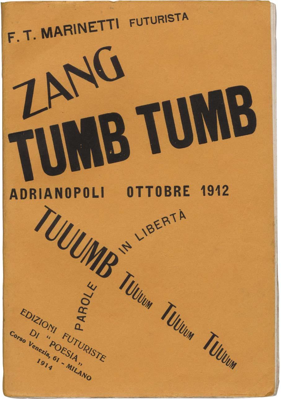
 foldout, from Les mots en liberte futurists, 1919 OPPOSITE: Cover for Zang Tumb Tumb")

31 FILIPPO TOMMASO MARINETTI born: Alexandria, Egypt education: the Sorbonne, University of Pavia Broke typographical rules and influenced modern design Founded Italian Futurism Combined words with typography to create a new form of expressive poetry ABOVE: Une assemblee tumultuese (A Tumultuous Assembly) foldout, from Les mots en liberte futurists, 1919 OPPOSITE: Cover for Zang Tumb Tumb poetry book, 1914 READ: Futurism: An Anthology, edited by Lawrence Rainey, Christine Poggi, and Laura Wittman, collects manifestos, artwork, and poems, including the work of Fortunato Depero, the most commercially successful Futurist artist and designer. Speed. Machines. Aggression. War. Change. These were the important elements of life in the 20th century, according to Italian Futurism founder Filippo Tommaso Marinetti. Although better known as a poet, Marinetti brought a new form of expression to this literary art by breaking all the rules of typography and graphic design still reflects his profound influence. In 1909, Marinetti published his Futurist Manifesto in a French newspaper, calling for a revolution in art, poetry, and design. He called for the demolition of traditional means of creating, and urged artists to embrace the speed, mechanical processes, and violence of the industrialized world. He saw war as a method of defeating the past and moving into the future. The married father of three daughters was also a big old sexist, as feminism was among the issues he railed against. He published his first book, Zang Tumb Tumb, in Based on his experiences during the Balkan War of 1912, the title is a graphic representation of the mechanized sounds of gunfire, grenades, and other weapons. It was one of his experiments in words in freedom, where he broke away from conventional linear writing by using only nouns no adjectives or verbs. Defying traditional typography, he designed the cover using a mixture of typefaces at varying scales and angles and scrambled around the page. He pioneered expressive typography, giving it a pictorial quality; his words looked the way they sounded. Marinetti furthered his Futurist theories in areas like music, dance, film, and textiles. He even published Futurist Cookbook, in which he proposed to ban pasta because it made the body sluggish (perhaps he foreshadowed the low-carb diet craze). He also became more political and embraced Fascism, even though his support for Italian dictator Benito Mussolini didn t last long. 30 GRAPHIC ICONS
32

33 EDWARD McKNIGHT KAUFFER born: Great Falls, Montana education: Mark Hopkins Institute; Chicago Art Institute Adapted knowledge of modern painting to design Designed radical poster incorporating Cubism, Futurism, and Vorticism Helped establish the discipline of graphic design in England Edward McKnight Kauffer was born in Montana, but it was Chicago that opened his artistic eyes, where the famous 1913 Armory Show introduced American patrons to European avant-garde art. Inspired, he traveled abroad to study. He saw the influential poster work of Ludwig Hohlwein in Germany, studied painting in Paris, and launched his career in advertising design in London. Frank Pick, an administrator for the London Underground, became an important client for Kauffer. Pick was a strong supporter of modern design and believed in its commercial value. At a time when the Underground was known for generating pollution, Pick and Kauffer began a bold campaign to give the transit system a more positive reputation by creating a series of travel posters that focused on the system s interesting destinations. Throughout their lengthy collaboration, Kauffer designed more than 100 posters for Pick. In 1919, Kauffer submitted work for a poster to promote London newspaper The Daily Herald. To illustrate the tagline, Soaring to Success! Daily Herald The Early Bird, he used his 1916 painting Flight, a dynamically radical interpretation of birds flying that looks like it was inspired by Japanese prints. In the painting, Kauffer married his own observations of birds in flight with a heavy dose of influence from the Futurists, as well as the Vorticists, a movement of British avant-garde abstract artists who idolized machines and speed. The poster went on to become an icon of Kauffer s work, and it led to commissions for book covers, interiors, store windows, theater sets, photomurals, and rugs. Kauffer was smart and sophisticated, and he understood that he needed to build friendly relationships with clients to get the best results. Frank Pick and Shell-Mex Oil s Jack Beddington agreed with him philosophically. But most clients didn t automatically embrace Kauffer s radical views on modernism, so he gently prodded them to get to the best design solution. In addition to socializing with clients, he was a part of London s art and literary scenes, hanging out with people like T.S. Eliot and Virginia Woolf. After building an influential advertising career in London, Kauffer moved to New York in It didn t go well. His symbolic designs with minimal text were popular among the museum set, but not yet accepted in the conservative world of American commercial advertising. He became restless and lost his confidence when faced with the competitive scene in New York, and died in OPPOSITE: Poster for the Daily Herald, 1918 OVERLEAF: Aeroshell poster, GRAPHIC ICONS

34 33 From the Library of Leslie A Cory

35 34 GRAPHIC ICONS

36 EARLY MODERN 35 From the Library of Leslie A Cory

37 SEE: The London Transport Museum includes 127 Kauffer posters in its collection, with a number of them regularly on display. ABOVE: BP ethyl poster, 1934 OPPOSITE: London Underground poster, GRAPHIC ICONS

38 EARLY MODERN 37 From the Library of Leslie A Cory


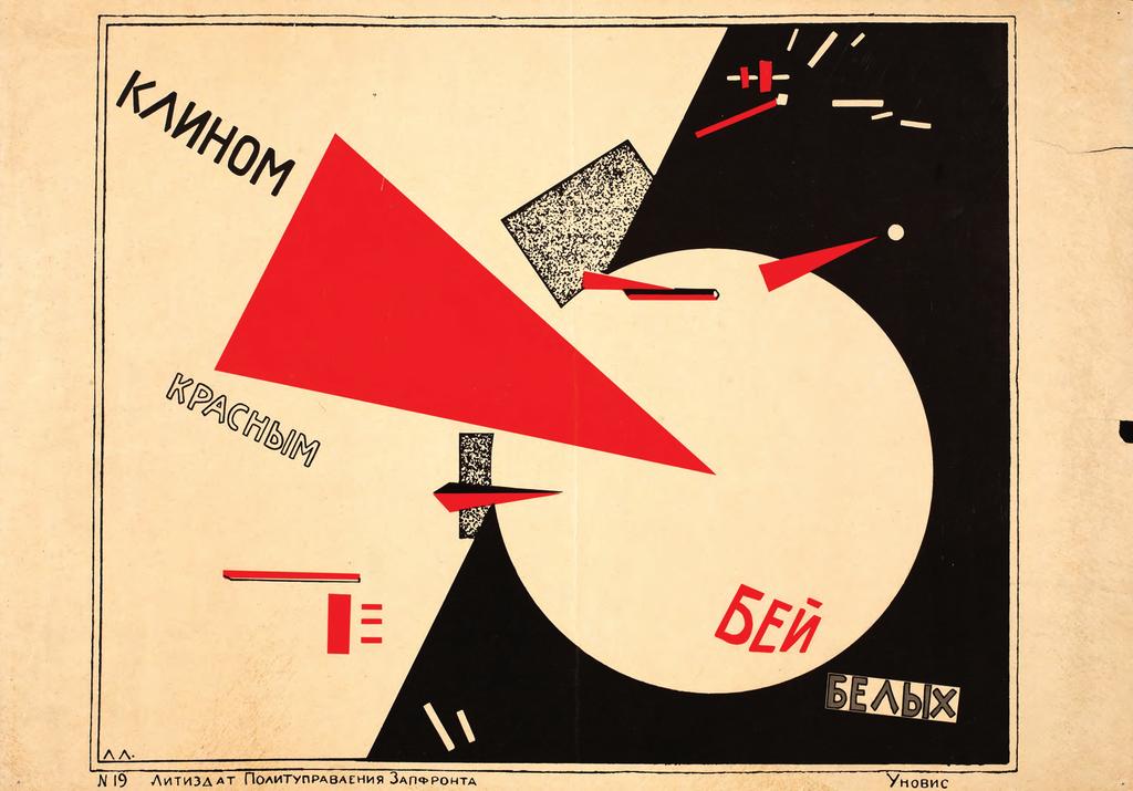
39 EL LISSITZKY born: Pochinok, Russia education: Technische Hochschule, Polytechnic Institute of Riga Influenced the design of books, exhibitions, and type Pioneered the use of diagonal axes, asymmetry, white space, and bold sans serif type Believed that visual communication could reach the uneducated masses and prompt social and political change ABOVE: Letterhead, 1926 OPPOSITE: Cover for Veshch magazine, 1922 OVERLEAF: Pages from For the Voice, poetry book by Vladimir Mayakovski, 1923 It s not surprising that Russian designer El Lissitzky drew influence from the Suprematists early in his career; his work often combined elements on a strong diagonal axis, giving his designs a new, dynamic quality. The Suprematist movement was born in Russia, the brainchild of painter Kasimir Malevich, who advocated for art built on abstract geometric shapes and flat colors. (The appropriately named Black Circle is one of Malevich s works.) Followers of Suprematism believed art need not serve any function beyond its intrinsic, spiritual value. In 1921, Lissitzky was among a group of artists who broke away from the Suprematists to focus on practical design to aid Russia s new communist state. These were the Constructivists. Lissitzky believed that art and design could communicate in a nation where much of the population was illiterate. He aimed to establish a visual language using shape and color instead of letterforms; in his famous political poster Beat the Whites with the Red Wedge, geometric shapes tell the story of the revolutionaries shattering the establishment. Lissitzky s design work had several distinguishing characteristics layouts structured on a grid, limited color palettes, tense diagonals, sans serif type, and repetition of pure geometric forms. He experimented with photomontage, a method of layering and superimposing multiple images. To him, sequencing the pages of a book felt like cinema. The way he organized space gave words a new energetic power. His diverse talents in painting, architecture, typography, and design allowed him to connect movements like Constructivism, De Stijl, Dada, and the Bauhaus. That integration produced layouts that not only engaged the eye, but also clarified and emphasized the content. Although he suffered from tuberculosis, he rarely slowed down. Teaching, writing, traveling, and working for publications like Veshch-Objet-Gegenstand, along with his friendly demeanor, helped spread his ideas around the world. 38 GRAPHIC ICONS

40 EARLY MODERN 39 From the Library of Leslie A Cory

41 40 GRAPHIC ICONS

42 EARLY MODERN 41 From the Library of Leslie A Cory
43 READ: Explore how contemporary designers are using their talents as Lissitzky did to prompt social change: Designing for Social Change: Strategies for Community-Based Graphic Design, by Andrew Shea, Ellen Lupton, and William Drenttel The Design Activist s Handbook: How to Change the World (or Your Part of It) with Socially Conscious Design, by Noah Scalin and Michelle Taute ABOVE: Beat the Whites with the Red Wedge, poster, 1919 OPPOSITE: Cover of Arckhitektura (Architecture), GRAPHIC ICONS

44 EARLY MODERN 43 From the Library of Leslie A Cory

45 ALEXANDER RODCHENKO born: St. Petersburg, Russia education: Kazan School of Art Pioneered photomontage Worked among diverse media, including design, painting, and photography Embraced dramatic angles and bold perspectives While in art school, Rodchenko met fellow student Varvara Stepanova ( ), who became his wife and partner in art. She was also an accomplished member of the Russian avant-garde who painted, photographed, wrote, and designed. She is best known for her designs for theater sets, costumes, and textiles. Her set designs included innovative collapsible structures that served multiple functions. Like her husband, she collaborated with Vladimir Mayakovsky on poster design. Her later work included magazine design for publications like Sovetskaya Zhenshchina (Soviet Woman). Alexander Rodchenko began his career in the visual arts as a painter, but politics steered him down a commercial design path. He joined El Lissitzky and Vladimir Tatlin in founding the Constructivist movement, but then he quit painting to serve the Russian Revolution in a practical manner. Putting his avant-garde ideals to use in promoting the message of the revolution became much more important to him than what he called easel painting. Like other Constructivists, Rodchenko s work was characterized by strong diagonals, asymmetry, sans serif type, heavy rules, white space, and bold photography. He pioneered the use of photomontage, combining different photographs into one composition. Juxtapositions in scale, perspective, and subject matter aimed to surprise viewers, awakening them to the new medium s revolutionary power. In 1923, Rodchenko began collaborating with poet and activist Vladimir Mayakovsky. They started an advertising agency together and worked for several state organizations. This work also promoted the ideals of the revolution and brought modern design into advertising. Around the same time, Rodchenko created the visuals to accompany Mayakovsky s poems in his book Pro Eto (About This). Interpreting abstract poetry was a good fit for Rodchenko s artwork. His work often had a cinematic quality to it, and he designed film posters for Sergei Eisenstein s Battleship Potemkin and Dziga Vertov s Kino Glaz (Cinema Eye), as well as the latter s title sequence. Rodchenko s sense of humor and diverse interests probably helped him survive under Josef Stalin s dictatorship. His versatility meant he was always beginning something new, which helped him stay optimistic. He found most of his success as a photographer, using radical compositions and experimenting with dramatic angles and perspectives. He later worked as a photojournalist and returned to painting. OPPOSITE: Kino Glanz (Film Eye), GRAPHIC ICONS From the Library of Leslie A Cory

46 EARLY MODERN 45 From the Library of Leslie A Cory

47 46 GRAPHIC ICONS


48 STENBERG BROTHERS Vladimir: born: Moscow, Russia education: Stroganov School of Applied Art Georgii: born: Moscow, Russia education: Stroganov School of Applied Art Created a groundbreaking style in movie posters Invented a projector to enlarge still images from film Infused dynamic movement into design Today, it s hard to find movie posters that demonstrate graphic design excellence. They weren t much better in the 1920s Soviet Union. After the Russian Revolution, though, the Bolshevik party saw film as an important way to win over the masses, 60 percent of whom were illiterate, with propaganda. Foreign films were also popular. Brothers Vladimir and Georgii Stenberg created more than 300 posters to advertise these films. Up to that point, movie posters often focused on the film s star during a key moment in the film, a conceptual approach we still see today. The Stenbergs took different elements and combined them, using dramatic changes in scale, extreme close-ups, and vivid color, creating a unique image reflecting the general feel of the movie. Their look was Constructivist, and their methods were similar to Alexander Rodchenko s photomontage. But while the Stenbergs work looks photographic, it was all created by hand. Reproducing large-scale photos was very difficult at the time. The brothers invented a projector so they could enlarge images from film frames, then trace, distort, and combine them. They incorporated movement into their work, which had not been seen before: people leaping, kicking, and falling through the air; and type and graphic elements spinning and curving. They also used bright, saturated colors, which was unusual, given that they were advertising black-and-white films. These colors were strong and jarring: a person s skin color might be green, yellow, or blue. Backgrounds were often urban and architectural. Born a year apart, they shared a desk at school after Vladimir was left behind in the second grade. They continued to collaborate inseparably as adults, working on the same project simultaneously. Members of Russia s avant-garde, they also sculpted and designed theater sets, shoes, and train cars. In 1933, Georgii was killed when a truck collided with his motorcycle. Soviet leader Joseph Stalin was punishing Constructivist artists at the time who went against his favored socialist realism, so Vladimir always feared that it had been no accident, but rather a murder carried out by the secret police. READ: Art of the Modern Movie Poster: International Postwar Style and Design, by Judith Salavetz, Spencer Drate, Sam Sarowitz, and Dave Kehr, contains some of the best movie poster designs created after World War II. SEE: Find classic examples of vintage movie posters at Posteritati Movie Poster Gallery, in New York s Little Italy, or L imagerie Gallery, in North Hollywood. OPPOSITE: In The Spring film poster, 1929 EARLY MODERN 47


49 THEO VAN DOESBURG born: Utrecht, The Netherlands Co-founded the De Stijl movement Aimed to develop a universal language of order, abstraction, and geometric shapes Experimented with typography ABOVE: Poem written by I.K. Bonset, van Doesburg s pseudonym, from De Stijl, 1921 OPPOSITE: Cover of De Stijl art journal, woodcut by Vilmos Huszar, 1919 As they did in Russia, politics met art in The Netherlands. During World War I, Dutch painter, designer, architect, and poet Theo van Doesburg joined people like painter Piet Mondrian and furniture designer Gerrit Rietveld to try to refine the ideas behind Cubism. They called this new movement De Stijl, or The Style. The group blamed nationalist pride and self-centered individualism for the war, and they aimed to establish a universal sense of order through a visual language of abstraction and geometric forms. This new vocabulary was rigid in its use of straight lines, blocks, asymmetry, and primary colors. Though Mondrian might be more well-known, van Doesburg was considered the main theoretical force behind the movement. He disagreed with Mondrian s thinking that De Stijl s ideals applied only to painting, and in his work for the group s magazine (also called De Stijl), which he designed and edited, van Doesburg experimented with typography and layout. Van Doesburg s diagonal compositions for the magazine broke with Mondrian s pure vertical and horizontal structures and this stylistic difference actually ended their friendship. While the gregarious van Doesburg was a part of this rational movement, he also was a part of its exact opposite: Dada, the non-art movement that mocked accepted art forms through inconsistency and absurdity. Under the assumed name I.K. Bonset, he edited the Dada magazine called Mécano, wrote Dada poetry, and experimented with typography in the same artistic vein. Though he died at the young age of 47, during his life he wrote, lectured, attended conferences, and organized exhibitions, in addition to designing and painting. Through those activities, he heavily influenced the avant-garde of his time, which has, in turn, shaped contemporary visual culture. 48 GRAPHIC ICONS

50 EARLY MODERN 49 From the Library of Leslie A Cory


51 French avant-garde poet Guillaume Apollinaire created a book of poems in 1918 called Calligrames. Breaking with the standard horizontal lines of type reading from left to right, he arranged the text in ways to visually express the poems meanings. Il Pleut ( it s raining ), is pictured at left. It was a one-time experiment for him, but it influenced the typographic experiments of the Futurists and the Dadaists. 50 GRAPHIC ICONS

52 ABOVE: Pamphlet cover, 1923 OPPOSITE: Cover of De Stijl, 1921 EARLY MODERN 51

53 THE BAUHAUS ABOVE: Bauhaus Building in Dessau, Germany OPPOSITE: László Moholy-Nagy, brochure cover for a set of 14 Bauhaus books, 1929 The Bauhaus ( building house ) was a progressive experiment in design education. Led by architect Walter Gropius, it was the model for a new design school, one where theory and practice were integrated. The school s philosophy and teaching approach have had a profound and lasting influence on modern design. In Germany s Weimar Republic in 1919, the school began with the idea of uniting the artist and the builder. William Morris s Arts and Crafts movement was a big influence, as were Russia s Constructivism and Holland s De Stijl. Gropius put together an impressive faculty. The focus was on architecture, and there was very little graphic design instruction at this time. However, the curriculum evolved over its 14-year run, and graphic design emerged as a fundamental discipline. Part of that evolution embraced industry and the machine, as the school moved away from traditional craftsmanship. Hungarian László Moholy-Nagy joined the faculty in 1923 and began teaching typography and photography. He also directed the Bauhaus Press and designed its visual identity: a composition of a circle, triangle, and square the basic geometric forms. He articulated the school s philosophies in 14 books, and published an article defining the New Typography, a movement that would be further developed by designer Jan Tschichold. Students learned traditional design skills like lettering and composition, but were encouraged to use principles such as asymmetry, balance, and structured space while exploring technological developments in photography and printing. Herbert Bayer and Joost Schmidt were both students at the Bauhaus who later taught there. After only 14 years, the Nazi party saw the school as a threat and forced it to close. Many of the teachers and students left Germany. Moholy-Nagy moved to Chicago to form the short-lived 52 GRAPHIC ICONS From the Library of Leslie A Cory

54 New Bauhaus. He then started the School of Design, which later became part of the Illinois Institute of Technology (IIT). The institute, then called Chicago s Armour Institute of Technology, also employed architect Ludwig Mies van der Rohe, who was the director of the Bauhaus at the end, to head its architecture school. Painter Paul Klee moved to Switzerland, while Wassily Kandinsky relocated to Paris. Graphic designer Josef Albers joined the faculty at North Carolina s Black Mountain College, while Gropius and also architect/furniture designer Marcel Breuer taught at the Harvard Graduate School of Design. Everyone took the Bauhaus ideals with them wherever they went, helping to spread the school s influence far and wide. READ: Bauhaus: Weimar, Dessau, Berlin, Chicago, by Hedwig Wingler, catalogs public and private documents relating to the Bauhaus, and exhibits furniture, ceramics, posters, ads, and other works created by Bauhaus students and teachers. SEE: The 1994 British TV documentary Bauhaus: The Face of the 20th Century features both new and archival footage, including interviews of noted Bauhaus students and educators, such as Walter Gropius, Wassily Kandinsky, Ludwig Mies van der Rohe, and Kurt Krantz. EARLY MODERN 53 From the Library of Leslie A Cory


55 HERBERT BAYER born: Haag, Austria education: the Bauhaus Continued to spread the influence of the Bauhaus Built a noteworthy advertising career in the United States Established design as a valuable corporate asset ABOVE: Exhibition catalog cover, 1923 OPPOSITE: Thuringian Banknotes, 1923 Herbert Bayer was a young master at the Bauhaus: a student who then became a teacher. He studied under László Moholy-Nagy and Wassily Kandinsky. With them, he helped form a functional design ideology that spanned design disciplines. He served as the school s director of the printing and advertising workshop, helping graphic design become a bigger part of the curriculum. During Germany s Weimar Republic, the hyperinflated economy was so unstable that each region had its own emergency currency. Bayer s design of these bank notes was a major departure from the conventional national symbols, swirls, and serif type. His modern look used grids, geometry, and sans serifs. Due to the unstable economy, though, the bills quickly became useless, and people began burning them for heat. His work covered a broad range: the signage at the Bauhaus building in Dessau, magazines like Vogue and Fortune, and a prefabricated newspaper stand. Fed up with bad typography, Bayer designed the sans serif font Universal in 1925 with no uppercase letters, since, he reasoned, we don t speak in upper and lowercase. Moving to the United States at the age of 38, Bayer began a noteworthy career in advertising. With his background in European modernism, he brought fresh ideas to corporate America. He had a lengthy association with the Container Corporation of America, a major supporter of modern design known for innovative advertising. Compared to his earlier work, Bayer s new designs became more illustrative as he continued to explore ways to communicate effectively. During this time he also designed and organized exhibitions, such as the Bauhaus exhibit at New York s Museum of Modern Art. He later moved to Aspen, Colorado, and Montecito, California. 54 GRAPHIC ICONS


56 55 From the Library of Leslie A Cory
57 Why should we write and print in two alphabets? We do not speak a capital A and a small a. 2 Herbert Bayer, explaining the thought behind his all-lowercase typeface Universal. The quote is set in a digital version of that face. 56 GRAPHIC ICONS From the Library of Leslie A Cory

58 Poster for Olivetti adding machines, 1953 EARLY MODERN 57

59 58 GRAPHIC ICONS

60 A.M. CASSANDRE born: Ukraine education: École des Beaux Arts and Académie Julian in Paris Applied concepts of modern painting, like those of Fernand Léger and Picasso, to French poster design Used strong perspective to imply three-dimensional space Designed typefaces From a time when the poster was emerging as an iconic advertising medium, one artist s work stands out, thanks to its simple forms and striking perspectives. Adolphe Mouron was a French painter who made a living designing posters under the pseudonym A.M. Cassandre. Cassandre used geometry, shadow, and silhouettes to create the illusion of space, and he pioneered airbrushing techniques to add smoothness and depth to his illustrations. A true commercial artist, he incorporated type as a vital part of his compositions, not as an afterthought. Cassandre s work had a geometric, architectural quality; like other creatives at the time (architect Le Corbusier notably among them), Cassandre found beauty in machines. Among the more than 200 posters that Cassandre designed, some of the most famous glorify gritty mechanical subjects like railroad cars, airplanes, and ocean liners. Like the Russian Constructivists, Cassandre believed that art should not be for the elite, but for everyone. But unlike the Constructivists, he was not committed to avant-garde philosophies. By borrowing elements from different movements and using them as more of a decorative style, his work represented the popular style later known as Art Deco. His type designs the fonts Bifur, Acier Noir, and Peignot were more elegant than functional. Cassandre cofounded Alliance Graphique, an advertising agency in Paris, before spending some time in New York to work for clients like Forbes and the Container Corporation of America. He eventually moved back to Paris to focus on painting and stage design. His personal life did not go as well as his professional one. He was divorced twice, and committed suicide at his home in A B C D E F G H I J K L M N O P Q R S T U V W X Y Z a b c d e f g h i j k l m n o p q r s t u v w x y z OPPOSITE: Express Nord train poster, 1927 ABOVE: Specimen of Peignot, based on Cassandre s type design. EARLY MODERN 59 From the Library of Leslie A Cory

61 WILLIAM ADDISON DWIGGINS born: Martinsville, Ohio education: Frank Holme School of Illustration, Chicago Coined the term graphic design Designed books and typefaces Wrote the influential book Layout in Advertising William Dwiggins remains recognized for his book and type designs but his most lasting influence lies in two words: graphic design. After studying under prolific type designer Frederic W. Goudy, Dwiggins became a freelance calligrapher and illustrator in the advertising industry. He moved on to book design for clients like Alfred A. Knopf, where he worked on over 300 projects and helped develop the company s high standards for design. He loved making books, and excelled at combining type, hand lettering, and nature-inspired flourishes into cohesive designs. But perhaps Dwiggins made the biggest contribution to the field with his writing. In 1922, he wrote an article for the Boston Evening Transcript titled New Kind of Printing Calls for New Design. In it, Dwiggins coined a new phrase for commercial art: graphic design (although the term didn t come into widespread use until the 1940s). His 1928 book, Layout in Advertising, not only shared his design theories, but also revealed his sense of humor, as he poked fun at his fellow designers for low standards in design and production. Dwiggins wanted to be remembered as a type designer and he is. He d be pleased that two of his five full typefaces, Caledonia and Electra, remain popular today. In his spare time, Dwiggins enjoyed his very detailed miniature marionette theater, which he built himself. Described as modest and funny, he said before his death on Christmas day in 1956: It was a grand adventure; I am content. 3 OPPOSITE: Paper sample book, c GRAPHIC ICONS

62

63 A V n ABOVE: Drawing for the typeface Caledonia, 1937 OPPOSITE: New Caledonia typeface, a digital version based on Dwiggins s design 62 GRAPHIC ICONS
64 B C D E F G From the Library of Leslie A Cory I J K L M N P Q R S T U W X Y Z a b c e f g h i j k l m o p q r s t u v EARLY MODERN 63

65 64 GRAPHIC ICONS

66 JAN TSCHICHOLD born: Leipzig, Germany education: Leipzig Academy for Graphic Arts and Book Trades Wrote The New Typography, a radical type and design guide that remains influential Raised the standards of book design Evolved beyond strict Modernism throughout his career Just as his design predecessors influenced Jan Tschichold, so he shaped graphic design long after his own death. After growing up in the heart of Germany s book industry, Tschichold had a formal education in classical typography and calligraphy. A Bauhaus exhibition in 1923 introduced him to Constructivism, and he soon began incorporating modern elements into his designs. His photomontage posters for Munich movie theater Phoebus Palast show the influence of László Moholy-Nagy and El Lissitzky. In 1928, Tschichold published a manual that continues to influence people today: Die neue Typografie (The New Typography), which is still in print. The strict standards in this book aimed to free designers from traditional restrictions and move them beyond centered type and ornaments. He believed design should be clear and efficient and that the tools of clarity were sans serif type, asymmetric compositions, photography, and white space. As the Nazi party felt Modernism was un-german, they arrested Tschichold in 1933 and imprisoned him for four weeks. He and his family then moved to Basel, Switzerland. His work began to drift away from the rigid New Typography. Centered type, serif faces, and ornaments began to appear in his work, as he understood that different projects called for different solutions. After a move to London in 1947, he standardized the look for the inexpensive paperbacks of Penguin Books. He color-coded the horizontal bands on the covers (orange = fiction, blue = biography), a design touch that is still in use today. In addition to design and typographic principles, he considered how the book felt in the hand, and established rules for printing, paper weight, and binding. Demanding and inflexible, he raised the level of quality and set standards that influenced the entire publishing industry. In addition to being more logical, asymmetry has the advantage that its complete appearance is far more optically effective than symmetry. 4 Jan Tschichold OPPOSITE: Exhibition poster for Konstructivism (Constructivism), 1937 EARLY MODERN 65 From the Library of Leslie A Cory

, 1938 66")
67 ABOVE: Advertising and Graphic Art cover, 1947 OPPOSITE: Exhibition poster for Der Berufsphotograph (The Professional Photographer), GRAPHIC ICONS

68 EARLY MODERN 67 From the Library of Leslie A Cory
69 Frank Lloyd Wright designs Fallingwater Superman first appears in comic books Japan attacks Pearl Harbor Pablo Picasso paints Guernica San Francisco s Golden Gate Bridge opens Germany invades Poland The New York World s Fair opens First computer, ENIAC, weighs 60,000 pounds United States drops atomic bombs on Hiroshima and Nagasaki MIDCENTURY MODERN: MODERNISM COMES TO AMERICA The Stock Market Crash of 1929 started a chain of events that resulted in the Great Depression of the 1930s, devastating global economies and putting millions of people out of work. The effects rippled through politics, culture, and society around the world: In Germany, for example, financial support for the Weimar Republic from American loans disappeared, and the Nazi party took advantage of this economic vulnerability as it began its rise to power in Europe. Designers and artists needed to either conform to Hitler s policies or move elsewhere. Many came to the United States, bringing their European modern sensibilities with them. Entering World War II helped the United States claw its way out of the Depression, as the war effort created jobs and pumped money back into the economy. When the conflict was over, growing consumer demand and an increase in births (the Baby Boom) fueled an economic surge. Cars and a new interstate highway system, both job creators, enabled more travel, which spawned hotels and fast-food restaurants along the way. Thanks to easily affordable mortgages for military returnees, the housing sector exploded beyond city limits and launched a new suburban way of life. In 1949, Arts & Architecture magazine sponsored the Case Study Home contest, challenging designers to marry good design with affordable materials and production. That same 68 GRAPHIC ICONS
70 Cold War begins Polaroid camera invented Color TV introduced Jack Kerouac s On the Road published LP records introduced Rosa Parks refuses to give up her bus seat, becoming a symbol of the civil rights movement Peace symbol created year, designers Charles and Ray Eames built their case study house, which became a functional model of accessible design. This new American economy led to new opportunities for graphic designers there were so many new products to promote and so many media outlets through which to do so. In addition to advertising, magazine publishing, film and television, and the music industry all attracted top design talent. Corporations began taking design more seriously, and the field of corporate identity creation began to flourish. And it wasn t just the émigré Europeans who were thriving in the design profession several American-born designers built successful careers on modernism, as well. In Europe during the 1950s, the international typographic style, or Swiss style, advanced the philosophies of the Bauhaus and the De Stijl movement. This rational approach, based on a mathematical grid to structure layouts, was so clean and simple it took modernism to a new minimal level. The style became more common as corporations began adopting it. Together, the Stock Market Crash and World War II produced economic changes that united people and ideas during the middle of the century, resulting in new ways to design and communicate. MIDCENTURY MODERN 69

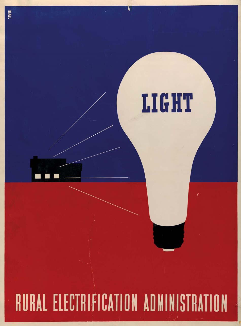
71 LESTER BEALL born: Kansas City, Missouri education: University of Chicago Launched the modern graphic design movement in the United States Designed famous posters pushing the benefits of electricity Advanced corporate-identity design Lester Beall studied art history in Chicago, but his true education in modernism came from French magazines and Bauhaus books. Beall became the first American graphic designer to successfully integrate the European avant-garde into corporate America, and he did it through his designs of posters, magazines, packaging, and identities. In the mid 1930s, nine out of ten rural homes in the United States did not have electricity. As part of President Franklin Delano Roosevelt s New Deal, Beall designed posters to support the Rural Electrification Administration s efforts to bring power to rural residents. Beall s first posters, created in 1937, were simple and graphic, with flat illustrations. They were designed to appeal to an audience with little education, much like El Lissitzky s work with the Constructivists a generation before had been. After the first posters, Beall produced two more sets, each becoming more complex. The third set, designed around the time the United States entered World War II, used photomontage: silhouetted photographs, graphic patterns, and angled type. The patriotic colors and implications that electricity would benefit the war effort appealed to people s sense of national pride. In 1935, moving from Chicago to New York brought Beall new design opportunities. Corporate identity design an entire visual language for a company, with detailed guidelines on how to use it is now a well-established discipline, but back then, it was not. Beall designed strong graphic identities and extensive usage guidelines for companies like Connecticut General Life Insurance and Caterpillar Tractors. His work for International Paper set forth guidelines on usage for everything including correspondence, delivery vehicles, building signs, and packaging. Beall eventually moved his family and studio out of the city to a farm in nearby Connecticut, where he was surrounded by natural beauty and peace and quiet. He achieved something many people search for today: a good work/life balance. By living and working in the country I felt I could enjoy a more integrated life, he wrote. The way a man lives is essential to the work he produces. The two cannot be separated. 5 Also, he believed that art and design cannot be separated. He counted artists Paul Klee, Henri Matisse, Pablo Picasso, and Jean Arp; photographer Man Ray; and designers Jan Tschichold and László Moholy-Nagy among his strongest influences. Constantly seeking visual inspiration, Beall always traveled with a camera and drew regularly. A big music fan, he frequently listened to jazz, as well as the works of composers Sergei Prokofiev and Igor Stravinsky. OPPOSITE: Rural electrification administration poster, GRAPHIC ICONS
72


73 READ: Lester Beall: Trailblazer of American Graphic Design, by R. Roger Remington ABOVE: Photoengraving magazine cover, 1938 OPPOSITE: International Paper Company logo, designed with Richard Rogers, 1960 Peter Behrens designed the first major corporate identity program in 1908, for German electrical manufacturer AEG. He unified all communication for the company by establishing clear guidelines for consistent use of the logo, type, and layouts, which were reflected in AEG s products, buildings, and advertising. 72 GRAPHIC ICONS From the Library of Leslie A Cory
74 MIDCENTURY MODERN 73 From the Library of Leslie A Cory

75 ALEXEY BRODOVITCH born: Ogolitchi, Russia Incorporated white space and the double-page spread into American magazine design Designed and edited Portfolio, an important graphic design magazine Collaborated with photographers like Richard Avedon, Irving Penn, and Man Ray Astonish me! 6 was Alexey Brodovitch s persistent challenge to the designers, photographers, and students he directed. A Russian émigré who moved from Paris to New York in 1930, he loved change, and looked at each issue of the magazines under his creative leadership as a chance to do something new. Before Brodovitch became art director at Harper s Bazaar, most American magazines were crowded and fussy. Text and images were usually kept separate, and models were often posed like stiff mannequins. Brodovitch changed all that. He added white space to give the images and text some breathing room. He combined type and pictures seamlessly. And, he ushered in a more elegant, sophisticated, and dynamic look in fashion photography; instead of asking models to stand perfectly still in a studio setting, Brodovitch encouraged his photographers to express themselves more and shoot on location, setting the models free to move. The photos in Harper s Bazaar didn t just show a piece of clothing or illustrate the text; they were crucial to Brodovitch s vision. He nurtured the careers of Richard Avedon and Irving Penn. Photographers are known for not liking anyone cropping their images, but Brodovitch was so good at it that even legends like Henri Cartier-Bresson and Man Ray didn t object. It s common now for magazine articles to open with a double-page spread. That s because of Alexey Brodovitch. He allowed feature stories to make a grand entrance with a single large cropped photo bleeding off the page, a headline, a small block of text, and plenty of white space. Brodovitch took a fairly restrained approach to typography, although he sometimes experimented with setting type in shapes that echoed an accompanying photo. Brodovitch was also art editor of the influential design magazine Portfolio, where he helped develop the content. Portfolio s creative team aspired to produce an entirely new kind of publication, with elaborate die-cuts, fold-outs, and special papers. But since Portfolio accepted no advertising, its business model was doomed, and it closed after just three issues. Today, original copies sell for hundreds of dollars. Throughout his career, Brodovitch taught the Design Laboratory, first at the Philadelphia Museum of Art s newly established art and design school, and later at the New School in New York. This workshop, open to designers, photographers, and illustrators, launched many a creative career; Design Lab students included Diane Arbus and Richard Avedon. Brodovitch s critiques were harsh but inspiring, as he, of course, expected to be astonished all the time. His personal life was not as successful as his professional. He was an alcoholic in an unhappy marriage, and his son had serious physical and emotional problems. Brodovitch s legendary tenure at Harper s Bazaar ended unceremoniously in 1958 when he was fired, likely because of his drinking. His health slowly deteriorated until his death ten years later. OPPOSITE: Harper s Bazaar cover, photograph by Richard Avedon, 1953 OVERLEAF: Front and back cover for Portfolio magazine #1, GRAPHIC ICONS

76 MIDCENTURY MODERN 75 From the Library of Leslie A Cory

77 76 GRAPHIC ICONS

78 MIDCENTURY MODERN 77 From the Library of Leslie A Cory


79 READ: Alexey Brodovitch, by Kerry William Purcell WATCH: The 1957 musical Funny Face stars Fred Astaire as a Richard Avedon-like fashion photographer who transforms Audrey Hepburn into a top model. Dovitch, the magazine art director, is based on Alexey Brodovitch. GET TO KNOW: Other influential magazine designers and art directors include Mehemed Fehmy Agha, Henry Wolf, Walter Bernard, Roger Black, Neville Brody, Fred Woodward, Luke Hayman, and Janet Froelich. (See also Cipe Pineles on page 100.) ABOVE: Covers for Portfolio magazine #2 1950; #3, 1951 OPPOSITE: Dylan Thomas book cover, GRAPHIC ICONS

80 MIDCENTURY MODERN 79 From the Library of Leslie A Cory

81 ABOVE: Serge Prokofiev album cover, 1950 OPPOSITE: Rudolf Serkin 10-inch package 80 GRAPHIC ICONS


82 ALEX STEINWEISS born: Brooklyn, New York education: Parsons School of Design Designed inventive record covers Developed the cardboard LP sleeve In an era of digital distribution, it s hard to imagine that packaging ever played a significant role in marketing new music. But it certainly did, and Alex Steinweiss paved the way for a golden age of album design. In 1939, Columbia Records hired Steinweiss to design posters and in-store displays to market their records. Retailers needed these promotions, because the records themselves 78-rpm discs wrapped in plain paper and packaged in boxed sets did nothing to sell themselves. Other labels, like Decca, featured some artwork on their covers, usually a stock decoration or a photo of the recording artist or composer. In a brilliant innovation, Steinweiss applied his beautiful poster designs to the actual record sleeves. Steinweiss pioneered a conceptual approach to album design; he didn t think a buyer would be attracted to a stuffy portrait of a classical composer. Always a big music fan, he d listen to the album before beginning the design, letting the music guide his work. For a recording of composer Bela Bartok s Concerto No. 3, Steinweiss created an abstract illustration of a piano, rendered in a contemporary color palette. He mixed stylized illustrations, simple geometric shapes, and musical symbols, incorporating type as part of the overall design. Although he was influenced by A.M. Cassandre and Lucian Bernhard, he had his own approach: playful, lively, and fresh. Necessity dictated some of Steinweiss s creative decisions and helped shape his distinctive style. The Columbia office was in Bridgeport, Connecticut, where there were no typesetters. So he often drew type by hand, and he later developed his curly script into a font called Steinweiss Scrawl. Process printing, which enabled colors to mix, was very expensive then, so Steinweiss usually worked with three or four flat colors. In 1948, Columbia introduced the LP longplaying record. Because the old 78-sized packaging scratched the new records, Steinweiss developed the folded cardboard sleeve, which is still used to package vinyl today. He also designed magazines, film titles, and product packaging, but most of his work was music. When he was in his 50s, Steinweiss felt out of place in the record industry, as photography became more popular for cover designs. In 1974, he and his wife moved to Florida, where he focused on ceramics and painting. Fortunately, he was able to see a revived interest in his design work before he died, in READ: Alex Steinweiss: The Inventor of the Modern Album Cover, by Kevin Reagan and Steven Heller GET TO KNOW: Other influential designers for the music world include Charles Murphy, Reid Miles, Hipgnosis, Jamie Reid, Barney Bubbles, Vaughan Oliver, Art Chantry, and Jason Munn. MIDCENTURY MODERN 81


83 HERBERT MATTER born: Engelberg, Switzerland education: École des Beaux Arts in Geneva, Academie Moderne in Paris Excelled at design, photography, and teaching Broadened the use of photography in design Experimented throughout his career ABOVE AND OPPOSITE: Swiss tourism posters, 1935 and 1934 Herbert Matter learned typography from A.M. Cassandre, geometry from Le Corbusier, and abstraction from Fernand Leger. He put these design sensibilities fully to use in his native Switzerland and later in the United States in the course of a career marked by constant experimentation. After studying in Paris, Matter was forced to leave France and return to his homeland when immigration authorities discovered he didn t have the proper documentation. After settling in Zurich, Matter designed a series of posters for the Swiss Tourist Office that were radically different from the era s typical travel posters of pretty landscapes and exciting city scenes. Matter collaged different photographs together, using dramatic changes in scale and striking perspectives to create imagery that was more expressive and artistic than realistic. In 1936 he left for a photography job in New York, and there he met with Harper s Bazaar art director Alexey Brodovitch. Brodovitch was already a fan two of Matter s posters hung in his office and he commissioned several fashion shoots from the Swiss photographer. Matter s photography grew more experimental over time. After a few years designing furniture in California for Charles and Ray Eames, Matter returned to New York. In 1944, he embarked on a collaboration with modern furniture manufacturers Hans and Florence Knoll that spanned many years and produced a body of work marked by abstract product photography and clean type. In designing an identity for the New Haven Railroad, Matter explored more than a hundred options before deciding on a logo of stacked, slab-serif letterforms in red and black. It was powerful and identifiable, and part of a comprehensive program that included trains, tickets, timetables, and marketing materials. Matter s influence remains strong today, thanks in part to his years in the photography department at Yale, where he taught more by doing than by lecturing. Always modest, he felt his work should do the talking. 82 GRAPHIC ICONS

84 MIDCENTURY MODERN 83 From the Library of Leslie A Cory

85

86 Industry is a tough taskmaster. Art is tougher. Industry plus Art, almost impossible. Some artists have done the impossible. Herbert Matter, for example. His work of 32 could have been done in 72 or even 82. It has that timeless, unerring quality one recognizes instinctively. 7 Paul Rand from a poem he wrote for an exhibition catalog of Matter s work ABOVE: New Haven Railroad trademark, 1954 OPPOSITE: Arts & Architecture magazine cover, 1945 MIDCENTURY MODERN 85 From the Library of Leslie A Cory


87 WATCH: The Visual Language of Herbert Matter, a documentary film by Reto Caduff READ: Herbert Matter: Modernist Photography and Graphic Design, by Jeffrey Head Matter s commitment to modernism was reflected not only in his work, but in his personal relationships as well. Painter Jackson Pollack was a close friend. The two met through their wives, who knew each other after being jailed together for protesting cutbacks to the Workers Progress Administration. Franz Kline, Robert Frank, and Willem de Kooning were also friends. Matter directed a film for the Museum of Modern Art on the sculpture of his friend Alexander Calder, and made photographs of his neighbor Alberto Giacometti and his sculptures, which were published in a book after Matter s death. His wife and muse, Abstract Expressionist painter Mercedes Matter, founded the influential New York Studio School of Drawing, Painting, and Sculpture in New York s Greenwich Village in ABOVE: Knoll Index of Designs catalog, cover and spread, 1950 OPPOSITE: Knoll ad 86 GRAPHIC ICONS From the Library of Leslie A Cory

88 MIDCENTURY MODERN 87 From the Library of Leslie A Cory

89 LADISLAV SUTNAR born: Pilsen, Czechoslovakia education: School of Applied Arts, Charles University, and the Czech Technical University (all in Prague) Pioneered what we now call information design Wrote books laying out important guidelines for design systems Designed catalogs, books, exhibits, toys, and more Ladislav Sutnar had intended to work in the United States temporarily. But global events kept him in New York, where he built a highly influential design career. Sutnar s work designing book covers, theater sets, and exhibitions in Prague led the Czech government to invite him to design the country s exhibit for the 1939 World s Fair in New York. In March of that year, Hitler invaded Czechoslovakia, so Sutnar remained in New York and became friendly with other émigrés, including designers like Walter Gropius and Herbert Bayer. He also met writer Knud Lönberg-Holm, who would become his partner in developing new methods of designing information for business. Lönberg-Holm worked at Sweet s Catalog Service, which compiled the catalogs of different manufacturers in the construction industry into one volume. These multi-source catalogs were convenient for the user, but visually they were a bit of a mess, as each manufacturer s section of the compilation looked different. Sutnar joined the company to improve the catalogs design. Recognizing that people look for products in different ways, Sutnar and Lönberg-Holm developed a system that cross-referenced each item by company, trade, and product name. Sutnar clarified the vast amount of information, using colors, shapes, and graphic symbols to guide the reader. He established hierarchy by emphasizing type changing scale and weight, reversing out of color, and using italics and parentheses which made skimming, reading, and remembering easier. (He also established the standard protocol of putting phone number area codes in parentheses.) Like Alexey Brodovitch was doing with magazines around the same time, Sutnar was moving beyond the single page and embracing the double-page spread, creating designs that weren t just visually interesting, but also helpful to the reader. Sutnar and Lönberg-Holm also collaborated on three books: Catalog Design (1944), Designing Information (1947), and Catalog Design Process (1950). These guides explained their methods, and encouraged designers to set consistent standards while still creating visual excitement. Influenced by the functional Constructivist and De Stijl movements, Sutnar always worked at developing a visual language that communicated directly. The fact that English was his second language, causing some struggles to understand and be understood, may have motivated him. Charts, graphs, and images simplified information, helping busy people save time. The way Sutnar steered readers through complex information sounds much like what we now call information design or information architecture, which has been further developed by Edward Tufte and Richard Saul Wurman, as well as by digital and web designers everywhere. As someone who believed that design should influence every part of daily life, Sutnar designed pretty much everything: furniture, fabrics, glassware and dishes, even toys. His colorful and geometric building block set, Build the Town, was never actually produced, in spite of Sutnar s efforts to design packaging and promotional materials for it. OPPOSITE: Catalog cover for Cuno Engineering Corporation, GRAPHIC ICONS

90 MIDCENTURY MODERN 89 From the Library of Leslie A Cory

91 LEFT AND OPPOSITE: Design and Paper booklet, cover and spreads, GRAPHIC ICONS


92 MIDCENTURY MODERN 91 From the Library of Leslie A Cory
 Talks, taken from a series of conferences founded by information designer Richard Saul Wurman and featuring short,")
93 READ: Envisioning Information, by Edward Tufte, shows and explains some of the best examples of information design from around the world. SEE: Visit TED.com for an extensive video library of TED (Technology, Entertainment, Design) Talks, taken from a series of conferences founded by information designer Richard Saul Wurman and featuring short, energetic presentations by some of today s most creative thinkers. ABOVE: George Bernard Shaw book cover, 1932 OPPOSITE: Build the Town building block set, c GRAPHIC ICONS


94 MIDCENTURY MODERN 93 From the Library of Leslie A Cory

95 ALVIN LUSTIG born: Denver, Colorado education: Los Angeles Community College, Art Center School Worked in multiple design disciplines Took an intellectual approach to solving problems Designed groundbreaking book covers Magazines, interiors, book jackets, packaging, fabrics, hotels, mall signage, the opening credits of the cartoon Mr. Magoo even a helicopter Alvin Lustig designed all of them. He always felt the title graphic designer was too limiting, and it s clear why: He designed everything. And he did it all before dying at the young age of 40. Lustig started in Los Angeles, and moved between there and New York a few times. During his first stint in New York, while working for Look magazine Lustig started designing interiors, which he continued to do after moving to Los Angeles a few years later. Work like this inspired him to design the total package for his clients, from corporate identity to office environment. But he is best known for his book covers. New Directions publisher James Laughlin had been packaging reprints of modern literary titles in a pretty traditional format, and they weren t selling. Lustig came on board and gave the books new life with bright colors and abstract visuals that echoed the art of Joan Miró and Paul Klee. Rather than showing an image that explicitly represented the story, Lustig read the work and created symbolic visuals that interpreted the book s overall meaning. The approach worked: stores began displaying the books prominently, and sales tripled. While Laughlin hoped readers weren t buying the books solely for their covers, he was grateful that the design exposed more people to quality writing. Like Herbert Matter, Lustig transformed the realistic qualities of photography and created an abstract art form. A series of conceptual blackand-white covers for the New Directions Modern Reader collection marked Lustig s shift away from illustration and toward photo collage. His 1953 cover for Federico Garcia Lorca s Three Tragedies is a great example: Lustig photographed the author s name written on a sandy beach, effectively integrating type and image. That design, along with inexpensive one-color printing, helped the book to stand out in a market dominated by painterly colors and traditional type. As a teenager, Lustig was diagnosed with diabetes. His vision began failing around 1950, and by 1954 he was totally blind. But that didn t stop him from working: He could see a design in his mind, and his wife, Elaine Lustig Cohen, or another assistant would produce it under his careful direction. The disease continued taking its toll, though, and he died in Elaine took over the many works in progress at the time of Lustig s death, and she went on to become an acclaimed designer herself. OPPOSITE: Three Lives, Gertrude Stein book cover, GRAPHIC ICONS

96 MIDCENTURY MODERN 95 From the Library of Leslie A Cory


97 TOP ROW: Selected Poems, Ezra Pound, 1949 The Glass Menagerie, Tennessee Williams, 1949 Stephen Crane: Stories And Tales, 1955 BOTTOM ROW: 3 Tragedies, Federico Garcia Lorca, paperback version, 1955 The Green Child, Herbert Read, 1948 The Final Hours, Jose Suarez Carreno, GRAPHIC ICONS


98 TOP ROW: Stories of Artists and Writers, Henry James, 1953 The Wanderer, Henri Alain-Fournier, 1946 Sex and Repression in Savage Society, Bronislaw Malinowski, 1955 BOTTOM ROW: Selected Poems, Kenneth Patchen, 1945 The Longest Journey, E.M. Forster, 1943 Hard Candy, Tennessee Williams, designed by Elaine Lustig Cohen Elaine Lustig was only 28 years old in 1955 when her husband died. With no formal design education, she took over Alvin s studio and designed book covers, signage, and catalogs, developing her own style as she transitioned to her own studio. She later married book publisher Arthur Cohen, and together they founded Ex Libris, a rare book dealership specializing in the European avant-garde. MIDCENTURY MODERN 97 From the Library of Leslie A Cory


99 READ: Born Modern: The Life and Design of Alvin Lustig, by Steven Heller and Elaine Lustig Cohen By Its Cover: Modern American Book Cover Design, by Ned Drew and Paul Sternberge DO: Alvin Lustig made type an important part of the artwork for the book Three Tragedies when he drew the author s name in sand. For one of your projects, create type out of found materials or something from the natural world, photograph it, and incorporate it into your design. ABOVE, LEFT: Industrial Design magazine cover, 1954 ABOVE RIGHT AND OPPOSITE: Staff magazine covers, GRAPHIC ICONS

100 MIDCENTURY MODERN 99 From the Library of Leslie A Cory


101 CIPE PINELES born: Vienna, Austria education: Pratt Institute Became the first female art director of a mass-market American magazine Inducted into the New York Art Directors Club and elected to its Hall of Fame as the first woman Hired fine artists to illustrate mainstream magazines ABOVE: Seventeen cover, photograph by Francesco Scavullo, 1948 OPPOSITE: Charm cover, 1954 Today, women make up around half of the graphic design profession. But when Cipe Pineles was looking for her first design job, prospective employers were interested in her portfolio until they learned that the unusual first name belonged to a woman. She eventually became an assistant to Condé Nast s art director Mehemed Fehmy Agha in 1932, and would expand her role there over the next 15 years. Designing for magazines like Vogue and Vanity Fair, she learned all about editorial design, art direction, and European modernism. Agha pushed her to consistently outdo herself and to find inspiration in fine art. She became art director at Glamour in 1942, the first female to hold that position at a major American magazine. She moved on to be art director at Seventeen, a magazine for teenage girls edited by Helen Valentine. While competing titles saw young women as frivolous husband hunters, Seventeen considered its readers smart and serious. By commissioning fine artists like Ad Reinhardt, Ben Shahn, and Andy Warhol to illustrate articles, Pineles rejected the idealized style typical of magazine illustrations at the time, and exposed her audience to modern art. As an artist herself, she was a hands-off art director. Her only request: that the artists produce illustrations that were as high in quality as their gallery work. In 1950, Pineles became art director at Charm, a magazine targeting a new demographic: working women. She designed fashion spreads showing the clothes in use at work, commuting, and running errands. We tried to make the prosaic attractive without using the tired clichés of false glamour, she observed in a later interview. You might say we tried to convey the attractiveness of reality, as opposed to the glitter of a never-never land. 8 Her work helped to redefine the look of women s magazines, while also furthering women s changing roles in society. Beginning in 1961, Pineles worked independently for such clients as Lincoln Center for the Performing Arts. From 1962 until 1987, she taught editorial design at Parsons School of Design, and directed the design of the school s publications. Her approach to teaching was to focus on content, not style. During a career of many firsts, Cipe Pineles led with her work and she led by example. 100 GRAPHIC ICONS

102 MIDCENTURY MODERN 101 From the Library of Leslie A Cory

103 ABOVE: Spread from Seventeen, illustrated by Pineles, 1948 OPPOSITE: Fashion spread from Charm, 1957 DESIGNERS IN LOVE Opposites don t always attract. Cipe Pineles was married to CBS Design Director William Golden, who lobbied for her induction into the Art Directors Club. After his premature death, she married information designer Will Burtin. Other design couples include Alexander Rodchenko and Varvara Stepanova, Charles and Ray Eames, Tibor and Maira Kalman, Massimo and Lella Vignelli, Seymour Chwast and Paula Scher (married, divorced, then remarried), Stephen Doyle and Gael Towey, Abbott Miller and Ellen Lupton, Rudy VanderLans and Zuzana Licko, Paul Sahre and Emily Oberman, Pum and Jake Lefebure, and Armin Vit and Bryony Gomez-Palacio. 102 GRAPHIC ICONS From the Library of Leslie A Cory


104 READ: Cipe Pineles: A Life of Design, by Martha Scotford; Women in Graphic Design , edited by Gerda Breuer and Julia Meer MIDCENTURY MODERN 103


105 COLLECTING GRAPHIC DESIGN TOP, LEFT: Fretz brochure, designed by Herbert Matter, TOP, RIGHT: Poster designed by Leonetto Cappiello, c ABOVE: Book cover by Alvin Lustig, Would you like to own one of the pieces shown in this book? You could. Posters, books, ads, and other printed ephemera are increasingly valued as collectible items. A collection can provide design inspiration, give a better understanding of history, and increase in value. It can be very expensive, but there are also very accessible ways of collecting iconic design pieces. Investor Merrill C. Berman started collecting graphic design in the 1970s once he was priced out of the fine art market, and now likely has the most extensive private 20th-century design collection in the world. At the time he started, the art world looked down on commercial and political posters. Berman didn t begin his collection with the aim of selling it for future gain; rather, he embraced the challenge of creating a museum-worthy collection of modern graphic design, which nobody else was doing. Since he s not trained as a designer, he taught himself as he went along and learned from each piece. Berman s collection includes works by Herbert Bayer, E. McKnight Kauffer, Ladislav Sutnar and other notable designers featured in this book; he frequently loans items to museum exhibitions, helping the rest of us to learn as well. (View his collection at mcbcollection.com.) How does one begin a design collection? It s not always easy, but there are four questions you should ask when considering a purchase: 104 GRAPHIC ICONS
106 What do you like? It s very simple: Buy what you like. You re going to live with it, so don t buy something you don t like just because you think it may increase in value. Is Art Nouveau your style, or Russian Constructivism? Or do you want an eclectic collection of pieces from different time periods and movements? If it s a poster you want to hang in your living room, color might be a factor. If it s for design inspiration, think about what you can learn from it. Kind Company s Greg D Onofrio, who curates a mid-20th century collection called Display, says, We collect what we love. Ultimately, our collection becomes a valuable tool to design practice, education and research. It s not enough to own the object it s also about what the object can teach us. Learning from our collection and sharing some of it online at thisisdisplay.org has made the experience of collecting worthwhile. Look online, go to museums and galleries and vintage shops. Get a sense of what s out there and what you d like to have for yourself. Who s the designer? Posters designed by Jules Cheret and Leonetto Cappiello are very popular, and it s fairly easy to find new, inexpensive reproductions of their original work. That popularity might make them seem a little common, though, so perhaps you want something different. Different can mean pricey. At the time of this writing, Herbert Matter s 1933 Fretz brochure recently sold at Swann Auction Galleries for $1,400, and El Lissitzky s Beat the Whites with the Red Wedge poster sold for $41,000. The Chisholm Larsson Gallery listed an Olivetti poster by Josef Müller- Brockmann for $650, and Milton Glaser s Bob Dylan poster for $350. Have a smaller budget? Scout sellers on Etsy (like ProjectObject and New Documents) and ebay to find mid-century design ephemera ranging from paperback books to posters to postage stamps, at prices well under $100. Is it rare? Is it original, or a reprint? In most cases, the original will be worth something and the reprint will not. (For example, at the time of this writing, the Etsy shop New Documents listed two versions of Federico Garcia Lorca s Three Tragedies, with a cover designed by Alvin Lustig. The original 1947 hardcover was $149; the 1962 ninth-edition paperback with a slightly different design was $12.) If you re not looking at buying something as an investment, and just want to own something you like, that s fine just decide that before you buy. What s the condition? Three things determine value: the designer, the rarity of the piece, and, as Scott Lindberg of New Documents says, condition, condition, condition. Have the colors faded? Are there rips or stains? These are vintage pieces, after all, so expect some wear and tear. Aaron Cohen, who runs the Etsy shop ProjectObject, says In order to be collectible, a piece can t simply be hard to find but if it s popular, scarce and beautiful, then it s likely highly collectible. Then, of course, condition is a critical factor. When I have a mint copy of something, it is usually priced accordingly. When asked about his biggest score, Cohen mentions Paul Bowles s personal copy of Franz Kafka s Amerika, designed by Alvin Lustig, as well as a rare holiday invitation Lustig designed for bookseller Jacob Zeitlin in Lindberg likes large collections, like a big pile of the Push Pin Graphic he recently acquired. Before making any significant investments, learn all you can. And work with someone you can trust. If it seems too good to be true, it probably is. MIDCENTURY MODERN 105 From the Library of Leslie A Cory


107 BRADBURY THOMPSON born: Topeka, Kansas education: Washburn College Recycled vintage elements in modern design Designed and art directed 30-plus magazines Developed new concept for the alphabet ABOVE, OPPOSITE, AND OVERLEAF: Cover and pages from Westvaco Inspirations,1957, 1945, and 1958 Low budgets didn t limit Bradbury Thompson s creativity. Taking vintage letterpress type and found imagery, he used his background in printing and his deep knowledge of typography and color to develop projects that still look fresh today. After graduating with a degree in economics, Thompson worked in the printing industry in his native Kansas. Always a fan of magazines growing up, he moved to New York and became art director at Mademoiselle ( ) and design director at Art News ( ). He designed for more than 30 other magazines during his career, including Smithsonian and Business Week. But he is best remembered for his work with Westvaco (West Virginia Pulp and Paper Company). To promote the company s papers and printing processes, Thompson designed Inspirations, a magazine for design professionals. His big restriction: Use only existing imagery, borrowed or donated from printers, museums, and ad agencies. At a time when abstraction was popular in design, this could have easily resulted in work that looked old-fashioned. Not in Thompson s hands. He experimented with photographic reproduction techniques and printing processes. For example, he superimposed brightly colored dots on an old anatomical illustration, and broke photographs down into separate cyan, magenta, yellow, and black printing channels. By recycling the vintage pieces and combining them with bold colors, transparent layers, and dramatically scaled type, he showed how modern design could incorporate historic elements Like Herbert Bayer, Thompson saw no need for both upper- and lowercase letters asking, why does the lower-case a look different than the upper-case A? His solution? Alphabet 26, which used a single symbol to represent each letter; instead of using capitals, Thompson proposed setting the symbol at a larger size to begin sentences and proper nouns. Alphabet 26 wasn t a font, but rather a concept that could work with every typeface; while it generated mild interest, it was never widely adopted. Described as an elegant man with great taste and good manners, Thompson pursued a multi-disciplinary career. He designed more than 100 U.S. postage stamps, wrote The Art of Graphic Design, and taught at Yale University. In another example of combining the modern and historic, he designed the Washburn College Bible. He used classic type and artwork, but separated the text into phrases that ended at natural stopping points, giving it a more readable rhythm. 106 GRAPHIC ICONS From the Library of Leslie A Cory

108 MIDCENTURY MODERN 107 From the Library of Leslie A Cory

109 108 GRAPHIC ICONS

110 MIDCENTURY MODERN 109 From the Library of Leslie A Cory
111 ERIK NITSCHE born: Lausanne, Switzerland education: Collège Classique of Lausanne, Kunstgewerbeschule in Munich Understood that design could shape a company s public image Designed iconic scientific posters Elevated the standard for nonfiction book design Family friend Paul Klee inspired Erik Nitsche to become an artist. Nitsche dreamed of studying at the Bauhaus, but to his disappointment he didn t have the opportunity. He must have enjoyed hearing that László Moholy-Nagy later saw his work and wondered who this person was that was designing like the Bauhaus. Nitsche immigrated to the United States in 1934, landing first in Hollywood and then moving to New York. After a productive period during which he illustrated magazine covers, designed movie posters and album covers, and created marketing materials for retailers, Nitsche began working with General Dynamics in It proved to be a case study in innovative corporate design. Defense industry contractor General Dynamics wished to be seen as an agent of peace, rather than of weapons and war; executives gave Nitsche complete control to create a comprehensive new identity designed to shift public opinion. Since much of the company s work, like the first atomic submarine, was top secret, Nitsche used abstract symbols to express the concept of using military technology for peaceful ends. He designed a series of posters to represent the company at Geneva s International Conference on the Peaceful Uses of Atomic Energy (dubbed the Atoms for Peace conference). He combined vivid colors and geometric forms with scientific imagery to develop designs that were bright and optimistic (two words that also describe Nitsche personally). It was a new way to present scientific information, and its influence can be seen in the space-age design style of the late 1950s. To document the company s history, Nitsche designed Dynamic America: A History of General Dynamics Corporation and Its Predecessor Companies, a 420-page book packed with visuals. It raised the bar for nonfiction book design, and still inspires designers today. It also prompted Nitsche to publish his own books. In the 1960s and 70s, he developed a series of illustrated histories covering topics like transportation, communication, architecture, energy, music, medicine, astronomy, and photography. He hired writers for the text, but researched the images and designed the books himself. He made the historical visuals fresh and modern by using white space and combining images in new ways. Nitsche also designed magazines, record covers, exhibitions, packaging, and signage. He moved around Munich, Los Angeles, New York, Geneva, Connecticut which he felt kept him creative. Business was not his strongest suit he turned down the IBM identity design project that went to Paul Rand but he was a confident designer who let his work do the talking. OPPOSITE: Atoms for Peace/Solar Dynamics poster for General Dynamics, GRAPHIC ICONS From the Library of Leslie A Cory

112


113 ABOVE: C.G. Jung book cover, 1933 RIGHT: Spreads from the book A History of Communications, Maurice Fabre, 1968 OPPOSITE: Posters for General Dynamics, GRAPHIC ICONS


114 MIDCENTURY MODERN 113 From the Library of Leslie A Cory

115 114 GRAPHIC ICONS


116 JOSEF MÜLLER-BROCKMANN born: Rapperswil, Switzerland education: University of Zurich, Zurich Gewerbeschule Advocated the use of the grid, sans serif type, and objective photography Founded Neue Grafik to promote Swiss Style Wrote the first comprehensive history of graphic design Josef Müller-Brockmann believed in rational, functional design. To achieve that, he used geometry, photography, and abstraction. And his favorite typeface: Akzidenz Grotesk. The work and writing of Max Bill, an architect and designer who studied at the Bauhaus, influenced Müller-Brockmann and led him away from his illustrative beginnings. Bill developed Theo van Doesburg s idea of a universal visual language by using a modular grid the underlying framework of columns and margins that guides the placement of text and images in a layout. It provides order, consistency, and flexibility, and helps to establish hierarchy. It continues to be an important tool today, especially in web design. This grid-based approach to graphic design became the foundation of the International Typographic Style, or Swiss Style, and Müller- Brockmann was a key figure in this influential movement. He favored photography as a literal and unbiased alternative to hand-drawn illustration, which he considered too subjective and open to different interpretations from viewers. Müller-Brockmann stripped extraneous decoration from his design; every element in his layout had a purpose. Over time, his work grew increasingly abstract. For example, he designed a series of concert posters for Zurich s Tonhalle. There were no music notes or instruments. Geometric shapes and lines were placed on the grid, but were varied in position and scale to suggest movement and rhythm. The result was abstract, yet very musical. Müller-Brockmann founded and co-edited the journal Neue Grafik (New Graphic Designer), to challenge the excessive and superficial design he was seeing at the time and to promote the Swiss Style. He also wrote the books The Graphic Artist and his Design Problems (1961) and History of the Poster (with Shizuko Müller-Yoshikawa, 1971). A third book, his History of Visual Communication (1971), was one of the first to summarize the history of graphic design. As an educator, he encouraged his students to be aware of the world outside of design, to become better problem solvers, and to always be self-critical. ABOVE: The Graphic Artist and his Design Problems book cover, 1961 OPPOSITE: Der Film poster, 1960 MIDCENTURY MODERN 115 From the Library of Leslie A Cory

117 It s unfortunate that the Swiss Style is often pigeonholed as cold, sterile, and even corporate, when in fact Müller-Brockmann s work was quite vivid and expressive. If you take a look at his Musica Viva poster series for The Tonhalle Zürich, you ll see each design masterfully evokes the mood, feeling, tone, and harmony of the music that the poster is announcing. 9 Mike Joyce Stereotype Design READ: Grid Systems in Graphic Design, by Josef Müller- Brockmann, a great how-to from the master himself. SEE: Punk and indie rock posters for bands like Ramones, Pixies, and Yo La Tengo, have been redesigned in the Swiss Style (using only Akzidenz Grotesk) and are for sale at Swissted.com. GET TO KNOW: Other noteworthy Swiss Style designers include Theo Ballmer, Karl Gerstner, Armin Hofmann, Ernst Keller, and Emil Ruder. ABOVE: Weniger Lärm (Stop Noise Pollution) poster, 1960 OPPOSITE: Juni-Festwochen Zurich poster, GRAPHIC ICONS

118 MIDCENTURY MODERN 117 From the Library of Leslie A Cory

119 PAUL RAND born: Brooklyn, New York education: Pratt Institute, Parsons School of Design, Art Students League Mastered corporate identity, advertising, and editorial design Developed strong identity programs for major corporations Influenced others through writing and teaching Paul Rand said, Visual communications of any kind, whether persuasive or informative, from billboards to birth announcements, should be seen as the embodiment of form and function: the integration of the beautiful and the useful. 10 It s not only about how it looks, or how it works, but about how it looks and works together. Born Peretz Rosenbaum into an Orthodox Jewish family, Rand changed his name, thinking the name would hinder his career. Rand s art school education didn t cover graphic design, so he learned about the Bauhaus from European magazines and books. He found inspiration not in other designers, but in painters, like Pablo Picasso, Paul Klee, and Vassily Kandinsky, and the architect Le Corbusier. He combined these influences with his own wit and playfulness to develop a modern American visual language. Early in his career, Rand worked in editorial design for Esquire, Apparel Arts, and the cultural journal Direction. In 1941, his collaboration with copywriter William Bernbach at the Weintraub Advertising agency effectively integrated art and copy in advertising a marriage that continues today. Rand s book-cover designs typified his streamlined approach, featuring basic shapes, cutouts, and colors combined with simple sans serif type. To add warmth and authenticity, he d sometimes incorporate his own handwriting. Rand made his biggest mark in the area of corporate identity. One of his most famous logos was for IBM a project that began as a collaboration with architect Eliot Noyes in 1956 and unfolded over more than 20 years. Rand knew the conservative company needed to be guided through a design progression. His first step was to tweak IBM s existing slab serif typeface, but it wasn t until 1972 that he incorporated the still-familiar horizontal stripes to better unify the three letters. In addition to the logo, he designed IBM s packaging, marketing materials, and annual reports. Rand was responsible for some of corporate America s most recognizable logos: Westinghouse, ABC, United Parcel Service, Yale University Press, Next Computers (for Steve Jobs), and Colorforms. Design wasn t Rand s only talent. Perhaps more important: his skill in convincing corporate executives that design has value, and that it should evolve as companies grow and develop. He railed against mediocrity, and he codified his approach and methodology in the classic book Thoughts on Design. (Unfortunately none of the books he authored remain in print.) He taught at Pratt Institute and Cooper Union before becoming a professor at Yale, where he spent 25 years. He worked hard up until the day he died, at age 82, and sacrificed much of his personal life for work. But, as he said, Design is a way of life. OPPOSITE: Thoughts on Design book cover, GRAPHIC ICONS

120 MIDCENTURY MODERN 119 From the Library of Leslie A Cory

121 Eye Bee M rebus poster, 1981 At the very pinnacle of my graphic forefathers stands the name of Paul Rand. Cantankerous, irascible, loving, bristling with talent, brimming over with taste, and endowed with invincible personal conviction the original and badass Rand showed the way. 11 George Lois 120 GRAPHIC ICONS


122 ABOVE, TOP: The IBM Look, Corporate Identification Design Guide Book, 1972 ABOVE: Westinghouse Graphics Identification Manual, 1961 MIDCENTURY MODERN 121

123 READ: Paul Rand, by Steven Heller and Sparkle and Spin: A Book About Words, by Ann and Paul Rand, one of three fun books for children illustrated by Rand and written by his second wife. Designing Brand Identity: An Essential Guide for the Whole Branding Team, by Alina Wheeler, explains the process from start to finish, illustrated by informative case studies. DO: Paul Rand had a good way to test the effectiveness of a logo: Blur or distort it in some way. Is it still recognizable? Try this with one of your logo designs. ABOVE: Direction magazine cover, 1940 OPPOSITE: Poster, 1970, featuring an illustration from GRAPHIC ICONS

124 MIDCENTURY MODERN 123 From the Library of Leslie A Cory

125 SAUL BASS born: The Bronx, New York education: Art Students League, Brooklyn College Pioneered the art of film title design Developed comprehensive ad campaigns for movies Designed many well-known corporate identity programs Bass fashioned title sequences into an art, creating in some cases a mini-film within a film. His graphic compositions in movement function as a prologue to the movie setting the tone, providing the mood, and foreshadowing the action. 12 Martin Scorsese OPPOSITE: Vertigo poster, 1958 Before Saul Bass, movie titles were considered so unimportant that theater curtains weren t pulled aside until they were over. When Otto Preminger s The Man with the Golden Arm was released in 1955, featuring Bass s minimal, animated title sequence, projectionists were actually instructed to open the curtain before the credits began. Bass studied art in his native New York, learning about Russian Constructivism and the Bauhaus from his teacher György Kepes, who had studied under László Moholy-Nagy. He opened his own office in Los Angeles in 1952, where he designed print ads for movies. Director Otto Preminger hired Bass to design the poster for his 1954 film Carmen Jones; he liked it so much, he asked Bass to design the titles as well. Bass focused on two elements that symbolized the film: a rose and a flame, superimposed over each other. That was a key element of Bass s work: Rather than spotlighting the movie s star, he would develop symbolic images to represent the film s meaning. For The Man with the Golden Arm, starring Frank Sinatra as a card dealer addicted to heroin, abstract paper cutouts enter the screen at different angles while the brassy score plays. At the end, the cutouts change into a distorted arm, the film s main symbol. For the first time, the title sequence set the mood and became part of the movie. Bass designed classic titles for Psycho; It s a Mad, Mad, Mad, Mad World; Bonjour Tristesse; Vertigo; Grand Prix; and North by Northwest. He continued designing for films into the 1980s and 90s, with titles for Martin Scorsese s Goodfellas and Casino, among others. Bass also changed the way films were marketed. What other designers were doing for corporations, Bass was doing for movies, creating a comprehensive and consistent suite of materials, from on-screen titles, to posters, to advertising. Collaborating with his wife, Elaine, Bass also directed his own films, including the Academy Awardwinning short Why Man Creates, and the feature-length Phase IV. Bass brought that same iconic visual approach to his corporate identity work. He designed logos for Continental Airlines, Minolta, AT&T, Warner Communications, and others, some of which are still in use today. 124 GRAPHIC ICONS From the Library of Leslie A Cory

126 MIDCENTURY MODERN 125 From the Library of Leslie A Cory

127 126 GRAPHIC ICONS


128 ABOVE: The Man with the Golden Arm film title stills, 1955 OPPOSITE: The Man with the Golden Arm poster, 1955 MIDCENTURY MODERN 127


129 ABOVE: Logos for Continental, AT&T, United Way, and Warner Communications OPPOSITE: Logos for Avery International, Girl Scouts, Alcoa, and United Airlines 128 GRAPHIC ICONS


130 READ: Saul Bass: A Life in Film and Design, by Jennifer Bass and Pat Kirkham GET TO KNOW: Other influential film title designers include Maurice Binder, Pablo Ferro, Kyle Cooper, Olivier Kuntzel and Florence Deygas, Danny Yount, and Gareth Smith and Jenny Lee. MIDCENTURY MODERN 129


131 GEORG OLDEN born: Birmingham, Alabama education: Virginia State College Pioneered on-air television graphics Became the first notable African American graphic designer ABOVE: Emancipation Proclamation centenary stamp, 1963 OPPOSITE, TOP: On-air graphic, news programming, CBS OPPOSITE, BOTTOM: Still from the title sequence for Search for Tomorrow, CBS, 1951 Before Rosa Parks, Jackie Robinson, and Martin Luther King Jr. broke racial barriers, Georg Olden entered the traditionally white, male world of graphic design and became its first prominent African American practitioner. Born in Alabama, Olden was the grandson of a slave who fought in the Civil War. During World War II, Olden left college to work as a graphic designer for the government s Office of Strategic Services. In a testament to the benefits of networking, Olden parlayed his contacts within the OSS to a job at CBS, in TV was brand new then. Under the direction of William Golden, who designed the CBS eye logo, Olden was in charge of creating on-air titles for six shows. As a visual medium, TV was very limited: black and white, fixed proportions, and picture quality that made type look fuzzy. Olden put those limitations to work, though, by designing clean and simple titles that quickly communicated the gist of the show. He integrated type and images to create bold, graphic, and playful visuals. During Olden s 15 years at the network, he grew from a one-person department to leader of a 14-person creative team, as the number of TV sets in the United States increased from 16 thousand to 85 million. He moved into advertising in 1960, working first for the agency BBDO, then for McCann Erickson. In 1963 Olden became the first African American ever to design a U.S. postage stamp when he was commissioned to mark the centennial of the Emancipation Proclamation, which freed the slaves still being held in the United States. The broken chain he designed was simple and direct, like his TV work. Olden attended a White House ceremony in which President John F. Kennedy introduced the stamp. As one of the few blacks in the industry, Olden said he never felt racism. He believed that anyone with talent and hard work could achieve what he did. But in 1970, he was laid off from McCann Erickson, and pursued an unsuccessful lawsuit against the company for wrongful termination based on racial discrimination. He moved to California and worked several different jobs, even directing an episode of The Mod Squad. Still upset about the layoff, he initiated a class action lawsuit against the agency along with others who felt they were victims of discrimination. Right before that case went to trial, on January 25, 1974, Olden was shot to death. His live-in girlfriend was charged with his murder, but was later acquitted on the grounds of self-defense. But Olden s career as a talented and pioneering graphic designer outshines the circumstances of his death. 130 GRAPHIC ICONS From the Library of Leslie A Cory


132 MIDCENTURY MODERN 131 From the Library of Leslie A Cory
133 As the first black American to achieve an executive position with a major corporation, my goal was the same as that of Jackie Robinson in baseball: to achieve maximum respect and recognition by my peers, the industry and the public, thereby hopefully expanding acceptance of, and opportunities for, future black 13 Americans in business. Georg Olden READ: TV by Design: Modern Art and the Rise of Network Television, by Lynn Spigel, explores the role of modernism in network television in the 1950s and 60s. Fly In the Buttermilk: Memoirs of an African American in Advertising, Design & Design Education, by Archie Boston DO: The Organization of Black Designers (OBD) is a multicultural, multidisciplinary professional association of more than 10,000 members committed to the increased visibility, empowerment, and support of its membership. Learn more at obd.org 132 GRAPHIC ICONS


,")

134 Graphics for news programming, sports programming, and stills from title sequences for the shows Perry Mason (1957), Undercurrent (1957), and Alfred Hitchcock Presents (1955), all for CBS MIDCENTURY MODERN 133


135 WILL BURTIN born: Cologne, Germany education: Handwerkskammer Köln, Kölner Werkschulen Made complex information understandable through design Advanced the understanding of science Organized multidisciplinary conferences on communication ABOVE: Scope magazine diagram, 1951 OPPOSITE: Scope magazine cover Graphic design is usually not a matter of life and death. For Will Burtin, though, the lives of World War II combat fighters depended on the clarity and effectiveness of his design. In his native Germany, Burtin was pressured to design Nazi propaganda for Adolf Hitler. Instead, he and his Jewish wife fled to the United States in It s said he never uttered another word in German. Burtin was drafted into the U.S. Army in 1943, and designed gunnery-training manuals for air combat. The challenge was not only making complex information easy for soldiers to understand and remember, but also to consider how factors like time, motion, and judgment factored into the training. Burtin demonstrated that design can deliver important and useful information, and that its beauty lies in clarity and effectiveness. His well-designed manuals cut the Army s gunnery training time in half, and they set a pattern for his future work: thoroughly researching a complex subject and distilling it into a visual presentation. Burtin was so talented that the publisher of Fortune magazine secured his early discharge from the Army because his work for the magazine would be in the country s best interest. Burtin brought elegant clarity to Fortune, designing easy-to-understand charts and graphs to present complex financial data. He did the same with medical information at Scope, the magazine for medical professionals from Upjohn Pharmaceuticals. During his 30-year relationship with Upjohn, Burtin designed the company s identity, packaging, communication materials, and groundbreaking exhibits. To help people better understand the human cell, he designed a walk-through model, enlarged one million times, with pulsing lights powered by a mile of wiring. Around ten million people saw the exhibit as it traveled the United States. Burtin also organized the multidisciplinary conferences Vision 65 and Vision 67, to address the challenges of mass communication and technology in the 1960s. Speakers included Josef Müller-Brockmann, Marshall McLuhan, Umberto Eco, Buckminster Fuller, Max Bill, and Wim Crouwel. Burtin always had good relationships with other designers. After his wife Hilda died, he married art director Cipe Pineles. And none other than Saul Bass gave the eulogy at Burtin s funeral. 134 GRAPHIC ICONS From the Library of Leslie A Cory

136 MIDCENTURY MODERN 135 From the Library of Leslie A Cory


137 READ: Design and Science: The Life and Work of Will Burtin, by R. Roger Remington and Robert Fripp and Visual Strategies: A Practical Guide to Graphics for Scientists and Engineers, by Felice C. Frankel and Angela H. DePace, a useful handbook featuring several cases of contemporary design for science. ABOVE: A-D Graphic Design magazine, front and back cover, 1942 OPPOSITE: The Brain exhibition, GRAPHIC ICONS

138 MIDCENTURY MODERN 137 From the Library of Leslie A Cory
139 President John F. Kennedy assassinated Martin Luther King Jr. makes his I Have a Dream speech Berlin Wall built Peace Corps founded National Organization for Women (NOW) founded Andy Warhol exhibits Campbell s Soup Cans Cuban Missile Crisis First U.S. combat troops arrive in Vietnam Miniskirt first appears Rolling Stone magazine launches LATE MODERN/POSTMODERN: CHANGE SPARKS NEW FORMS OF EXPRESSION The 1960s was a period of major social, political, and cultural upheaval around the world. People rebelled against restrictive norms. They wanted change and took action. Students and activists protested the Vietnam War. African Americans, fed up with being treated as second-class citizens, stood up for civil rights. Women rallied for equal pay at work, and gay people fought back against police harassment. This emphasis toward action and activism filtered into graphic design, as well with typography being a case in point. Developments in printing technology gave designers more control over their work: Instead of relying on a printer to compose type and position images in a layout, designers used rub-down type and photomechanical transfer to do it themselves. This DIY approach not only gave designers more freedom, but protest groups were able to get their messages out by using the new technologies to produce posters quickly and cheaply. 138 GRAPHIC ICONS
140 Neil Armstrong walks on the moon Woodstock Music & Art Fair President Richard Nixon resigns First known AIDS case in the United States First Earth Day celebration United States pulls out of Vietnam Microsoft founded IBM introduces personal computer MTV launches Popular culture mixed with fine art to create Pop Art, a less serious movement. It was led by artists like Roy Lichtenstein and Andy Warhol, and incorporated advertising, comic strips, and product packaging into painting. Some graphic designers embraced this highbrow-lowbrow approach, which infused their work with fun and playfulness. Even as the late modernists continued pushing the ideas of the movement, a new generation of designers began exploring different ways to communicate visually. Rather than strictly adhering to a rigorous set of rules, they embraced historical references and ornament, and blended different kinds of images and type styles. It was a looser, less formal approach that rejected rational order and yielded work that was more expressive, more personal. For years, modernism had dominated graphic design. This new postmodern approach, which threw out the rule book and allowed for personal expression, brought new possibilities for communication and expression. LATE MODERN/POSTMODERN 139


141 IVAN CHERMAYEFF AND TOM GEISMAR Ivan Chermayeff: 1932 born: London, England education: Harvard University, the Institute of Design in Chicago, Yale University Tom Geismar: 1931 born: Glen Ridge, New Jersey education: Brown University, Rhode Island School of Design, Yale University Designed iconic logos and brand identities Introduced abstract design in corporate identity in the United States Designed noteworthy exhibitions for major art and cultural institutions In 1960, Chermayeff and Geismar proposed a radical idea: a corporate logo, for Chase Manhattan Bank, that was not based on letterforms or a recognizable image. Their design was simple four wedges rotated around a square to form an octagon but it met with resistance, because at that time no major American corporation had an abstract logo. And that s precisely why Chermayeff and Geismar s design worked; it stood out from the competition and became an identifying symbol inextricably associated with Chase. Soon, other corporations followed suit with abstract logos of their own. But Chermayeff and Geismar haven t limited themselves to a particular style. For them, design is solving problems, and they pursue the best solution, regardless of form. They ve designed more than 100 corporate identities, for clients such as NBC, PBS, Screen Gems, Barneys New York, Boston s MBTA, and Pan Am. They also create digital media and exhibitions, at venues like the well-known Ellis Island Immigration Museum and the John F. Kennedy Library. Their strength is in their ideas and in their ability to sell those ideas. Like Paul Rand, in the past they collaborated with architect Eliot Noyes on corporate identity work. As Noyes was designing modern service stations for Mobil Oil, Chermayeff and Geismar created a simple logo of geometric type to echo the circles and cylinders of the gas station designs. Thanks to a simple gesture the setting of the o in red the Mobil logo has remained iconic. When asked about their influences, Tom Geismar said, We spent a year together in the graduate graphic design department at Yale, at a time when even the term graphic design was just coming into use. Among the visiting teachers were Lester Beall, Alexey Brodovitch, Leo Lionni, Alvin Lustig, and Herbert Matter. They are all rightful heroes to us, along with, and especially, Paul Rand, whose influence continues to evoke wonder. 14 After graduating from Yale, Geismar designed exhibitions for the U.S. Army, and Chermayeff worked for Alvin Lustig. They opened their firm in Founding partner Robert Brownjohn left after two years, and Steff Geissbuhler was a partner from 1975 to More than 50 years after its start, the firm is still going strong; partner Sagi Haviv has joined the masthead, and the firm is now called Chermayeff & Geismar & Haviv. And they continue solving problems. READ: Identify, by Ivan Chermayeff, Tom Geismar, and Sagi Haviv OPPOSITE: Chase logo, 1961; Mobil logo, 1965; PBS logo 140 GRAPHIC ICONS
142 LATE MODERN/POSTMODERN 141 From the Library of Leslie A Cory


143 There s a cleanliness and a simplicity to their work that just makes it look so easy, when in reality, consistently achieving consensus with a diverse range of clients is anything but. 15 David Airey TOP, LEFT: Winston Churchill TV series poster, 1983 TOP, RIGHT: Guggenheim Museum poster, 1975 ABOVE: Conservation International logo, 2010 OPPOSITE: Signage for 9 West 57th Street, New York City, GRAPHIC ICONS

144 LATE MODERN/POSTMODERN 143 From the Library of Leslie A Cory


145 YUSAKU KAMEKURA born: Niigata Prefecture, Japan education: Institute of New Architecture and Industrial Arts, Tokyo Combined European modernism with traditional Japanese aesthetics Designed the first Olympics posters to use photography Led and organized the Japanese graphic design profession ABOVE: Book cover, 1965 OPPOSITE: Olympics poster, 1964 All eyes were on Japan during the summer of For the first time, the Olympics were to be held in an Asian country and broadcast in color. The people of Japan wanted to show the world that they had rebuilt after the devastation of World War II, that they were no longer the enemy, and that they were a force in the technology industry. Through the logo and dynamic posters he designed for the Games, Yusaku Kamekura showed the world that Japan was a force in the design world as well. Kamekura studied the Bauhaus and Constructivism, and his work blended the functionality of these modern movements with the lyrical grace of traditional Japanese design. The result? A boldly minimal aesthetic that used color, light, geometry, and photography. He did more than design: His 1965 book, Trademarks and Symbols of the World, with a preface by Paul Rand, was a visual essay on the best logo designs. He was the editor of Creation magazine, which showcased design and art around the world. And, he apparently originated the phrase corporate identity graphics. Kamekura was a leader in Japanese design. He co-founded the Japanese Advertising Art Club, which raised the level of professionalism in Japanese design and helped creatives move beyond the country s traditional handmade approach. He was a founder and managing director of the Japan Design Center, connecting designers with corporate leaders. His legacy lives on through the Yusaku Kamekura Design Award, presented annually to the Graphic Design in Japan competition award winner. He continues to represent design excellence not just in Japan, but also all over the world. 144 GRAPHIC ICONS

146 LATE MODERN/POSTMODERN 145 From the Library of Leslie A Cory

147 GET TO KNOW: Other influential designers from Japan include Masuda Tadashi, Tadanori Yokoo, Ikko Tanaka, Takenobu Igarashi, Shigeo Fukuda, and Koichi Sato. READ: White, by Kenya Hara, a brief book about Japanese aesthetics, emptiness, purity, and simplicity. ABOVE AND OPPOSITE: Posters, GRAPHIC ICONS

148 LATE MODERN/POSTMODERN 147 From the Library of Leslie A Cory

149 148 GRAPHIC ICONS

150 HERB LUBALIN born: Brooklyn, New York education: The Cooper Union Mastered expressive typography and type as image Rejected rational modernism Established an influential type foundry Although he is celebrated for his lively type, Herb Lubalin didn t consider himself a typographer; the term felt too mechanical. Instead, he said, he designed with letters. He rejected the rules of traditional typography and the rigors of modernism to create type that was more expressive. He manipulated letterforms, incorporated flourishes, and added a dose of humor. Type became more than a medium for setting text; type became image. Changes in technology helped. Phototypesetting, a process of projecting type onto film for printing, gave designers in the 1960s much more freedom than setting metal type. This enabled Lubalin to experiment with big changes in scale and unusual letterspacing. He co-founded International Typeface Corporation (ITC) in 1970 to produce typefaces for the new technology, and sought to compensate type designers fairly with royalties and copyright protection. To promote ITC s products, Lubalin edited and designed the journal U&lc, which became a respected source for inspiration and information. Lubalin began his career in advertising, spending 20 years at the agency Sudler & Hennessey, Inc. He established his own studio in 1964 and worked with different partners over the years. Throughout the 1960s, Lubalin collaborated with publisher Ralph Ginzburg on three progressive magazines that reflected the changing sexual and political culture of the era: Eros, Fact, and Avant Garde (whose logo later became a typeface). Accordingly, Lubalin s designs were looser and more experimental than traditional periodicals. Lubalin died in 1981, but there has been a renewed interest in his work as designers move beyond simple and clean in a search for new means of expression. LEFT: Preparation H ad OPPOSITE: U&lc magazine cover, 1978 LATE MODERN/POSTMODERN 149
151 150 GRAPHIC ICONS
152 ABOVE AND OPPOSITE: Logos LATE MODERN/POSTMODERN 151


153 READ: New Ornamental Type: Decorative Lettering in the Digital Age, by Steven Heller and Gail Anderson, to see more recent examples of expressive typography. SEE: The Herb Lubalin Study Center of Design and Typography, at the Cooper Union in New York, collects Lubalin s work, including sketches, drafts, and finished pieces. It s free and open to the public by appointment. Online, see lubalincenter.cooper.edu ABOVE, LEFT: Fact magazine cover, 1964 ABOVE, RIGHT: Cover for book on punctuation, 1969 OPPOSITE: Avant Garde type specimen poster 152 GRAPHIC ICONS

154 LATE MODERN/POSTMODERN 153 From the Library of Leslie A Cory

155 GASTROTYPOGRAPHICALASSEMBLAGE When CBS moved into its new headquarters in 1965, the company s vice president and creative director, Lou Dorfsman, proposed a typographic solution to decorating a 33-foot wall in the cafeteria: cover the wall with food-related words, rendered in 3D in different typefaces. Herb Lubalin and Tom Carnase created the custom type for more than 1,400 hand-milled wood letters, which were painted white and displayed both horizontally and vertically. In the 1990s, CBS dumped the wall during a redesign, and it was saved and stored by designer Nick Fasciano. Atlanta nonprofit The Center for Design Study, led by Rick Anwyl, acquired it and spent years restoring the panels to their former glory. In 2014 it will go on permanent display at The Culinary Institute of America, in Hyde Park, New York. 154 GRAPHIC ICONS From the Library of Leslie A Cory


156 LATE MODERN/POSTMODERN 155 From the Library of Leslie A Cory


157 SEYMOUR CHWAST 1931 born: Bronx, New York education: The Cooper Union Combined illustration and design Incorporated historic styles Co-founded Push Pin Studios ABOVE: Book cover, 1969 OPPOSITE: Antiwar poster, 1967 Inspired by comic books, Victorian type, and Walt Disney, Seymour Chwast merged illustration and design in a big departure from modernism. He revived historic styles and blended them in a fresh way, creating fun and expressive visuals. To attract clients for freelance projects at the beginning of their careers, Chwast and his Cooper Union friends Edward Sorel, Reynold Ruffins, and Milton Glaser published the Push Pin Almanack, an ambitious recurring promotional piece that focused on a different theme with each issue. More important than exhibiting their drawing skills, it showed the importance of ideas in design and illustration. It was so successful that Chwast, Glaser, and Sorel went into business together full-time, forming Push Pin Studios in Ruffins joined a year later; both he and Sorel had left by The studio became well known for its eclectic and playful posters, ads, and covers for books, records, and magazines. The Almanack became the Push Pin Graphic, and its themes ranged from social and political issues to popular culture. When Glaser left the studio in 1974, Chwast carried on, renaming it Pushpin Group in 1981, and continued to collaborate with other designers and illustrators. He also branched out into publishing to create the kind of playful books that he liked, for both children and adults. Recently, Chwast transformed classic literature like Dante s Inferno and The Canterbury Tales into graphic novels. His sense of design still comes into play: He doesn t just draw scenes, but works at pacing and surprise. When asked what keeps him working after all these years, he replies, I like to draw GRAPHIC ICONS

158 LATE MODERN/POSTMODERN 157 From the Library of Leslie A Cory

159 READ: Seymour: The Obsessive Images of Seymour Chwast, by Seymour Chwast ABOVE: Poster OPPOSITE: Book cover, GRAPHIC ICONS

160 LATE MODERN/POSTMODERN 159 From the Library of Leslie A Cory

161 MILTON GLASER 1929 born: New York, New York education: The Cooper Union, New York, and the Academy of Fine Arts, Bologna, Italy Blended historic styles to move past modernism Designed iconic logos, posters, magazines, and restaurants Influenced others through writing and teaching Studying under painter Giorgio Morandi in Italy transformed Milton Glaser s views on design. He learned to respect the past and to draw inspiration from ideas and movements that actually came before the Bauhaus. Glaser had nothing against modernism; he just felt it had run its course for innovation and expression. Instead, he embraced historical styles, ornament, and complexity. Upon his return to the United States, Glaser teamed with Seymour Chwast, Reynold Ruffins, and Edward Sorel to form Push Pin Studios, the influential collaborative famous for its eclectic illustration and storytelling. For Glaser, Push Pin was fun a place where the Cooper Union alumni could re-create their school experience. In 1974, Glaser left to start his own studio, as he felt Push Pin was so well known that it had become a style in itself, limiting his creative potential. In 1966, Glaser designed a poster that was included with Bob Dylan s Greatest Hits album: a simple silhouette of the singer/songwriter s profile, inspired by a Marcel Duchamp self-portrait, brought to life with a rainbow of curls and a custom typeface. The album sold millions of copies, making the poster one of the most widely distributed in history (though Dylan himself apparently never liked it). The 1970s brought financial crisis and high crime rates to New York. The state wanted to attract tourists and raise morale among residents. Glaser designed the simple I (Heart) NY logo, by now so familiar that it feels like it has always existed, pro bono. (Although he didn t make money from it, someone did and still is it would have cost a ridiculous amount to publish it in these pages.) As someone who believes in being active in his community, Glaser has said he is proud to be part of a movement that transformed the city and state that he calls home. One of Glaser s many strengths is his versatility. He founded New York Magazine with journalist Clay Felker in 1968, art directing it for nine years. It became the blueprint for city magazines all over the country. To make a federal building in Indianapolis more inviting, Glaser designed Color Fuses, a mural wrapping around the building that explores the interaction of light and color. His love of food led to graphic and interior design projects for several restaurants, including Windows on the World at the World Trade Center. He has also designed packaging and store environments for supermarkets, like Grand Union, making product information clearer and helping people better navigate through the store. His teaching and writing have contributed greatly to the field. He still works today, and credits his longevity to his love for design and his ability to feel what Alexey Brodovitch always wanted: He can still be astonished. OPPOSITE: Bob Dylan poster, GRAPHIC ICONS

162 LATE MODERN/POSTMODERN 161 From the Library of Leslie A Cory
163 Less is not necessarily more. Just enough is more. 17 Milton Glaser 162 GRAPHIC ICONS


164 READ: Milton Glaser: Graphic Design and Art is Work, two career overviews published 25 years apart WATCH: Milton Glaser: To Inform and Delight, a documentary on Glaser s career and everyday life SEE: Milton Glaser Design Study Center and Archives, at 380 Second Avenue in New York City, preserves the work of Glaser and other designers affiliated with the School of Visual Arts, and is accessible to researchers and designers by appointment. Online, go to Glaserarchives.org ABOVE: Mahalia Jackson poster, 1967 ABOVE, RIGHT: Identity for Asylum Records, 1983 LATE MODERN/POSTMODERN 163

165 ABOVE: Logo for the play Angels in America, 1993 OPPOSITE: School of Visual Arts poster, GRAPHIC ICONS

166 LATE MODERN/POSTMODERN 165 From the Library of Leslie A Cory

167


168 GEORGE LOIS 1931 born: Bronx, New York education: Pratt Institute Designed iconic and controversial magazine covers Developed advertising campaigns for top brands I m not a designer. I m a communicator. 18 George Lois has communicated for many brands, like MTV, Stouffer s Lean Cuisine, Aunt Jemima, and Jiffy Lube. He s an advertising man. Lois s advertising work caught the eye of Esquire magazine editor Harold Hayes in 1962, a period of major change around the world. Esquire featured great writers, like Truman Capote, Gay Talese, and Tom Wolfe, covering politics, racism, and popular culture. Esquire s covers weren t as strong as its content; they were designed by committee and looked like every other magazine. Lois knew that the package had to be as least as good as what was inside. Although he was busy running his own ad agency, Papert Koenig Lois, he was willing to take on the cover design job, as long as he could do it his way. Lois s goal was to create covers so compelling they would stop people on the street and make them buy the magazine. The first cover he designed featuring the African American boxer Sonny Liston as Santa Claus sparked controversy. In the early stages of the Vietnam War, people in the United States were not yet aware of the war s brutality and problems. Based on an interview in the magazine, Lois designed a cover that needed no image, just a quote from a horrified U.S. soldier when he saw the aftermath of an attack: Oh my God we hit a little girl. It was a big wake-up call to the nation, and protests followed soon, as people learned more about the war. When heavyweight champion boxer Muhammad Ali refused to join the army on religious grounds (he had recently converted to Islam), Lois posed him as the Christian martyr St. Sebastian, known for surviving an attempted execution by arrows. Lois designed 92 covers for Esquire that captured the era s changing times many of which angered advertisers and subscribers. Lois continues in advertising, always pursuing what he calls the Big Idea. He believes a million dollars can become 10 million if an idea cuts through the clutter and reaches people. He developed the I want my MTV campaign, even convincing Mick Jagger to appear in an ad for free. He has authored several books, including Damn Good Advice (For People with Talent!): How to Unleash Your Creative Potential by America s Master Communicator. When asked for tips for young designers, he said, My advice is to read Damn Good Advice and then read it again, and again, just as I read Thoughts on Design by Paul Rand when I was 14 years old. 19 ABOVE AND OPPOSITE: Esquire covers, 1968 and 1966 READ: George Lois: On His Creation of the Big Idea, by George Lois DO: Pick up a copy of your favorite magazine, select a memorable or emphatic quote from one of the articles, and create a compelling cover using just those words. LATE MODERN/POSTMODERN 167


169 WIM CROUWEL 1928 born: Groningen, The Netherlands education: Minerva Academy, Groningen Designed radical typeface for computer use Co-founded influential multidisciplinary design studio Developed grid system for museum communications ABOVE: Leger poster, 1957 OPPOSITE: New alphabet, 1967 The Netherlands is a small country, but it s had a big impact on design. Wim Crouwel s typographic work is a good example of Dutch design at its best: clean and functional, like the work of his forefather Theo van Doesburg yet progressive and surprising. In the 1960s, Dutch graphic designers usually worked solo, and companies with large projects hired firms outside the country. In order to attract those large projects, Crouwel and four partners, with a range of experience in graphic and industrial design, formed Total Design. It was the country s first multidisciplinary studio, where teams handled complex two- and three-dimensional projects. Private corporations, government agencies, and arts organizations hired Total, and their designs for postage stamps, airport signage, and museum posters made a distinct mark on the country s visual culture. Crouwel had an uncanny sense of how computers would influence design and vice versa, and he created a groundbreaking typeface to work with this emerging technology. At the time, dot-matrix printers and computer screens couldn t reproduce traditional type with curved letterforms. Starting with the Swiss typographic grid, Crouwel based letters on the rectangle, using only vertical, horizontal, and diagonal lines. The result was 1967 s New Alphabet, so radical in appearance that it was almost abstract. It was never meant to be used; it was just an experiment. Crouwel must have been surprised to see the New Alphabet used on the cover that Peter Saville designed for New Order s Substance album 20 years later. Still, that concept influenced his future work, like his poster for Vormgevers (Designers), for which he hand-rendered the lettering based on squares in a visible grid. Crouwel developed a system for Amsterdam s Stedelijk Museum where each piece posters, brochures, advertisements used the same grid. Although these pieces promoted art exhibits, they never depicted the art itself. The type-centric design and common grid unified the museum s communications, yet the system was flexible enough to remain fresh and interesting. Hans Rudi Erdt, A. M. Cassandre, and especially Josef Müller-Brockmann are big influences on Crouwel s work, and in turn, Crouwel remains a prevalent figure in the design world in 2013, he was celebrated with a retrospective at London s Design Museum. Crouwel inspires young designers, including Philippe Apeloig and Spin, who created a series of posters based on the grid he developed for the Stedelijk Museum. 168 GRAPHIC ICONS From the Library of Leslie A Cory

170 LATE MODERN/POSTMODERN 169 From the Library of Leslie A Cory

171 READ: Dutch Graphic Design: A Century, by Kees Broos and Paul Hefting ABOVE: Calendar, 1964 OPPOSITE: Stedelijk Museum poster, 1968 GET TO KNOW: Additional influential Dutch designers include H.N. Werkman, Piet Zwart, Gert Dumbar, Jan van Toorn, Irma Boom, and Experimental Jetset. 170 GRAPHIC ICONS

172 LATE MODERN/POSTMODERN 171 From the Library of Leslie A Cory

173 172 GRAPHIC ICONS


174 WALTER LANDOR born: Munich, Germany education: Goldsmith College School of Art at London University Pioneered design based on consumer research Built one of the world s largest brand design agencies Walter Landor believed in designing for the consumer, not for award shows or for his peers. He constantly sought ways to better understand his audience, by testing package designs right on grocery-store shelves and asking shoppers directly for their opinions. He based design decisions on these early forms of consumer research and built one of the world s most successful branding agencies as a result. Landor was an industrial designer in London who came to New York in 1939 to attend the World s Fair. He traveled to San Francisco and fell in love with the city, and stayed there to teach at California College of Arts and Crafts (now California College of the Arts), where he fell in love with his student and future wife, Josephine. She was his only associate when he started his firm in their small apartment. The agency grew, and in 1964 moved to the Klamath, a ferryboat docked at San Francisco s Pier 5. That creative use of space enhanced the firm s reputation and provided it with room to grow into large corporate identity projects. It also accommodated a photo studio and mock store for market research. (The Klamath also hosted many Friday night parties for designers and media types, along with occasional guests like Andy Warhol and members of the Grateful Dead.) Landor didn t think of design as art. It was communication. The days of store clerks recommending products had passed he knew that the package itself must send the message through strong shelf impact. Seeking emotional connections between brands and consumers, Landor preferred warmer, more accessible designs over the cooler Swiss modernism that was popular at the time. Brands as diverse as Levi s, Coca-Cola, Bank of America, Alitalia, and the World Wildlife Fund benefited from Walter Landor s expertise. Young & Rubicam bought Landor Associates in 1989, but the founder s legacy of research and strategy lives on. READ: A Designer s Research Manual: Succeed in Design by Knowing Your Clients and What They Really Need, by Jenn and Ken Visocky O Grady; Packaging Essentials: 100 Design Principles for Creating Packages, by Sara Roncarelli and Candace Ellicott GET TO KNOW: Other big brand design and strategy agencies include Lippincott, Wolff Olins, Siegel + Gale, Interbrand, Sterling Brands, and FutureBrand. OPPOSITE: Levi s logo, 1968 Alitalia identity, 1969 Landor Associates continues without its founder, and still designs iconic brands. In 1994, designer Lindon Leader transformed Federal Express into FedEx, a nickname and verb customers had already been informally using. The logo appears to be simply typographic, but the negative space between the E and x forms a subtle arrow a great way to imply speed and motion without being too obvious. LATE MODERN/POSTMODERN 173 From the Library of Leslie A Cory

175 OTL AICHER born: Ulm, Germany education: Academy of Fine Arts, Munich Designed grid-based pictograms Co-founded influential design school Otl Aicher s work is part of my childhood memories. While for most people it must look cold, geometrical, stark, that s not the case for me. His work comes with romantic overtones, which makes it so special to me. 20 Jan Wilker, karlssonwilker inc. DOWNLOAD: Fifty transport pictograms to communicate information, such as departing flights, baggage claim, and restrooms, developed by AIGA and the U.S. Department of Transportation, are free to use: aiga.org/symbol-signs. OPPOSITE: Munich Olympics pictograms, 1972 Systems were crucial in the work of Otl Aicher. He designed comprehensive identity systems for companies such as Lufthansa German Airlines, Braun, and chemical company BASF. He developed an integrated design education system, and created a system of simplified pictograms that became an international visual language that s still used today. In 1936, the Olympics were held in Berlin, Germany. Hitler was gaining power, and saw the games as an opportunity for Nazi propaganda. When the Olympics returned to Germany in 1972, organizers hoped to move past the Nazi Olympics and show the world a bright and happy face. Otl Aicher and his design team developed colorful posters and a logo based on the sun. To transcend language barriers among the international audience, Aicher relied on visuals rather than text as much as possible. He developed a system of pictograms to identify the different sports and to provide general wayfinding information. He reduced the human image to the simplest of geometric forms, yet kept it recognizable. Aicher wasn t the first to design pictograms for the Olympics. But he was the first to base each one on a grid, establishing a unity of form lacking in earlier, more illustrative versions. Unfortunately, the Munich Games were not happy: Eleven Israeli athletes were killed by members of Black September, a Palestinian terrorist group. With Swiss designer Max Bill, Aicher co-founded and taught at the Ulm School of Design (Hochschule für Gestaltung) in Ulm, Germany in The curriculum was based on the Bauhaus, but it expanded to include science and semiotics, the study of signs and symbols. Aicher didn t just want to train successful designers, he wanted to educate responsible citizens who would change the world through their work. Over time, Aicher s designs, including posters to promote events and lectures at the school, became more abstract, focusing on color, pattern, and geometry. Inspired by the development of phototypesetting, Aicher designed two typefaces, including Rotis, which bridged serif and sans serif fonts. He named this type family, which includes semi sans and semi serif styles, after the town where he lived and worked. 174 GRAPHIC ICONS From the Library of Leslie A Cory


176 LATE MODERN/POSTMODERN 175 From the Library of Leslie A Cory


177 MICHAEL VANDERBYL 1947 born: Oakland, California education: California College of Arts and Crafts (later California College of the Arts) Expanded graphic design into multiple disciplines Helped establish San Francisco as a design hub ABOVE: Bolier furniture collection OPPOSITE: Poster, 1979 Graphic design isn t all that Michael Vanderbyl does he also designs furniture, showrooms, and products but graphic design informs everything he does. He proves that if you can design, you can design anything. Vanderbyl started his design firm in San Francisco in His early graphic design work combined simple typography with playful postmodern elements like pastel palettes, diagonals, textures, and patterns. Design rode a wave of prominence in San Francisco in the 1980s, and Vanderbyl was an energizing force behind it. His 1979 poster for California Public Radio is a perfect example, with its clean horizontal lines, symbolic geometric shapes enhancing a silhouette of a face, and a repeating scribble representing radio waves. The design was simple, yet warm and expressive. Vanderbyl was always intrigued by threedimensional work (even though he was once told he wasn t smart enough to be an architect). When one of his major clients didn t have the budget to hire an architect, Vanderbyl stepped in to design a product showroom. His graphic-design background led the way, as he looked at the project like a lifesize brochure, with an emphasis not on the space, but on the products. Vanderbyl s product-oriented solution stood out, and he gained more work designing showrooms. Vanderbyl is now Dean of Design at his alma mater, California College of the Arts. He encourages his students to really listen to the problem at hand, which will guide them to an appropriate solution. He is also a fan of self-doubt, as it means one is still learning as a designer. 176 GRAPHIC ICONS

178 LATE MODERN/POSTMODERN 177 From the Library of Leslie A Cory

179 GET TO KNOW: The Michaels San Francisco designers who gained prominence in the 1980s and 90s and share a first name: Cronan, Mabry, Manwaring, and Schwab ABOVE: Poster for an organization that advocates reclaiming public spaces for bicycles, 2013 OPPOSITE: Teknion showrooms in Montreal and Chicago 178 GRAPHIC ICONS


180 LATE MODERN/POSTMODERN 179 From the Library of Leslie A Cory
 Designed influential album covers Focused on conceptual imagery to make an emotional connection between bands and")

181 PETER SAVILLE 1955 born: London, England education: St. Ambrose College, Manchester Polytechnic (later Manchester Metropolitan University) Designed influential album covers Focused on conceptual imagery to make an emotional connection between bands and their fans ABOVE: Poster, 1978 OPPOSITE: New Order s Power, Corruption & Lies album cover, 1983 While punk and disco dominated the 1970s music scene, Peter Saville was listening to experimental and electronic bands, like Roxy Music and Kraftwerk. So it s not surprising that this British designer deployed his talents in the music world. In 1978, British journalist Tony Wilson hired Saville to design a poster promoting his Manchester music club, The Factory. An anarchic punk-rock aesthetic dominated gig posters and album covers at the time, but Saville was instead influenced by early-modern typographers like Jan Tschichold and Herbert Bayer; his first poster for The Factory, based on an industrial warning sign, is ordered and simple. Wilson and Saville co-founded Factory Records, an independent label where freedom (in both the music and the design) ruled. As art director working with bands like Joy Division, Saville was able to design without creative, budgetary, or time constraints (a situation that probably doesn t exist anywhere today). In 1979, he moved to London and worked for DinDisc, where he enjoyed the same artistic liberty. There, he met future business partner Brendan Wickes and photographer Trevor Key, who challenged Saville to use new techniques in photography and printing. By the early 80s, Saville had moved beyond his early modern influences and into classical and historic references. His 1983 album cover for New Order s Power, Corruption & Lies featured a painting of roses by artist Henri Fantin-Latour juxtaposed with a grid of colored squares representing the band s name and album title (a decoder on the back of the jacket revealed the meaning). It was much more evocative than a portrait of the band and connected with listeners in a deeper way. Just as fashion allows like-minded people to connect with each other by dressing in a certain way, Saville s designs drew music fans together with the bands they love. Saville went on to design album covers for mainstream acts, such as Wham! and Peter Gabriel, before briefly becoming a partner at Pentagram Design and working with ad agency Frankfurt Balkind. He continues to work for clients like Whitechapel Art Gallery, fashion designer Stella McCartney, and the city of Manchester, as well as to design his personal art projects. 180 GRAPHIC ICONS

182 LATE MODERN/POSTMODERN 181 From the Library of Leslie A Cory

183 WATCH: 24 Hour Party People, a 2002 comedic docudrama with an entertaining take on the Factory Records story and the Manchester, England, music scene. ABOVE: City of Manchester identity, 2005 RIGHT: Joy Division s Unknown Pleasures album cover, GRAPHIC ICONS
184 LATE MODERN/POSTMODERN 183 From the Library of Leslie A Cory
185 Disaster at Russia s Chernobyl nuclear power plant Official end of the Cold War South Africa s Nelson Mandela freed Berlin Wall falls Students massacred in China s Tiananmen Square Collapse of the Soviet Union Nirvana releases Nevermind O.J. Simpson found not guilty of murder THE DIGITAL ERA: THE COMPUTER CHANGES EVERYTHING Apple Inc. launched the Macintosh personal computer in It was more userfriendly than other PCs and with its desktop publishing software, graphical user interface, and mouse (all novel at the time), the Mac was uniquely geared to designers. Compared to what we can create on the computer today, the original Macintosh, with only 128k, had limited capabilities. At the time, though, it opened up so many new possibilities. Of course, using a computer didn t automatically make designers better at their craft. Instead, the new technology gave them more control and sped up their exploration process. As with anything unfamiliar, the Mac sparked debate among designers during this time: While some saw the computer as simply another tool for creating work, like a drawing pen, others saw its potential as a medium in itself. Emerging digital technology also changed typography, exploding the number of typefaces available and giving designers the tools to create and distribute their own fonts. Some digital typefaces were updated versions of classics, while others were brand new: type that was made for low-resolution screens, and type that was less functional and more illustrative. It was easier to break the rules. As computers spread from education and business into the home, the general public took an increased awareness of and interest in graphic design, as people began picking 184 GRAPHIC ICONS
186 Google goes online Unclear winner in U.S. presidential election between Al Gore and George W. Bush Former Iraqi president Saddam Hussein captured Euro becomes the new European currency Apple releases first ipod U.S. President Barack Obama sworn in out fonts and colors as they made their own flyers, scrapbooks, and invitations. The line between the professional designer and the hobbyist began to blur. In the 1990s, designers like David Carson broke all the rules as they played with image distortion, type legibility, and basic hierarchy. Why not make page numbers the most prominent part of a layout? Why not set an entire article in a symbol font that the reader will have to decipher? There was a refreshing jolt of youthful experimentation as people moved past the limits of the rational and functional. Finally, the computer offered something brand new: interactivity. With the rise of the Internet, social media, and mobile applications, the user gained control over how, when, and where they accessed information. For the first time, designers could shape different experiences for different people. Of course, technology wasn t the only new development during this era: Design education programs expanded and became more rigorous. Design writing evolved into its own discipline, as practitioners took matters into their own hands to write articles, books, and criticisms that brought new perspectives to the design canon. And designers were and are affected and influenced by social, political, and cultural changes as they explored new ways to engage their audiences. Today, people all over the world can communicate with each other like never before. The digital revolution continues, and design is sure to play a significant role in shaping the future. THE DIGITAL ERA 185

187 APRIL GREIMAN 1948 born: New York, New York education: Kansas City Art Institute, Allgemeine Kunstgewerbeschule (General Arts Trade School) in Basel, Switzerland Pioneered computer technology as a design tool Established New Wave design in the United States April Greiman uses different words to describe what she does: hybrid imagery, transmedia, visual communication. But not graphic design. She feels the term refers exclusively to print, and her work combines elements from different types of media. Greiman thinks in terms of space when she designs, not in terms of a page. This is probably why designing digitally has been such a good fit for her. New Wave typographer Wolfgang Weingart encouraged Greiman, while in graduate school at Basel, to break free from a grid-based approach to design to layer type, to float it in space, to make it illegible. She brought this knowledge to New York and, after growing frustrated by the rigid limitations imposed by East Coast clients, she moved in 1976 to Los Angeles and opened a studio. She began teaching at California Institute of the Arts (CalArts) in 1982 and gained access to the school s computers and video equipment. The new technology opened so many possibilities for Greiman, enabling her to combine print, video, and type into multiple layers that were previously impossible to create. She felt strongly that these new tools weren t just a means to arrive at the same old solutions, but that they should lead us to explore ideas and create something new. When Greiman designed an issue of Design Quarterly for the Walker Art Center in 1986, she blew up the traditional magazine format, creating a 2-foot-by-6-foot folding collage that combined a nude portrait of the designer overlaid with multiple layers of images and text. While the fact that Greiman used a computer to create the work hardly seems noteworthy today, consider that the computer had one megabyte of RAM and a monochrome 9-inch display. Greiman built the collage on the computer and output letter-size pages on her dot-matrix machine, then directed the magazine s printer to assemble the pages and photograph the entire composition. Greiman wasn t just tinkering with the computer; she was exploring the idea of making sense, touching on philosophy and physics. Like much of Greiman s work, the project wasn t just about technology, it was personal. Greiman s list of influences is well-rounded: Among them are her former teachers Armin Hofmann and Wolfgang Weingart, singer/songwriter/poet Leonard Cohen, theoretical physicist David Bohm, psychiatrist Carl Jung, and spiritual leader the Dali Lama. As the world continues to change, so does Greiman. More recently, she s been creating web design, branding, signage, and public art, and consulting on color, finishes, and textures for architectural projects. She continues to teach, and believes in always being open to new ways of doing things. OPPOSITE: Your Turn My Turn, 3-D poster, GRAPHIC ICONS

188 THE DIGITAL ERA 187 From the Library of Leslie A Cory

189 Does It Make Sense? Design Quarterly, 1986 Do what you love to do, with a vengeance. 188 GRAPHIC ICONS

190 21 It s not WHAT YOU DO but WHO YOU ARE. April Greiman THE DIGITAL ERA 189 From the Library of Leslie A Cory


191 STAY: Miracle Manor Retreat Bed and Breakfast in Desert Hot Springs, California, is a mid-century modern spa/motel near Joshua Tree National Park owned by Greiman and her husband, architect Michael Rotondi. TOP, LEFT: 19th Amendment commemorative stamp, U.S. Postal Service, 1995 TOP, RIGHT: Roto Architects website, 2008 ABOVE: Color, branding, and signage for the Great Park of Irvine, CA OPPOSITE: Hand Holding a Bowl of Rice, mural, Wilshire Vermont Station, Los Angeles, GRAPHIC ICONS


192 THE DIGITAL ERA 191 From the Library of Leslie A Cory

 with Emigre magazine.")

193 RUDY VANDERLANS AND ZUZANA LICKO Rudy VanderLans: 1955 born: Voorburg, The Netherlands education: Royal Academy of Art, The Hague, The Netherlands; University of California at Berkeley Zuzana Licko: 1961 born: Bratislava, Czechoslovakia education: University of California at Berkeley Founded experimental design journal Designed groundbreaking digital typefaces Embraced new design tools ABOVE: Emigre music poster OPPOSITE: Oakland type specimen, now part of the Lo-Res type family Apple broke new ground in 1984 when it introduced the Macintosh computer. Designers Rudy VanderLans and Zuzana Licko did the same (albeit on a much smaller scale) with Emigre magazine. While many designers initially resisted the computer, VanderLans and Licko embraced it, though in different and complementary ways: VanderLans liked the freedom it gave him in designing layouts, while it gave Licko a disciplined method for designing type. VanderLans studied design in The Netherlands and worked at Total Design. But he was more attracted to the expressive work of Herb Lubalin and Milton Glaser than to the Dutch modernists. He went on to study photography at UC Berkeley, where he met Licko, his future wife and business partner, as she studied graphic communications. Emigre magazine quickly became a forum for designers, especially those interested in experimentation and technology. It featured in-depth articles and visual essays, in layouts that broke all the rules with varying type sizes, overlapping layers, text columns crashing into each other, and distorted letterforms, all techniques that the Mac made easier. VanderLans and Licko sold their type designs to fund the magazine (which meant they didn t have to cater to advertisers). The typefaces were an important part of the magazine s design as well. After the first two issues, the magazine was set exclusively in Emigre fonts. Licko began with rough, pixilated typefaces, like Oakland, and progressed to more versatile fonts, like the popular Mrs. Eaves. Emigre Fonts also carried select designs by Barry Deck, Jonathan Barnbrook, Elliot Earls, Bob Aufuldish, and Ed Fella, among others. The magazine ceased publication in 2005, but Licko continues designing fonts, and VanderLans designs the type specimens. They also sell books, ceramics, and collectible items. 192 GRAPHIC ICONS

194 THE DIGITAL ERA 193 From the Library of Leslie A Cory

, Carol Twombly, and Herman Zapf.")
195 LEFT: Emigre magazine spreads: Number 43, Number 49 OPPOSITE: Emigre magazine covers: Number 19, Number 33, Number 53, Number 64 READ: Merz to Emigre and Beyond: Avant Garde Magazine; Design of the Twentieth Century, by Steven Heller GET TO KNOW: Other influential type designers include Morris Fuller Benton, Matthew Carter, William Addison Dwiggins (see page 60), Tobias Frere-Jones, Adrian Frutiger, Eric Gill, Jonathan Hoefler, Paul Renner, Erik Spiekermann, Jan Tschichold (see page 64), Carol Twombly, and Herman Zapf. 194 GRAPHIC ICONS


196 THE DIGITAL ERA 195 From the Library of Leslie A Cory


197 EDWARD FELLA 1938 born: Detroit, Michigan education: Cranbrook Academy of Art Created handmade lettering and design Taught design for 25 years Embraced American vernacular in his work ABOVE: Detroit Focus Gallery flyer, 1989 OPPOSITE: Lecture poster Do something you haven t done before, 22 Ed Fella would tell his students. It s great advice for expanding one s horizons, and it also describes Fella s career. For almost 30 years, Fella worked in commercial design in Detroit, growing frustrated all the while by the lack of personal expression in his work. At age 47, he quit and went to graduate school at Cranbrook, where Katherine and Michael McCoy s innovative design program enabled him to explore and ask questions without real-world limitations. After Cranbrook, Fella moved west to teach at California Institute of the Arts (CalArts), and his design work was anything but commercial. He collaged pieces of found imagery with hand-drawn type, creating designs influenced by Dada and Surrealism. He traveled cross-country every summer, photographing quirky signs along the way. Many graphic designers take such photos, but Fella incorporated that vernacular into his work in a meaningful way: one that breaks the rules and appreciates everyday beauty. In an age of computer-generated design, Fella works entirely by hand. Although he retired from teaching in 2013, Fella s influence in formal exploration and in expressive and playful typography will continue through the students he taught over 25 years. Consistently described as nice and generous, Fella is also a great photographer who loves to read, and who encouraged his students to be curious about the world. He also encourages people to understand history and to participate in design discourse, saying, It s all the difference between an amateur and a professional, a hack and a master! GRAPHIC ICONS

198 197 From the Library of Leslie A Cory

199 READ: Fingerprint: The Art of Using Hand-Made Elements in Graphic Design, by Chen Design Associates, to see examples of contemporary designers who have incorporated the handmade into their work. DO: Tackle your next design project entirely by hand from concept to finished work, using found imagery, your own photography, hand-lettering, and other analog elements. How does working by hand change your thinking? Lettering for The New York Times Book Review, GRAPHIC ICONS

200 THE DIGITAL ERA 199 From the Library of Leslie A Cory


201 200 GRAPHIC ICONS


202 MURIEL COOPER born: Brookline, Massachusetts education: The Ohio State University and the Massachusetts College of Art (later Massachusetts College of Art and Design) Pioneered design for the screen Blended graphic design and computer science Designed important books about the design profession and its practitioners Muriel Cooper had two design careers: first as a print designer and second as a groundbreaking digital designer. Both revolved around the Massachusetts Institute of Technology (MIT), and both were based on her quest to make static media more dynamic. MIT s Office of Publications hired Cooper in 1952 and continued working with her after she established her own studio. She then became art director for MIT Press, where she designed classic books, such as Hans Wingler s Bauhaus. She designed the first edition of Learning from Las Vegas; authors Robert Venturi, Denise Scott Brown, and Steven Izenour hated what she did, but many graphic designers loved it. Cooper took her first computer class at MIT in 1967, and it bewildered her. However, she could see the computer s potential in the creative process, and soon began the second phase of her career: applying her design skills to computer screens. With Ron MacNeil, Cooper co-founded the research group Visible Language Workshop in 1975, which later became part of MIT s Media Lab. Cooper didn t write code, but she didn t need to; she was the designer and the thinker. She knew what she wanted visually, and encouraged her students to use technology to present well-designed information. Cooper presented the group s research at the influential TED5 (Technology, Entertainment, Design) conference in For the first time, computer graphics were shown in three transparent dimensions, which moved, changed sizes, and shifted focus, instead of the standard Microsoft Windows interface of opaque panels stacked like cards. She made a big impact: Even Microsoft founder Bill Gates was interested in her work. Unfortunately, she died soon after of a heart attack, but her legacy in interactive design continues. Muriel Cooper taught me that design had very little to do with how you make something, and instead why you make something. 24 John Maeda ABOVE: MIT Press logo OPPOSITE, TOP: Image rendered as soft type, MIT Media Lab s Visible Language Workshop OPPOSITE, BOTTOM: Information Landscape, MIT Media Lab s Visible Language Workshop, 1994 THE DIGITAL ERA 201 From the Library of Leslie A Cory

203 STEVEN HELLER 1950 born: New York, New York Wrote hundreds of books and articles about design Co-founded innovative educational programs Art directed The New York Times Book Review GET TO KNOW: Other design writers include Michael Bierut, Ralph Caplan, William Drenttel, Peter Hall, Jessica Helfand, Richard Hollis, Ellen Lupton, Philip B. Meggs, Rick Poynor, Kerry William Purcell, Alston Purvis, Adrian Shaughnessy, Alice Twemlow, Lorraine Wild, and Veronique Vienne. READ: Writing and Research for Graphic Designers: A Designer s Manual to Strategic Communication and Presentation, by Steven Heller LISTEN: Podcasts of Heller s SVA lectures are available, as are other presentations and discussions. Go to hellerbooks.com or download them from the Apple Store. OPPOSITE: Some of the more than 100 books written by Heller While researching this book, it s been difficult for me to find source material that was not written by Steven Heller. Thirty years ago, there were very few books on graphic design. Heller has since authored or co-authored more than 100 titles, educating readers about the power of graphic design. Heller wasn t the first one to write about design, of course, but he s the most prolific. Through his writing, he teaches, he connects, he criticizes, and he celebrates. Heller has brought a deeper understanding of design not only to students and practicing designers, but also to the public (including clients). Thanks to him, it s now easier to explain what we do for a living to our families. It seems that an author who writes 100 books on one subject would repeat himself. Not Steven Heller: His titles range from how-tos and histories to biographies and design criticism. Heller s output continues apace: He contributes to publications both online and off, including Print magazine, Design Observer, AIGA s online journal, and The New York Times Book Review. Heller began his career as a practitioner, and he worked as an art director for The New York Times for more than 30 years. But at his core, Heller is an educator: writing, teaching, and lecturing about design. In 1998, he co-founded the Designer as Author MFA program at the School of Visual Arts in New York, which he co-chairs with Lita Talarico. The entrepreneurial program guides students beyond being service providers, to become, in fact, their own clients to not only design content, but to create it. As someone who generously shares what he knows, he also co-founded SVA s MFA Design Criticism (D-Crit) program, with Alice Twemlow, for the study of design writing, research, and criticism, as well as the MFA Interaction Design program, with Liz Danzico. Among my peers, Heller says, Rick Poynor is excellent, Michael Bierut is lyrical, Karrie Jacobs is powerful and Ralph Caplan is sublime. 25 But he s mostly inspired by writers who tackle other subjects and genres: art critic Arthur Danto, columnist Frank Rich, and novelists Philip Roth, T.C. Boyle, and Paul Auster. It s hard to imagine a design practitioner today who hasn t read and learned from Steven Heller. 202 GRAPHIC ICONS


204 Steven Heller THE DIGITAL ERA 203

205 STEPHEN DOYLE 1956 born: Baltimore, Maryland education: The Cooper Union, New York Experiments with typography Harnesses color s power to connect and communicate Balances art and commerce ABOVE: Logo for The Cooper Union, at its 150th anniversary OPPOSITE: 19th Amendment anniversary installation in New York s Grand Central Terminal A master of type, color, and dimension, Stephen Doyle is equally at home working on massive commercial projects and on small, quietly beautiful artistic experiments. He built a career on designing for major brands, and more recently has become something of a sculptor, creating dimensional illustrations out of paper, wood, and found objects. After art directing Esquire and Rolling Stone, Doyle landed at the influential M&Co., whose founder, Tibor Kalman, shaped his creative approach. In 1985, Doyle, Tom Kluepfel and William Drenttel launched Drenttel Doyle Partners, a hybrid design and advertising agency that worked with top clients, including Spy magazine, IBM, and Champion Paper. Drenttel left in 1997, and the studio carried on as Doyle Partners. Doyle s packaging for Martha Stewart s line of home goods sold at mass-market retailer Kmart remains among his most high-profile work. And for good reason: Doyle used clean typography, bright colors, and beautiful photography to create a unified and instantly identifiable brand that included thousands of products. The packaging and the products themselves proved that high-quality design could appeal to everyday shoppers seeking everyday goods. A regular contributor to The New York Times, Doyle creates illustrations that focus on a single word that he constructs (using materials like wood, water, or paper) and transforms (by bending, twisting, or breaking). The images are consistently visually arresting; more important, they force the viewer to think. Doyle furthers his experiments with type and meaning in his free time, cutting text from books and building elaborate paper sculptures. Among his influences, Doyle praises M&Co. and Kalman, who, he says, created a kind of un-design underground that attempted to play with the vernacular and mess with the context of things. This uniquely New York school of thought took a very antithetical approach to the high-falutin and the overly-intellectual design approach. At M&Co., real text and real context were actually being smacked together in a real-world context, resulting in work that came to life with raw ideas, positioning them (us), in hindsight, as constructionists swimming upstream against the current of deconstructivists which was the mode du jour. 26 Doyle s humor and enthusiasm are evident in his work, and he seems to enjoy himself most when he doesn t know what he s doing. That uncertainty keeps his ideas fresh each project is different; so is each solution. 204 GRAPHIC ICONS

206 THE DIGITAL ERA 205 From the Library of Leslie A Cory


207 GET TO KNOW: Tibor Kalman and the work he did at M&Co and Colors magazine. SEE: The Type Directors Club promotes excellence in typography in print and on screen. The organization holds annual competitions, publishes books, hosts exhibitions, and offers classes and lectures. Visit tdc.org ABOVE, TOP: Packaging for Martha Stewart Everyday products in Kmart ABOVE: Construction site fence housing a mini-photo exhibition through peepholes, International School of Photography OPPOSITE: Poster for The Academy of American Poets, GRAPHIC ICONS

208 THE DIGITAL ERA 207 From the Library of Leslie A Cory

209 ABOVE: Signage for a paper trade show OPPOSITE: Illustration for The New York Times about computers misinterpreting information 208 GRAPHIC ICONS

210 THE DIGITAL ERA 209 From the Library of Leslie A Cory

 Then her teacher, Stanislas Zagorski, suggested that she think of type in a more conceptual way, using it as the main image in her work, to communicate visually as well as verbally.")
211 PAULA SCHER 1948 born: Washington, DC education: Tyler School of Art, Philadelphia Illustrates with typography Designs distinctive identities for cultural institutions and corporations ABOVE: Trust Elvis poster for CBS/Columbia Records, 1981 OPPOSITE: Season campaign poster for The Public Theater, 1995 Photo: Carol Rosegg As a design student, Paula Scher couldn t get the hang of working with type, of formally positioning words and letters in a layout. (She s hardly the first or last design student to struggle through typography class.) Then her teacher, Stanislas Zagorski, suggested that she think of type in a more conceptual way, using it as the main image in her work, to communicate visually as well as verbally. That simple direction helped Scher establish herself as a master of persuasive, expressive, even aggressive type. As art director at CBS Records and Atlantic Records during the 1970s, Scher worked on big-budget album covers, but she found the small-budget projects more interesting, because they required her to create her own artwork. Because she hated the sterility of the typeface Helvetica, she experimented with older type styles art deco, mid-century modern, constructivism and combined them. Not because she was a postmodernist, but because she wanted to create something more expressive than Helvetica. After a few years in a partnership with editorial designer Terry Koppel, Scher joined the influential studio Pentagram as partner in Three years later, she took on a defining project: a new identity for New York City s Public Theater (formerly known as Shakespeare in the Park). Director George Wolfe wanted a visual identity that looked nothing like Shakespeare, and Scher designed exactly that: a big, bold typographic language that was loud and urban and distinctive. Scher s street posters for the show Bring in Da Noise, Bring in Da Funk pushed this in-your-face style even further, with brash type that actually looked noisy. Scher s design became so popular that it changed theater advertising, as more groups tried to capture the youthful vigor of her work for the Public. Scher is a very intuitive designer her first or second idea is usually her best. That doesn t mean it s easy: For her, the best way to grow as a designer is to take on projects for which she s not qualified. After making a big splash with the Public, she was approached to design architectural signage for other performance venues. She had no experience in that field, but the work forced her to think in new ways; her fresh approach resulted in innovative and successful signage for projects such as Symphony Space and Jazz at Lincoln Center. As someone who worked with her hands in the days before the computer, she misses the craft of making something. When she s not designing for CitiBank or the Metropolitan Opera or Bloomberg, she paints large-format typographic maps. 210 GRAPHIC ICONS

212 THE DIGITAL ERA 211 From the Library of Leslie A Cory

213 ABOVE: The Diva Is Dismissed poster for The Public Theater, 1994 OPPOSITE: Ballet Tech poster, GRAPHIC ICONS

214 Pentagram is a multidisciplinary design collective owned by partner designers, with offices in New York, London, San Francisco, Austin, and Berlin. There isn t much they can t do, with graphic designers, architects, interior designers, and product designers on board. Each partner must be an active designer as well as a good businessperson. Pentagram began in 1972 when Crosby/Fletcher/Forbes added two new partners and named themselves after a five-pointed star. In 2013, there were 19 partners, among them Michael Gericke, Luke Hayman, Angus Hyland, Natasha Jen, Abbott Miller, Emily Oberman, Eddie Opara, Woody Pirtle, DJ Stout, and Lisa Strausfeld. THE DIGITAL ERA 213 From the Library of Leslie A Cory
, 2001 Photo: Peter Mauss/Esto WATCH:")
215 READ: Maps, by Paula Scher; Graphic Design and Architecture, A 20th Century History, by Richard Poulin, for examples of environmental design and typography in architecture. ABOVE: Selected Patents, 2009 diagram for The New York Times magazine, 2009 OPPOSITE: Environmental graphics for the New Jersey Performing Arts Center (NJPAC), 2001 Photo: Peter Mauss/Esto WATCH: Artist Series, a group of short films directed by the late web designer/filmmaker Hillman Curtis, includes Paula Scher, David Carson, Milton Glaser, and Stefan Sagmeister. 214 GRAPHIC ICONS


216 THE DIGITAL ERA 215 From the Library of Leslie A Cory

217


218 MICHAEL BIERUT 1957 born: Cleveland, Ohio education: University of Cincinnati s College of Design, Architecture, Art, and Planning Designs bold identities Co-founded online forum for design I admire creative people who don t wait for inspiration or strokes of genius, but who can simply show up for work every day and do the best they can, says Michael Bierut of his creative influences. My favorite example is the Motown songwriting team Holland-Dozier-Holland. They had no idea they were making timeless contributions to popular culture, but rather were just grinding out song after song for the Four Tops, the Supremes, and the Vandellas. Yet what they created have touched millions and millions of people. 27 The above quote speaks to Bierut s work ethic and his ability to make design and creativity understandable. It makes sense that he uses music to illustrate a point: Like many other designers, it was a love of album covers that led him to graphic design. After an internship at Boston public TV station WGBH under Chris Pullman, Bierut worked for design legend Massimo Vignelli for 10 years. In 1990, he became a partner at the New York office of Pentagram. For avant-garde performance space Brooklyn Academy of Music (BAM), Bierut developed a simple yet bold visual language of large cropped type, suggesting something exciting beyond the horizon. The identity remains one of the most recognizable in New York City. Bierut excels as an identity designer, developing comprehensive brands from the ground up as well as consulting with companies that need a refreshed look. Luxury retailer Saks Fifth Avenue had used several logos over the years and wanted something new. Bierut looked back through the brand s history and found a cursive logo from 1973, drawn by Tom Carnase (and part of an earlier identity designed by Vignelli). To freshen it up, Bierut placed the logo into a square, then broke that square into several smaller squares that could be rotated and arranged to create hundreds of different patterns. The ever-changing new look references the store s long heritage, while looking fresh and modern. Bierut s friendly and approachable nature fosters a sense of community among designers through his involvement and leadership in the AIGA, the professional association for design. He also writes for design publications, and is a critic at the Yale School of Art. In 2003, along with William Drenttel, Jessica Helfand, and Rick Poynor he co-founded the website Design Observer, which has become a forum for designers of all disciplines. ABOVE AND OPPOSITE: Identity, signage and poster for the Brooklyn Academy of Music, 1995 OVERLEAF: Environmental graphics for The New York Times Building, 2007 Photo: Peter Mauss/Esto THE DIGITAL ERA 217

219 218 GRAPHIC ICONS

220 THE DIGITAL ERA 219 From the Library of Leslie A Cory


221 ABOVE: Poster for The Architectural League of New York s Beaux Arts Ball, 1999 RIGHT: Poster for the AIGA National Design Conference, 2001 OPPOSITE: Identity and shopping bags for Saks Fifth Avenue, 2006 READ: Seventy-Nine Short Essays on Design, by Michael Bierut; Design Observer at http//:designobserver.com 220 GRAPHIC ICONS


222 THE DIGITAL ERA 221 From the Library of Leslie A Cory

223 JOHN MAEDA 1966 born: Seattle,Washington education: Massachusetts Institute of Technology, Cambridge, Massachusetts; University of Tsukuba Institute of Art and Design, Japan Combines design and technology Advocates computer knowledge for designers Leads well-known design college ABOVE: Time Paint software for Macintosh, 1994 OPPOSITE: One of ten poster designs for Japanese type foundry Morisawa, 1996 John Maeda was a computer science grad student at MIT on his way to becoming a user interface designer. Then he read Thoughts on Design, by Paul Rand an experience that shifted the course of Maeda s career. Maeda took a humbling message from Rand s book: Understanding the computer did not necessarily make one a good designer. Encouraged by his professor Muriel Cooper, Maeda decided to study graphic design in Japan, where he added traditional design skills and concepts to his knowledge of computers. Maeda then returned to MIT to teach, and founded the Aesthetics and Computation Group at the Media Lab. It was there that Maeda, who as a child excelled at both math and art (though his father only bragged about the math part), explored the area where design and technology meet. For Maeda, the computer is a tool and a medium. Through the Media Lab, Maeda created digital experiences like The Reactive Square, in which shapes responded to sound, and Time Paint, a time-based program of flying colors. His Design by Numbers project (no longer active) encouraged designers and artists to learn computer programming. In his quest to educate, Maeda writes books, too: The Laws of Simplicity outlines his hopes that technology will simplify, rather than complicate, our lives. In 2008, Maeda became president of Rhode Island School of Design. As an educator, he considers creative thinking equally important as technical capability in developing the leaders of tomorrow. To the emphasis on science, technology, engineering, and math (STEM) throughout the country s educational system, Maeda proposes adding an A for Art, to create STEAM. His goal? Not to make the world more high-tech, but to make it more humane. 222 GRAPHIC ICONS

224 THE DIGITAL ERA 223 From the Library of Leslie A Cory


225 READ: The Laws of Simplicity, by John Maeda GET TO KNOW: Other influential digital designers include: Jake Barton, Scott Dadich, Joshua Davis, Jason Fried, Ji Lee, Jason Santa Maria, Lisa Strausfeld, Khoi Vinh, and Robert Wong. ABOVE, LEFT: Exhibition poster for Ginza Graphic Gallery, 2002 ABOVE: Shiseido poster celebrating 30 years of commercial films, 1995 OPPOSITE: MIT Math Department poster, GRAPHIC ICONS

226 THE DIGITAL ERA 225 From the Library of Leslie A Cory


227 STEFAN SAGMEISTER 1962 born: Bregenz, Austria education: University Applied Arts, Vienna, Austria; Pratt Institute, New York Designed innovative CD packaging Takes sabbaticals to experiment Pushes and provokes with his work ABOVE: Art of Oubey, artist monograph, in 3-D molded slipcase OPPOSITE: AIGA Detroit lecture poster, 1999 Legendary designer Tibor Kalman once told his young protégé, Stefan, this is terrible, just terrible. I am so disappointed. 28 Even at its worst, Stefan Sagmeister s work is remarkable. And Kalman his criticism notwithstanding remains a big influence for Sagmeister. Stefan Sagmeister doesn t see a new project as just another job; he sees an opportunity to create something magnificent. He pushes beyond the functional to develop designs that consistently provoke a reaction. After working at ad agency Leo Burnett s design group in Hong Kong, Sagmeister joined Kalman s M&Co in New York in Although his tenure there was brief, his boss taught him to take risks and to explore different design disciplines. But, Sagmeister recalls, It was, more than anything else, his incredible salesmanship that set his studio apart from all the others. There were probably a number of people around who were as smart as Tibor (and there were certainly a lot who were better at designing), but nobody else could sell these concepts without any changes, get those ideas with almost no alterations out into the hands of the public. Nobody else was as passionate. 29 When Sagmeister launched his own studio that same year, he wanted to focus on design for music. Business was slow, so he designed a CD for a friend s band (which was called H.P. Zinker), with a special red jewel box that concealed a secret image on the inside cover. The design trick worked: Major record labels noticed Sagmeister s innovative package, and he went on to design for top artists, including Lou Reed, Pat Metheny, David Byrne, and the Rolling Stones. Not shy about using his body to make a point, Sagmeister appeared nude on a postcard to announce his new studio. He also photographed himself in his underwear before and after he ate 100 different kinds of junk food, showing what a 23-pound weight gain looks like. For a poster promoting an AIGA event, he had the type carved into his torso by an assistant. It was a pretty shocking image, and the entire design industry noticed. As music downloads became more common, CD packaging jobs dwindled, forcing Sagmeister to rethink his business. He began looking for ways to incorporate meaning into his work, and took a yearlong sabbatical to explore and experiment. He returned refreshed and inspired, and he continues to regularly schedule extended time off. In 2012 Sagmeister added Jessica Walsh as his partner in a nod to the firm s first promo, they announced the partnership with a postcard featuring a nude double portrait. The two continue pushing boundaries and balancing commercial projects with self-directed work. 226 GRAPHIC ICONS

228 THE DIGITAL ERA 227 From the Library of Leslie A Cory
. Both books are out of print but available from online booksellers.")
229 READ: Things I Have Learned in My Life So Far and Made You Look, both by Stefan Sagmeister (the latter features an outer case that reveals a hidden image, similar to Sagmeister s CD slipcover for H.P. Zinker). Both books are out of print but available from online booksellers. ABOVE: Lou Reed Set the Twilight Reeling poster, 1996 OPPOSITE: Levi s billboard, GRAPHIC ICONS


230 THE DIGITAL ERA 229 From the Library of Leslie A Cory


231 THIS PAGE: The Happy Show installation at Institute of Contemporary Art, Philadelphia, PA OPPOSITE: Trying to Look Good Limits My Life, part of typographic project 20 Things I Have Learned in My Life So Far, GRAPHIC ICONS


232 THE DIGITAL ERA 231 From the Library of Leslie A Cory
233 NOTES 1. Steven Heller, Words to Design By, Print, August 15, Herbert Spencer, Pioneers of Modern Typography (Cambridge, MA: The MIT Press, 1990), Art Directors Club, Hall of Fame: W.A. Dwiggins, 1979, 4. Jan Tschichold, The New Typography: A Handbook for Modern Designers (Berkeley: University of California Press, 2006), R. Roger Remington, AIGA Medalist: Lester Beall, Quentin Newark, What is Graphic Design? (Hove, UK: RotoVision, 2007), Steven Heller and David R. Brown, AIGA Medalist: Herbert Matter, Martha Scotford, The Tenth Pioneer, Eye, no. 18, vol. 5, Mike Joyce, interview with author, Jeremy Aynsley, Pioneers of Modern Graphic Design, (London: Mitchell Beazley, 2004), George Lois, interview with author, Jon Krasner, Motion Graphic Design: Applied History and Aesthetics (Boca Raton, FL: CRC Press), Julie Lasky, AIGA Medalist: Georg Olden, Tom Geismar, interview with author, David Airey, interview with author, Bill Baker, Comics: Seymour Chwast Driven to Draw, The Morton Report, November 30, Milton Glaser, Ten Things I Have Learned, part of an AIGA talk in London, Rob Schwartz, The Quest For Whoa! A Conversation with the Legendary George Lois, Forbes, April 1, George Lois, interview with author, Jan Wilker, interview with author, April Greiman, interview with author, Michael Dooley and David Shields, Words and Images on Ed Fella, Print, May 14, Edward Fella, interview with author, John Maeda, interview with author, Steven Heller, interview with author, Stephen Doyle, interview with author, Michael Bierut, interview with author, Stefan Sagmeister, interview with author, Ibid. SELECTED BIBLIOGRAPHY AIGA. AIGA Medal, Medalist biographies, 1920s 2010s, Ambrose, Gavin, and Paul Harris. The Visual Dictionary of Graphic Design. New York: AVA Publishing, Art Directors Club. ADC Hall of Fame, Aynsley, Jeremy. Pioneers of Modern Graphic Design. London: Mitchell Beazley, Bauret, Gabriel. Alexey Brodovitch. New York: Assouline, Brown, Robert K. and Susan Reinhold. The Poster Art of A.M. Cassandre. New York: E. P. Dutton, 1979 Chambers, Jason, Meet One of the Pioneering Blacks in the Ad Industry, Ad Age, Feb. 16, Craig, James and Bruce Barton. Thirty Centuries of Graphic Design. New York: Watson-Guptill Publication, Cramsie, Patrick. The Story of Graphic Design. New York: Abrams, Drew, Ned, and Paul Sternberger. By Its Cover: Modern American Book Cover Design. New York: Princeton Architectural Press, Drucker, Johanna, and Emily McVarish. Graphic Design History: A Critical Guide. Upper Saddle River, NJ: Pearson Prentice Hall, Eskilson, Stephen J. Graphic Design: A New History. New Haven, CT: Yale University Press, Friedman, Mildred et. al. Graphic Design in America: A Visual Language History. Minneapolis/New York: Walker Art Center/Abrams, Gerber, Anna, and Anja Lutz. Influences: A Lexicon of Contemporary Graphic Design. Berlin: Gestalten, Gomez-Palacio, Bryony, and Armin Vit. Graphic Design Referenced. Beverly, MA: Rockport Publishers, Heller, Steven, and Seymour Chwast. Graphic Style: From Victorian to New Century. New York: Harry N. Abrams, Heller, Steven. Design Literacy: Understanding Graphic Design. New York: Allworth Press, Heller, Steven and Marie Finamore (Eds.), Design Culture: An Anthology of Writing from the AIGA Journal of Graphic Design. New York: Allworth Press, GRAPHIC ICONS
234 Heller, Steven. Paul Rand. London, Phaidon, Heller, Steven, and Georgette Ballance, eds., Graphic Design History. New York: Allworth Press, Heller, Steven. The Graphic Design Reader. New York: Allworth Press, Heller, Steven, and Mirko Ilic. The Anatomy of Design: Uncovering the Influences and Inspirations in Modern Graphic Design. Beverly, MA: Rockport Publishers, Heller, Steven; Ed. I Heart Design: Remarkable Graphic Design Selected by Designers, Illustrators, and Critics. Beverly, MA: Rockport Publishers, Heller, Steven. Erik Nitsche, Design Auteur, Print. November 22, Heller, Steven, and Veronique Vienne, eds. 100 Ideas that Changed Graphic Design. Laurence King Publishers. April 18, Hollis, Richard. Graphic Design: A Concise History. London: Thames & Hudson, Kohler, Eric. In the Groove: Vintage Record Graphics San Francisco: Chronicle Books, Kurlansky, Mervyn. Masters of the 20th Century: The Icograda Design Hall of Fame. New York: Graphic, Livingston, Alan, and Isabella Livingston. The Thames and Hudson Dictionary of Graphic Design and Designers. London: Thames and Hudson, Lupton, Ellen. Thinking With Type: A Critical guide for Designers, Writers, Editors, & Students. New York: Princeton Architectural Press, Meggs, Philip B. Six Chapters in Design: Bass, Chermayeff, Glaser, Rand, Tanaka, Tomaszewski. San Francisco: Chronicle Books, Meggs, Philip B. A History of Graphic Design. Hoboken, NJ: John Wiley and Sons, Mount, Christopher. Stenberg Brothers: Constructing a Revolution in Soviet Design. New York: The Museum of Modern Art, Poulin, Richard. Graphic Design + Architecture: A 20th Century History. Beverly, MA: Rockport Publishers, Poulin, Richard. The Language of Graphic Design: An Illustrated Handbook for Understanding Fundamental Design Principles. Beverly, MA: Rockport Publishers, Purvis, Alston W., and Cees W. de Jong. Dutch Graphic Design: A Century of Innovation. London: Thames and Hudson, Purvis, Alston W., and Martijn F. Le Coultre. Graphic Design 20th Century. New York: Princeton Architectural Press, Rathgeb, Markus. Otl Aicher. London: Phaidon Press, Remington, R. Roger. Nine Pioneers in American Graphic Design. Cambridge MA: The MIT Press, 1989 Remington, Roger. Lester Beall: Trailblazer of American Graphic Design. New York: W. W. Norton & Company, 1996 Remington, R. Roger. American Modernism: Graphic Design 1920 to New Haven, CT: Yale University Press, Remington. Roger R., and Robert S. P. Fripp. Design and Science: The Life and Work of Will Burtin. Aldershot, UK, and Burlington, VT: Lund Humphries, Scher, Paula. Make it Bigger. New York: Princeton Architectural Press, Scotford, Martha. Cipe Pineles: A Life of Design. New York: W. W. Norton & Company, Shaughnessy, Adrian. Graphic Design: A User s Manual. London: Laurence King Publishing Ltd., Spencer, Herbert. Pioneers of Modern Typography. Cambridge, MA: The MIT Press, Studio 3. A History of Graphic Design for Rainy Days. Berlin: Gestalten, Sutnar, Ladislav. Prague New York Design in Action. Prague: Argo, Weill, Alain. Graphic Design: A History. New York: Abrams, Weston, Richard. Modernism. London: Phaidon Press, Wheeler, Alina. Designing Brand Identity: A Complete Guide to Creating, Building, and Maintaining Strong Brands. Hoboken, NJ: John Wiley & Sons, Wrede, Stuart. The Modern Poster. New York: The Museum of Modern Art, BIBLIOGRAPHY 233
235 ACKNOWLEDGMENTS I d like to express my sincere thanks to the many people who have made this book possible. I m grateful that my editor Nikki Echler McDonald saw the potential of this project and helped make it a reality. Thanks to everyone at Peachpit Press, especially Tracey Croom, Charlene Charles Will, and Alison Serafini. Big thanks to my editorial team: Bryn Mooth, who smoothed my rough sentences while being a consistently calming voice of reason, and to Elaine Merrill, Liz Welch and Emily Glossbrenner. Also, I d like to thank my friend Nancy Eklund Later for helping me shape the idea for this book, as did Kerry Colburn and Jennifer Worick. Thanks also to the experienced authors who kindly offered me advice: Steven Heller, Alston Purvis, Richard Poulin, Tim Samara, and Bryony Gomez-Palacio. Without visual examples of great design work, this book would not exist (and it almost didn t). To the designers, estates, and organizations who contributed: Thank you for sharing such inspiring work. I am especially grateful to the people who were so generous with their images and source materials: Merrill Berman and Jim Frank of the Merrill C. Berman Collection, Emily Roz and Alexander Tochilovsky of the Herb Lubalin Study Center of Design and Typography, Aaron Cohen of ProjectObject, Scott Lindberg of New Documents, Rebecca Weiss of Swann Auction Galleries, Molly McCombs and Randy Ross of Modernism 101, Beth Kleber of The Milton Glaser Design Study Center and Archives, Jeffrey Head, Tim Shipe of the International Dada Archive at University of Iowa, Richard Kasvin of Chicago Center for the Print, Christian Annyas of The Movie Title Stills Collection, Sean Casey of the Rare Books & Manuscripts Department at Boston Public Library, Barbara Blumenthal of the Mortimer Rare Book Room at Smith College, and Kari Horowicz of the RIT Graphic Design Archive. Thanks also to J Aimee Cronin, Adrienne Fields, and Lauren Graves from Artists Rights Society, and Kathryn Pawlick of VAGA. I m grateful to the late Steve Reoutt, who first opened my eyes to design history. Big thanks to my friend Herb Thornby for his hand-drawn illustrations of the designers in this book. I think it s important to put faces with these names, and Herb made that possible. Thanks also to Arturo Medrano for his assistance throughout. And of course, my sincere gratitude goes to my family. I m forever thankful for my late parents, John and Eileen Clifford, who always encouraged me and remain my biggest influences. Thanks to Tim for his support, patience, hard work, and understanding, and to Will for making my day, everyday. 234 GRAPHIC ICONS
236 INDEX 3D design, , 176, Hour Party People, 182 A abstract forms, 16, 32, 38, 94, 140 advertising, 13, 16, 18, 118, 167 African American designer, 130, 132 Aicher, Otl, AIGA, 217 Albers, Josef, 53 album covers, 81, 110, 180, 210 Alexey Brodovitch, 78 Alex Steinweiss: The Inventor of the Modern Album Cover, 81 Alliance Graphique, 59 Alphabet 26, 106 Apollinaire, Guillaume, 50 Apple Inc., 184, 192 Armour Institute of Technology, 53 Art Deco style, 59 Art Directors Club, 100, 102 art exhibits, 140, 168 Artist Series, 214 Art is Work, 163 Art Nouveau movement, 13, 14, 16 Art of Graphic Design, The, 106 Art of the Modern Movie Poster, 47 Arts and Crafts movement, 11 13, 52 asymmetry, 38, 44, 48, 65 Avedon, Richard, 74, 78 B band posters, 116, 160, 180 Bass, Saul, , 134 Bauhaus, 38, 52 53, 54, 124 Bauhaus: The Face of the 20th Century, 53 Bauhaus: Weimar, Dessau, Berlin, Chicago, 53, 201 Bayer, Herbert, 9, 52, 54 57, 88 Beall, Lester, Beardsley, Aubrey, 14 Beddington, Jack, 32 Beggarstaff Brothers, 14, 18, 27 Behrens, Peter, 14, 72 Berman, Merrill C., 104 Bernhard, Lucian, Bernhardt, Sarah, 13 Bierut, Michael, Bill, Max, 115, 174 Black Mountain College, 53 Bonset, I.K., 48 book covers, 32, 88, 92, 94 98, 118 book design, 38, 60, 88, 94, 110, 201 book publishing, Born Modern: The Life and Design of Alvin Lustig, 98 Bradley, Will, 14 brand identity, 122, 140, 167, 173. See also corporate identity Breuer, Marcel, 53 Brodovitch, Alexey, Burtin, Will, By Its Cover: Modern American Book Cover Design, 98 C California College of Arts and Crafts, 9, 173, 176 California College of the Arts, 9, 173, 176 California Institute of the Arts, 186, 196 Calligrames, 50 calligraphy, 65 Cappiello, Leonetto, 13, 105 Carson, David, 185, 214 Cassandre, A.M., catalog design, 88, 97 CBS wall decoration, CD packaging, 226, 228 Center for Design Study, 154 Cheret, Jules, 11, 13, 105 Chermayeff, Ivan, Chwast, Seymour, Cipe Peneles: A Life of Design, 103 Cohen, Arthur, 97 collecting graphic design, color, communicating with, 204 communications conferences, 134 computers, 184, 186, 222 computer typefaces, 168 Constructivism, 16, 38, 44, 47, 52, 88 consumer research, 173 Contempora, 18 Cooper, Muriel, Cooper Union, 118, 149, 152, 156, 160, 204 corporate identity, 70, 72, 110, 118, 124, 210, 217. See also logos costume design, 44 Crouwel, Wim, Cubism, 16, 48 D Dada movement, 16, 38, 48 Damn Good Advice, 167 Depero, Fortunato, 30 design. See also graphic design 3D, , 176, 201 collections, combining illustration and, 156 combining technology and, 222 as communication, 173 contests, 18, 68, 144 couples, 102 dynamic movement in, 47 history, 9 lectures, 202 online forum for, 217 professional association for, 217 schools, 52 53, 81, 100, 118, 140, 174, 222 simplicity in, 16, 222, 224 writers, 202 Design Activist s Handbook, 42 Design and Science: The Life and Work of Will Burtin, 136 designers. See graphic designers Designer s Research Manual, 173 Designing Brand Identity, 122 Designing for Social Change, 42 Design Observer, 220 De Stijl movement, 16, 38, 48, 52, 88 diagonals, 38, 44, 176 digital era designers, D Onofrio, Greg, 105 Doyle, Stephen, Dutch designers, 168, 170 Dutch Graphic Design: A Century, 170 Dwiggins, William Addison, E Eames, Charles and Ray, 69, 82 early modern designers, ebay, 105 editorial design, 118 Émigré magazine, 192, 194 Envisioning Information, 92 Erdt, Hans Rudi, Esquire magazine, 167, 204 Etsy, 105 European modernism, 144 exhibits, 88, 110, 134, 140 Ex Libris, 97 expressive typography, 30, 149, 152 F Fella, Edward, film photography, 17 film posters. See movie posters film title design, 124, 129 Fingerprint: The Art of Using Hand-Made Elements in Graphic Design, 198 forum, design, 217 INDEX 235
237 furniture design, 88, 176 Futurism, 16, 30, 32 Futurism: An Anthology, 30 Futurist Cookbook, 30 G Geismar, Tom, General Dynamics, geometric designs, 14, 16, 17, 38, 48, 174 George Lois: On His Creation of the Big Idea, 167 Germany Art Nouveau movement, 14 poster style movement, 18, 24, 27 Glaser, Milton, 105, Glaserarchives.org, 163 Goudy, Frederic W., 60 Graphic Artist and his Design Problems, The, 115 graphic design. See also design computer science and, 201 books about, 202 coining of term, 60 collecting, history, 9, 115 Graphic Design and Architecture, 214 graphic designers choosing most influential, 9 computer knowledge for, 222 digital era, early modern, first notable African American, 130, 132 impact of computers on, lack of name recognition for, 9 late/post-modern, mid-century modern, Great Depression, 68 Greiman, April, grid-based design, 168, 174, 175, 186 grid layouts, 38, 115 Grid Systems in Graphic Design, 116 Gropius, Walter, 52, 88 Growald, Ernst, 18 grunge, 9 H hand lettering, 13, 196, 198 Harvard Graduate School of Design, 53 Heller, Steven, history, graphic design, 9, 115 History of the Poster, 20, 115 History of Visual Communication, 115 Hohlwein, Ludwig, I Identify, 140 identity design, 70, 110, 217. See also corporate identity Illinois Institute of Technology, 53 Industrial Age, Industrial Revolution, 11 information design, 88, 92 Inspirations magazine, 106 interactive design, 185, 201 International Typeface Corporation (ITC), 149 International Typographic Style, 69, 115. See also Swiss Style Italian Futurism, 16, 30, 32 J-K Japanese graphic designers, 144, 146 Japanese woodblock prints, 13 Jugendstil movement, 14 Kalman, Tibor, 9, 204, 206, 226 Kamekura, Yusaku, Kandinsky, Wassily, 53, 54 Kauffer, Edward McKnight, 9, Kelmscott Press, Klee, Paul, 53, 110 Klimt, Gustav, 14 Krantz, Kurt, 53 L Landor, Walter, late/post-modern designers, Laws of Simplicity, The, 222, 224 Layout in Advertising, 60 Learning from Las Vegas, 201 Léger, Fernand, 59 Lester Beall: Trailblazer of American Graphic Design, 72 Lichtenstein, Roy, 139 Licko, Zuzana, L imagerie Gallery, 47 Lissitzky, El, 9, 38 43, 44, 105 logos, 118, 124, 128, 140, 144, , 160. See also corporate identity Lois, George, Lönberg-Holm, Knud, 88 Lubalin, Herb, , 154 Lustig, Alvin, 94 99, 105 Lustig, Elaine, 97 M Macintosh computer, 184, 192 Made You Look, 228 Maeda, John, magazine covers, 110, 167 magazine design, 44, 100, 106, 134, 149, 160 magazine designers, 78 Malevich, Kasimir, 38 Maps, 214 Marinetti, Filippo Tommaso, mass-market cameras, 17 mass production, 11 13, 17 Matter, Herbert, 9, 82 87, 105 Mayakovsky, Vladimir, 44 Media Lab, MIT s, 201, 222 medical information, 134 Meggs, Philip B., 9 Meggs History of Graphic Design, 9 Merz to Émigré and Beyond, 194 mid-century modern designers, Mies van der Rohe, Ludwig, 53 Milton Glaser: Graphic Design, 163 Milton Glaser: To Inform and Delight, 163 minimalism, 18, 20 Miracle Manor Retreat Bed and Breakfast, 190 MIT s Media Lab, 201, 222 modern art, 16 modernism, 65, 68 69, 139, 144, 149 Moholy-Nagy, László, 52 53, 54, 124 Mondrian, Piet, 48 Morris, William, 11, 14, 52 Moser, Koloman, 14 movement, infusing design with, 47 movements, graphic design, 9 movie campaigns, 124 Movie Poster Gallery, Posteritati, 47 movie posters, 44, 47, 65 Mucha, Alphonse, 12, 13 Müller-Brockmann, Josef, 20, 105, multidisciplinary design studio, 168 museum communications, 168 music posters, 116, 160, 180 N-O Neue Grafik journal, 115 New Alphabet, 168 New Art movement, 13. See also Art Nouveau movement New Bauhaus, 53 New Ornamental Type: Decorative Lettering in the Digital Age, 152 New Typography, The, 65 New Typography movement, 52, 65 New Wave design, 186 Nicholson, William, 14 Nitsche, Erik, Olden, Georg, organic forms, 13, 16 overprinting technique, GRAPHIC ICONS
238 P Parisian poster art, 13 Parsons School of Design, 81, 100, 118 Penn, Irving, 74 Pentagram, 210, 213, 217 personal computers, 184, 192 photography, 17, 82 photomontage, 38, 44, 47, 65, 70 phototypesetting, 149, 174 Picasso, Pablo, 59, 68 Pick, Frank, 32 pictograms, 174, 175 Pineles, Cipe, , 134 Plakatstil, 18, 24, 27 political posters, 38 Pop Art, 139 Portfolio magazine, 74 postage stamps, 106, 130 poster contest, 18 Posteritati Movie Poster Gallery, 47 posters band/music, 116, 160, 180 father of modern, 13 mass production of, 11 movie, 44, 47, 65 object, 18 political, 38 rural electrification, scientific, 110 simplicity in, 16 travel, 32, 82 war, 24, 27 poster style movement, 18, 24, 27 post-modern designers. See late/ post-modern designers Priester matches, 18 printed materials, 14, 17, 138 printing presses, printing technology, 138 Pryde, James, 14 publishing houses, 11 13, 14, 65 Purvis, Alston W., 9 Push Pin Studios, 156, 160 R Rand, Paul, , 167, 222 rational modernism, 149 Ray, Man, 74 record covers. See album covers Reoutt, Steve, 9 restaurant design, 160 Rhode Island School of Design, 140, 222 Rietveld, Gerrit, 48 Rodchenko, Alexander, 44 45, 47 Russian Constructivists, 59, 105, 124. See also Constructivism Russian Revolution, 16 17, 44, 47 S sabbaticals, 226 Sachplakat, 18 Sagmeister, Stefan, San Francisco designers, 176, 178 sans serif type, 38, 44, 115 Saville, Peter, Scher, Paula, Schmidt, Joost, 52 scientific information, 134, 136 scientific posters, 110 set design, 44, 47, 88 Seventy-Nine Short Essays on Design, 220 Seymour: The Obsessive Images of Seymour Chwast, 158 signage, 54, 94, 168, 186, 210 silhouettes, 18, 70 simplicity, 16, 222, 224 social change, designing for, 42 Sorel, Edward, 156, 160 Soviet Woman magazine, 44 Sparkle and Spin: A Book About Words, 122 Steinweiss, Alex, Stenberg, Georgii, Stenberg, Vladimir, Stepanova, Varvara, 44 Stock Market Crash of 1929, 68, 69 street posters, 11, 210. See also posters Suprematist movement, 38 Sutnar, Ladislav, Swiss Style, 69, 115, 116 T Tatlin, Vladimir, 44 technology, combining design and, 222 TED conference, 92, 201 television graphics, 130 textile design, 18, 30, 44 theater sets, 44, 47, 88 themes, graphic design, 9 Things I Have Learned in My Life So Far, 228 Thompson, Bradbury, Thoughts on Design, 118, 119, 167, 222 Total Design, 168, 192 Toulouse-Lautrec, Henri de, 12, 13 toy design, 88 training manuals, 134 travel posters, 32, 82 Tschichold, Jan, 9, 52, type designers, 59, 149, 174, 192, 194 Type Directors Club, 206 typefaces, 18, 22, 149, , 168, 174. See also typography type foundry, 149 typography, 17, 30, 48, 52, 138, 149, 204. See also typefaces U-V Ulm School of Design, 174 Utamaro, Kitagawa, 12 Vanderbyl, Michael, Vanderlans, Rudy, van Doesburg, Theo, 48 51, 115, 168 Vienna Secession, 14 Vision conferences, 134 visual communication, 118, 174, 186 visual culture, 11 visual language, 38, 48, 86 Visual Strategies: A Practical Guide to Graphics for Scientists and Engineers, 136 Vorticists, 32 W-Z Warhol, Andy, 100, 139, 173 war posters, 24, 27 Wayside Press, 14 White, 146 white space, 9, 38, 44, 65, 74, 110 woodblock prints, 13 World War II, 68, 69, 134 Writing and Research for Graphic Designers, 202 Wurman, Richard Saul, 88, 92 Zang Tumb Tumb, 30 INDEX 237
239 IMAGE CREDITS t=top b=bottom r=right l=left c=center Illustrations of all designers by Herb Thornby. p. 8 courtesy Beinecke Rare Book And Manuscript Library, Yale University. p. 10 courtesy the Library of Congress. p. 11 courtesy Beinecke Rare Book and Manuscript Library, Yale University. pp courtesy the Library of Congress. CHAPTER 1 pp Artists Rights Society (ARS), New York / VG Bild-Kunst, Bonn; pp courtesy Swann Auction Galleries, p. 23 courtesy the Merrill C. Berman Collection, photo by Jim Frank. p Courtesy the Library of Congress. pp Artists Rights Society (ARS), New York / VG Bild-Kunst, Bonn, courtesy the Library of Congress. pp Artists Rights Society (ARS), New York / SIAE, Rome, courtesy Beinecke Rare Book and Manuscript Library, Yale University. pp Simon Rendall; p. 33 courtesy the Library of Congress, p courtesy Swann Auction Galleries, p. 36 courtesy the Library of Congress. p. 37 TIL from the London Transport Museum collection. p. 38 Courtesy Beinecke Rare Book and Manuscript Library, Yale University. p. 39 courtesy the Merrill C. Berman Collection, photo by Jim Frank. p courtesy Beinecke Rare Book and Manuscript Library, Yale University. p. 42 courtesy the Merrill C. Berman Collection, photo by Jim Frank. p. 43 courtesy Beinecke Rare Book and Manuscript Library, Yale University. p. 45 Art Estate of Alexander Rodchenko/ RAO Moscow/VAGA, New York, courtesy the Merrill C. Berman Collection, photo by Jim Frank. p. 46 Art Estate of Georgii and Vladimir Stenberg/RAO, Moscow/ VAGA, New York, Courtesy Swann Auction Galleries. p t courtesy of The International Dada Archive, Special Collections, University of Iowa Libraries. p. 50b courtesy Beinecke Rare Book And Manuscript Library, Yale University. p. 51 courtesy of The International Dada Archive, Special Collections, University of Iowa Libraries. p. 52 Can Stock Photo Inc. p Artists Rights Society (ARS), New York / VG Bild-Kunst, Bonn, courtesy the Merrill C. Berman Collection, photo by Jim Frank. P Artists Rights Society (ARS), New York / VG Bild-Kunst, Bonn; p. 54 courtesy President and Fellows of Harvard College, p. 55 istockphoto.com, p. 57 courtesy the Library of Congress. p 58 MOURON. CASSANDRE. Lic P. 61 permission of S.D. Warren Company (d/b/a Sappi Fine Paper North America), courtesy Mortimer Rare Book Room, Smith College. p. 62 courtesy of the Trustees of the Boston Public Library/Rare Books. P Tschichold family; p. 66 Courtesy Swann Auction Galleries, p 66l courtesy Modernism 101, p courtesy the Merrill C. Berman Collection, photo by Jim Frank. CHAPTER 2 pp t Art Lester Beall Jr. Trust/Licensed by VAGA, New York, NY; p. 71 courtesy the Library of Congress, p. 72t courtesy the Merrill C. Berman Collection, photo by Jim Frank. p. 73 courtesy International Paper Company. p. 75 The Richard Avedon Foundation with permission of Hearst, and Michel Brodovitch, courtesy RIT Graphic Design Archives, Wallace Library, Rochester Institute of Technology. pp permission of Michel Brodovitch; p courtesy Modernism 101, p courtesy The Herb Lubalin Study Center of Design and Typography. p permission of Sony Music Entertainment, courtesy Scott Lindberg/New Documents. p permission of Alex Matter; p. 82 courtesy the Library of Congress, p. 83 courtesy Swann Auction Galleries, p courtesy Jeffrey Head, p. 86l and r courtesy Modernism 101, p. 87 courtesy Yale University Library. pp Ladislav Sutnar, by permission of the Ladislav Sutnar Family; p. 89 courtesy RIT Graphic Design Archives, Wallace Library, Rochester Institute of Technology, pp courtesy The Herb Lubalin Study Center of Design and Typography, p. 92 courtesy the Merrill C. Berman Collection, photo by Jim Frank, p. 93t courtesy Swann Auction Galleries, p. 93b courtesy the Merrill C. Berman Collection, photo by Jim Frank. pp permission Elaine Lustig Cohen; p. 93 Courtesy Scott Lindberg/New Documents, p. 96tl Collection of Aaron Charles Cohen, p. 96tc courtesy The Herb Lubalin Study Center of Design and Typography, 238 GRAPHIC ICONS From the Library of Leslie A Cory
240 p. 96tr courtesy John Clifford, p. 96bl courtesy The Herb Lubalin Study Center of Design and Typography, p. 96bc, 96br,, 97tl, 97tc, 97tr, 97bl collection of Aaron Charles Cohen, p. 97bc courtesy Scott Lindberg/New Documents, p. 97br courtesy The Herb Lubalin Study Center of Design and Typography, p. 98l courtesy Modernism 101, p.98r and 99 courtesy The Herb Lubalin Study Center of Design and Typography. pp permission of Carol Burtin Fripp; p. 100 with permission of Estate of Francesco Scavullo and Hearst, courtesy RIT Graphic Design Archives, Wallace Library, Rochester Institute of Technology, p courtesy RIT Graphic Design Archives, Wallace Library, Rochester Institute of Technology, p. 102 with permission from Hearst. p. 104tl permission of Alex Matter, courtesy Swann Auction Galleries. p. 104tr courtesy the Library of Congress. p. 104b permission Elaine Lustig Cohen, courtesy Scott Lindberg/New Documents. p Westvaco Corporation, courtesy The Herb Lubalin Study Center of Design and Typography. p permission Renate Nitsche; p. 111 and 113 used with the permission of General Dynamics Corporation, p. 111 and 113tr and 113br collection Chicago Center for the Print, p. 112 John Clifford, p. 113tl and 113bl courtesy the Library of Congress. pp Artists Rights Society (ARS), New York / ProLitteris, Zurich; p. 114 and 116 courtesy the Library of Congress, p. 115 courtesy Modernism 101, p. 117 courtesy Swann Auction Galleries. pp permission Paul Rand Revocable Trust; p. 119, 121t, 121b, 122 courtesy Modernism 101, p. 120 and 123 courtesy The Herb Lubalin Study Center Of Design and Typography. pp The Estate Of Saul Bass; p. 127 courtesy Christian Annyas. pp permission Georg Olden Jr., courtesy of AIGA, pp permission Carol Burtin Fripp; p. 134 courtesy RIT Graphic Design Archives, Wallace Library, Rochester Institute of Technology, p. 135 courtesy The Herb Lubalin Study Center of Design and Typography, p. 136 courtesy Modernism 101, p. 137 Photography by Jerry Cooke, The Jerry Cooke Archives, Inc. 2013, courtesy RIT Graphic Design Archives, Wallace Library, Rochester Institute of Technology. CHAPTER 3 pp permission Chermayeff & Geismar, p. 142b permission Chermayeff & Geismar & Haviv. pp permission Yusaku Kamekura Award; p. 144 courtesy Modernism 101, p. 145 courtesy Swann Auction Galleries, pp courtesy the Merrill C. Berman Collection, photo by Jim Frank. p permission and courtesy The Herb Lubalin Study Center of Design and Typography. pp permission The Center for Design Study, courtesy The Herb Lubalin Study Center of Design and Typography. pp permission Seymour Chwast, Push Pin Group Inc.; p. 156 courtesy John Clifford, p. 157 courtesy The Milton Glaser Design Study Center and Archives, p. 158 courtesy The Library of Congress, p. 159 Courtesy Scott Lindberg/New Documents. p Milton Glaser; p. 161, 163r, 164, 165 courtesy The Milton Glaser Design Study Center and Archives, p. 163l Courtesy The Library of Congress. pp created and designed by George Lois. p. 168 Wim Crouwel for Van Abbemuseum. pp permission Total Design (Wim Crouwel). pp permission Landor Associates. p by ERCO GmbH. pp permission Vanderbyl Design. pp permission Peter Saville. CHAPTER 4 pp permission April Greiman Made In Space. pp permission Emigre. pp permission Edward Fella. p. 200t and 200b permission MIT Media Lab. p. 201 permission The MIT Press. p. 203 permission Steven Heller. pp permission Doyle Partners. pp permission Paula Scher/Pentagram Design. pp permission Michael Bierut/ Pentagram Design. pp permission John Maeda. pp permission Sagmeister & Walsh. IMAGE CREDITS 239 From the Library of Leslie A Cory

241 Unlimited online access to all Peachpit, Adobe Press, Apple Training and New Riders videos and books, as well as content from other leading publishers including: O Reilly Media, Focal Press, Sams, Que, Total Training, John Wiley & Sons, Course Technology PTR, Class on Demand, VTC and more. No time commitment or contract required! Sign up for one month or a year. All for $19.99 a month SIGN UP TODAY peachpit.com/creativeedge From the Library of Leslie A Cory


242 Join the Peachpit Affiliate Team! You love our books and you love to share them with your colleagues and friends...why not earn some $$ doing it! If you have a website, blog or even a Facebook page, you can start earning money by putting a Peachpit link on your page. If a visitor clicks on that link and purchases something on peachpit.com, you earn commissions* on all sales! Every sale you bring to our site will earn you a commission. All you have to do is post an ad and we ll take care of the rest. Apply and get started! It s quick and easy to apply. To learn more go to: *Valid for all books, ebooks and video sales at
Jan Tschichold, cinema poster for Die Hose, 1927
 Prang and Co. and others, c. 1880 - early 1900s, collection of chromolithography Jan Tschichold, cinema poster for Die Hose, 1927 Stefan Sagmeister AIGA poster, 1999, knife, bandages, photography, computer
Saturday, March 26, 16
 Filippo Marinetti lectured in Russia. Russian artists absorbed cubism and futurism and quickly added innovative directions of their own. Ilya Zdanevich insert cover for Milliork by Aleksei Kruchenykh 1919
Bauhaus The New Typography American Modernism
 Bauhaus American Modernism ARTH 4573 HISTORY OF GRAPHIC DESIGN Section 7 bauhaus, the new typography, american modernism Laszlo Moholy-Nagy, title page Staatliches Bauhaus in Weimer, 1919-1923, 1923 Modernism
Chapter 15: A New Language of Form
 Chapter 15: A New Language of Form Russia Constructivism(1916-1924) Committed to complete abstraction with a devotion to modernity Themes are often geometric, experimental and rarely emotional. Constructivist
Filippo Marinetti lectured in Russia. Russian artists absorbed cubism and futurism and quickly added innovative directions of their own.
 Filippo Marinetti lectured in Russia. Russian artists absorbed cubism and futurism and quickly added innovative directions of their own. David and Vladimir Burliuk, pages from Vladimir Mayakovsky: A Tragedy,
APRIL GREIMAN. SAIC Introduction to Graphic Design Summer 2017 Lucy J. Nicholls
 APRIL GREIMAN SAIC Introduction to Graphic Design Summer 2017 Lucy J. Nicholls Contents 1. Life 2. Work 3. Critique 4. Recognition SAIC Introduction to Graphic Design SUMMER 2017 Lucy J. Nicholls Life
Эль Лиси цкий. El Lissitzky. Hamish Bullough - Devries
 Эль Лиси цкий El Lissitzky Hamish Bullough - Devries WHO- Eleazar Lissitsky was born in Pochinok, Russia in 1890, Intelligent and ambitious, his thirst for travel developed after the authorities begun
Frank Lloyd Wright He was an American architect who rejected the reliance on historical design and pioneered a philosophy of organic architecture.
 Frank Lloyd Wright He was an American architect who rejected the reliance on historical design and pioneered a philosophy of organic architecture. Frank Lloyd Wright Known for his prairie style designs,
} An association that promoted the union of art and technology. } Integrated traditional crafts and industrial mass-production techniques
 Modernism } Modern Art Overview and Influence } Art Nouveau } Frank Lloyd Wright - America } The Four (The Glasgow School) - Scotland } Vienna Secession Austria (Austro-Hungarian Empire) } Werkbund & Peter
Syllabus, Modern Architecture, p. 1
 Syllabus, Modern Architecture, p. 1 Art History W300: Modern Architecture, 1750-Present [Writing Intensive] Temple University, Department of Art History Fall Semester 2006 Main Campus: Ritter Hall, room
Modern and Postmodern Architecture
 Modern and Postmodern Architecture Modernism Modernism refers to the broad movement in Western arts and literature that gathered pace from around 1850, and is characterized by a deliberate rejection of
1. Historical Overview 1
 ART 1600, The Aesthetics of Architecture, Interiors, and Design Fall Semester 2012 Grover Center W115 M,W,F: 12:55-1:50 Matthew Ziff, M. Arch, Associate Professor, Interior Architecture Area Chair School
Theory of Modernism Architecture
 Theory of Modernism Architecture An overview of early 20th century Architecture trends Dr. Mohammed Al-Shabander Objectives Understand why the Industrial Revolution, and sociopolitical changes altered
Study Guide for Exam 3: Monday, October 7: 12:55-1:50pm
 ART 1600, The Aesthetics of Architecture, Interiors, and Design Fall Semester 2013 Grover Center W115 M,W,F: 12:55-1:50 Matthew Ziff, M. Arch, Associate Professor, Interior Architecture Area Chair School
Architecture Culture III 1750 thru The International Style Spring 2012
 Architecture Culture III Professor Tony Rizzuto Office: N152 Office Hours: by Appointment e-mail address: tony7957@bellsouth.net Course Description This course is part of a sequence designed as an historical
Arts Teaching Kit for Senior Secondary Curriculum. Visual Arts. Video: Modernism in Architecture. [Teacher notes] Organizer Sponsor Research Team
![Arts Teaching Kit for Senior Secondary Curriculum. Visual Arts. Video: Modernism in Architecture. [Teacher notes] Organizer Sponsor Research Team](/thumbs/87/95065923.jpg "Arts Teaching Kit for Senior Secondary Curriculum. Visual Arts. Video: Modernism in Architecture. [Teacher notes] Organizer Sponsor Research Team") Arts Teaching Kit for Senior Secondary Curriculum Visual Arts Video: Modernism in Architecture [Teacher notes] Organizer Sponsor Research Team Contents Preamble Teaching plan Lesson 1: Modernism in Architecture
Arts Teaching Kit for Senior Secondary Curriculum Visual Arts Video: Modernism in Architecture [Teacher notes] Organizer Sponsor Research Team Contents Preamble Teaching plan Lesson 1: Modernism in Architecture
Arts Teaching Kit for Senior Secondary Curriculum. Visual Arts. Video: Modernism in Architecture. [Student notes] Organizer Sponsor Research Team
![Arts Teaching Kit for Senior Secondary Curriculum. Visual Arts. Video: Modernism in Architecture. [Student notes] Organizer Sponsor Research Team](/thumbs/79/79521013.jpg "Arts Teaching Kit for Senior Secondary Curriculum. Visual Arts. Video: Modernism in Architecture. [Student notes] Organizer Sponsor Research Team") Arts Teaching Kit for Senior Secondary Curriculum Visual Arts Video: Modernism in Architecture [Student notes] Organizer Sponsor Research Team Contents Preamble Learning plan Lesson 1: Modernism in Architecture
Arts Teaching Kit for Senior Secondary Curriculum Visual Arts Video: Modernism in Architecture [Student notes] Organizer Sponsor Research Team Contents Preamble Learning plan Lesson 1: Modernism in Architecture
The Bauhaus. 1 The Bauhaus 1. 2 German workshops 5. 3 The Weimar Location The Dessau Location New Faculty The Epoch Closes 66
 GDT-101 / HISTORY OF GRAPHIC DESIGN / THE BAUHAUS / Overview i / lxxii The Bauhaus 1 The Bauhaus 1 2 German workshops 5 3 The Weimar Location 23 4 The Dessau Location 44 5 New Faculty 53 6 The Epoch Closes
M.C. Escher: The Art Mathmatician Yeazan Hammad 10/14/2014
 M.C. Escher: The Art Mathmatician Yeazan Hammad 10/14/2014 Maurits cornelis Escher was a Dutch graphic artist who is known to have gotten his inspirations for his works from mathematics lived from June
Flash Cards Exam Review V
 Flash Cards Exam Review V CHAPTER 18 The International Typographical Style MAX BILL American architecture exhibit poster, 1945 He studied at Bauhaus and worked in Zurich, Switzerland as an architect,
Alvar Aalto s Tuberculosis Sanatorium in Paimio: Psychological Functionalism
 Alvar Aalto s Tuberculosis Sanatorium in Paimio: Psychological Functionalism Charlotte Jolly Architectural Theories and Concepts Fall 2014 Thesis Alvar Aalto s Tuberculosis Sanatorium built from 1929-33
Finding aid for the Charles W Morris collection, circa AG 116
 Center for Creative Photography The University of Arizona 1030 N. Olive Rd. P.O. Box 210103 Tucson, AZ 85721 Phone: 520-621-6273 Fax: 520-621-9444 Email: info@ccp.arizona.edu URL: http://creativephotography.org
The due date for submitting this assignment has passed. As per our records you have not submitted this
 X reviewer3@nptel.iitm.ac.in Courses» Contemporary Architecture and Design Unit 3 - Week 2 Announcements Course Ask a Question Progress Mentor FAQ Course outline How to access the portal Week 1 Week 2
Giving Is Good. for the Soul. The Life and Legacy of Charles and Shirley Weiss
 Giving Is Good for the Soul The Life and Legacy of Charles and Shirley Weiss by Grace Camblos Commissioned by The Graduate School, The University of North Carolina at Chapel Hill Charles and Shirley Weiss
Swinburne Research Bank
 Swinburne Research Bank http://researchbank.swinburne.edu.au Jackson, Simon. (2005). Global influences shape professional design bodies. Curve. (11). Copyright 2005 (Please consult author). This is the
Modern Architecture: A Critical History (Fourth Edition) (World Of Art) PDF
 (World Of Art) PDF") Modern Architecture: A Critical History (Fourth Edition) (World Of Art) PDF "One of the most important works on modern architecture we have today."â Architectural Design This acclaimed survey of modern
Modern Architecture: A Critical History (Fourth Edition) (World Of Art) PDF "One of the most important works on modern architecture we have today."â Architectural Design This acclaimed survey of modern
Home Selling Made Simple
 Home Selling Made Simple Table of Contents Introduction...4 Determining Your Asking Price...5 Should You Sell Solo?...6 Tips On Advertising Your Home For Sale...8 Building Rapport With Homebuyers...10
College of Architecture Departmental Records -- R. Buckminster Fuller
 College of Architecture Departmental Records -- R. Buckminster Fuller 1932-1967 Overview Repository: Special Collections, Clemson University Libraries, Clemson, SC 29634-3001 Series #: 96 Abstract: Dates:
Solomon R. Guggenheim Museum New York City, USA
 Solomon R. Guggenheim Museum New York City, USA Solomon R. Guggenheim Museum Widely regarded as an exceptional icon of the 20 th century, the Solomon R. Guggenheim Museum launched the great age of museum
American architect Frank Lloyd Wright became known for his repetition of rectangular zones and use of asymmetrical spatial organization in his design
 American architect Frank Lloyd Wright became known for his repetition of rectangular zones and use of asymmetrical spatial organization in his design of furniture, wallpaper and stained glass windows.
20 Century Architecture
 20 Century Architecture th and Design into the 21st Century Modern to Post-Modern Modernism After 1900 artistic innovation in Europe and the US increased in a rapid succession of movements, or isms. The
CYNTHIA COULTER H O M E D E S I G N S
 CYNTHIA COULTER H O M E D E S I G N S CONTEMPORARY DESIGNS, NATURAL ELEMENTS Lodge Living Sign I Cynthia Coulter Lodge Living Sign II Cynthia Coulter Cynthia Coulter began painting as a child with much
Influence of Digital Computer Technology on Architectural Design Teaching Mode
 Influence of Digital Computer Technology on Architectural Design Teaching Mode Huang Ting 1 and Jiang Sicheng 2 1 Department of Architecture, College of Civil Engineering, Yancheng Institute of Technology,
Lettering For Architects And Designers, 2nd Edition By Martha Sutherland READ ONLINE
 Lettering For Architects And Designers, 2nd Edition By Martha Sutherland READ ONLINE London: Architectural Press/ New York: Reinhold,1954 Giedion. Sigfried. Lettera: A standard book of fine lettering.
poul kjærholm PK52 PK52A
 poul kjærholm PK52 PK52A SIMPLE FORM AND OUTSTANDING CRAFTSMANSHIP In 1955, furniture designer Poul Kjærholm, the standard-bearer for Danish modernism, developed a unique furniture series for the Royal
Federal Republic of Germany. VI Houses with Balcony Access, Dessau-Roßlau: N 51 48' 3" / E 12 14' 39"
 Executive Summary State Party State, Province or Region Name of the serial property Geographical coordinates to the nearest second Federal Republic of Germany Federal State of Saxony-Anhalt; Federal State
526 NUAGE. Gallery. Family PERRIAND Catalogue I Maestri Year of design 1952 / 1956 Year of production 2012
 526 NUAGE Family PERRIAND Catalogue I Maestri Year of design 1952 / 1956 Year of production 2012 Sideboards, cupboards, bookshelves, with ground support or hung following symmetrical and asymmetrical plans,
poul kjærholm pk1 pk52 pk52a
 poul kjærholm pk1 pk52 pk52a PK1 poul KJÆRHOLM S FIRST CHAIR PK1 AN ABSOLUTE CLASSIC Poul Kjærholm had a unique ability to combine steel and organic materials one he demonstrated early in his career with
Creating holistic architecture requires a sense of perspective
 Creating holistic architecture requires a sense of perspective BESSARDs Studio takes pride in being a small studio, since it allows them to control the entire architectural process. BIM generates a crucial
BAUHAUS, CROWN HALL, FAU: A COMPARATIVE INVESTIGATION OF THE CURRICULUM DESIGN IN SCHOOLS OF ARCHITECTURE
 BAUHAUS, CROWN HALL, FAU: A COMPARATIVE INVESTIGATION OF THE CURRICULUM DESIGN IN SCHOOLS OF ARCHITECTURE Contributor: Sarah Mulrooney, Cork Centre for Architectural Education Biographical Note Sarah graduated
Maya Lin and Her Impact on the Landscape Architecture Community
 LSA 220- Introduction to Landscape Architecture. Prof. Fernandez Maximilian Eckhardt Final Project 11/30/15 Maya Lin and Her Impact on the Landscape Architecture Community When thinking about relevant
GANDY BRODIE TEN TENEMENTS
 GANDY BRODIE TEN TENEMENTS FRONT COVER: Untitled (tenement yard) c. 1973, pastel on paper, 23 ¾ x 17 ¾ in. BACK COVER: every sidewalk has a smiling side (from The Happy Tenement) c. 1962, ink on paper,
The 5 biggest house-flipping mistakes that will cost you serious time and money and how to avoid them
 Doug Hopkins Free Special Report The 5 biggest house-flipping mistakes that will cost you serious time and money and how to avoid them Hi! Doug Hopkins here from the Property Wars TV show on The Discovery
J.J. Lankes Papers, (bulk , 1942)
") 1 of 9 J.J. Lankes Papers, 1907-1988 (bulk 1922-1934, 1942) Administration Information Creator J.J. Lankes RBR Illus. L2 1907 Extent 2 letter-size document cases, 1 legal-size document case. 1.5 linear
1 of 9 J.J. Lankes Papers, 1907-1988 (bulk 1922-1934, 1942) Administration Information Creator J.J. Lankes RBR Illus. L2 1907 Extent 2 letter-size document cases, 1 legal-size document case. 1.5 linear
Frog Street Pre-K Correlated to the Oklahoma PASS Standards For Pre-Kindergarten 2015
 Frog Street Pre-K Correlated to the Oklahoma PASS Standards For Pre-Kindergarten 2015 EXH1594 www.frogstreet.com TEXTBOOK COMPANY: Frog Street Press, Inc. CORRELATION TO OKLAHOMA PASS STANDARDS FOR PRE-KINDERGARTEN
Liska+Associates Inc. Communication Design 05 > 06
 Liska+Associates Inc. Communication Design 05 > 06 Liska + Associates Inc: many brands + one process: exceptional results Valuable partnerships don t end when a project does they just get started as a
Architect For Your Luxury Home
 Selecting the Right Architect For Your Luxury Home Designing Innovative Spaces to Suit Your Vision and Lifestyle Resulting in the Home of Your Dreams. Selecting the Right Architect for Your Luxury Home
MODERN ARCHITECTURE MOMO TO POMO EXAM NOTES
 MODERN ARCHITECTURE MOMO TO POMO EXAM NOTES 1 CONTENT Part A: The Turn of The 20th Century: Reductivism In European 1890-1910 Lecture 1: Introduction: Sources of The Modern Movement 1 Lecture 2: Introduction:
ARCHITECTURE EDUCATION IN FINLAND
 Jaana Räsänen ARCHITECTURE EDUCATION IN FINLAND Architecture art and everyday experiences Combining the rational and the irrational, architecture is difficult to define. It is a common thought that architecture
Telling Tales. Storytelling as architectural representation By Jana Čulek
 Telling Tales Storytelling as architectural representation By Jana Čulek Telling Tales Telling Tales Storytelling as architectural representation By Jana Čulek As architects, we often create more stories
Georges Pompidou Center Renzo Piano, Richard Rogers Paris, France IRCAM Extension Renzo Piano, Richard Rogers Paris, France 1977
 Intention of design was to create a more articulated, layered building by manipulation of plan, section, and elevation which would weave together the oversimplified 20th century block and the richer, more
Graduate Concentration in the History + Theory of Architecture
 Graduate Concentration in the History + Theory of Architecture School of Architecture College of Design NC State University Concentration in History + Theory 12.03.2017 1 Program Description Comprising
TOTAL ARCHITECTURES / ART AS LIFE IN:
 2019 Spring Term 3-Credit Travel Course TOTAL ARCHITECTURES / ART AS LIFE IN: The Netherlands Germany + Russia 2019 Taubman College Spring Travel Course The De Stijl in the Netherlands, Bauhaus in Germany,
OWN YOUR WORKPLACE IN THE HEART OF AVENTURA
 OWN YOUR WORKPLACE IN THE HEART OF AVENTURA DIRECTLY ACROSS FROM AVENTURA MALL Modern, sleek, and designed for today s visionary businesses, Forum Aventura is the pinnacle of office space ownership. Forum
WESTERN SPECIALTY CONTRACTORS. Property Inspections. The Critical First Step
 WESTERN SPECIALTY CONTRACTORS Property Inspections The Critical First Step How to Use a Building Component Inventory to Provide Clients More Value Are you preparing to launch a new or revamped maintenance
Architecture - Reaching for the Sky
 Reading Practice Architecture - Reaching for the Sky Architecture is the art and science of designing buildings and structures. A building reflects the scientific and technological achievements of the
most dramatic resuscitations in American art history, made more impressive by the fact that Wright was seventy years old in 1937.
 Frank Lloyd Wright Frank Lloyd Wright is an American architect born on June 8, 1867 in Wisconsin who developed his own unique architectural style. The style was very organic and distinctly American. An
Bloomsbury Bliss September 22 30, 2018
 Bloomsbury Bliss September 22 30, 2018 Our previous Bloomsbury Revisited quickly sold out and was thoroughly enjoyed by all. Our participants appreciated our focused tour agenda which offered opportunities
Pevsner: The Complete Broadcast Talks, Architecture and Art on Radio and. Nikolaus Pevsner did more than anyone else in twentieth century Britain to
 Pevsner: The Complete Broadcast Talks, Architecture and Art on Radio and Television, 1945-1977 edited by Stephen Games London: Ashgate Press, 2014, 578 pages ISBN: 978-1-4094-6197-5 (hardback) Price: 90
2012 COLLAB STUDENT DESIGN COMPETITION. Competition Brief DOLFINGER-MCMAHON FOUNDATION IS PROUD TO SPONSOR THE COLLAB STUDENT DESIGN COMPETITION
 2012 COLLAB STUDENT DESIGN COMPETITION DOLFINGER-MCMAHON FOUNDATION IS PROUD TO SPONSOR THE COLLAB STUDENT DESIGN COMPETITION Collab PHILADELPHIA MUSEUM OF ART facebook.com/collabphilamuseum Collab will
BASE. Matt ( M.) Porcelain & Ceramic Tiles 60x60cm 80x80cm 60x120cm 30x30cm 30x60cm 30x90cm 40x80cm. Ceramic. Porcelain. Porcelain Tiles Size
 Porcelain & Ceramic Tiles 60x60cm 80x80cm 60x120cm 30x30cm 30x60cm 30x90cm 40x80cm. Ceramic. Porcelain. Porcelain Tiles Size") BASE Porcelain & Ceramic Tiles 30x30cm cm 30x90cm 40x80cm Size 60x120 80x80 60x60 Ceramic Tiles Size 30x90 40x80 30x30 Porcelain Ceramic BASE GREY M 30x30cm BASE GREY M cm 30x90cm 40x80cm Matt ( M.) BASE
BASE Porcelain & Ceramic Tiles 30x30cm cm 30x90cm 40x80cm Size 60x120 80x80 60x60 Ceramic Tiles Size 30x90 40x80 30x30 Porcelain Ceramic BASE GREY M 30x30cm BASE GREY M cm 30x90cm 40x80cm Matt ( M.) BASE
Good evening, my name is Abe Chorbajian and Alek and I would like to introduce our Jurors who took time from their busy schedule to participate in rev
 Good evening, my name is Abe Chorbajian and Alek and I would like to introduce our Jurors who took time from their busy schedule to participate in reviewing our 2010 design Awards Vaughan is an architect
FAQ: The Complete Prose of T. S. Eliot
 FOR IMMEDIATE RELEASE Contact: Jack Holmes (410) 516-6928, jmh@press.jhu.edu August 11, 2014 FAQ: The Complete Prose of T. S. Eliot WHAT IS THE SIGNIFICANCE OF PUBLISHING THIS MATERIAL AND WHY HAVE ELIOT
Charlotte Perriand s Legacy Celebrated in a Show of Unprecedented Scope
 EXHIBITIONS Charlotte Perriand s Legacy Celebrated in a Show of Unprecedented Scope A new exhibition cocurated by Paris s Galerie Downtown-François Laffanour and Venus Over Manhattan is the largest group
Lecture One, titled 'The Kiss' Lecture Two, 'The Burning Child' Joseph Leo Koerner
 Vienna took its interiors seriously. Between 1898 and 1938, many of this city s greatest minds grappled with how to structure and appoint the inner spaces of everyday life. The result the modern home would
Masterpiece: Tree of Life (Art Glass Window), 1904 by Frank Lloyd Wright for the Darwin D. Martin House
, 1904 by Frank Lloyd Wright for the Darwin D. Martin House") Masterpiece: Tree of Life (Art Glass Window), 1904 by Frank Lloyd Wright for the Darwin D. Martin House Keywords: Shape, Line, Repetition, Structure Grade: 4 th Grade Month: September/October Activity:
Masterpiece: Tree of Life (Art Glass Window), 1904 by Frank Lloyd Wright for the Darwin D. Martin House Keywords: Shape, Line, Repetition, Structure Grade: 4 th Grade Month: September/October Activity:
Alvar Aalto. March 1. Principles of furniture and design
 March 1 Alvar Aalto 2014 Research the Furniture Designer allocated to you. Give an account of this Designers work history. Outline his timber preference, styles, influences, designs & books. Describe some
Perfectly Planned Community historic pullman district. Chicago Condo Conversion felicia ferrone - architect
 Perfectly Planned Community historic pullman district Chicago Condo Conversion felicia ferrone - architect Made in Chicago a look inside the haymaker shop JUNE 2012 great products for the small home ONE
Press Release. Berlin, Zentrifugale Tendenzen: Tallinn - Moskau - Nowosibirsk Centrifugal Tendencies: Tallinn - Moscow - Novosibirsk
 Press Release Berlin, 28.08.2017 Zentrifugale Tendenzen: Tallinn - Moskau - Nowosibirsk Centrifugal Tendencies: Tallinn - Moscow - Novosibirsk Tchoban Foundation. Museum for Architectural Drawing Christinenstraße
Greg Kucera and Frye Art Museum: Uplifting Regional Talent
 Greg Kucera and Frye Art Museum: Uplifting Regional Talent The Frye Art Museum is a pillar in the Seattle s arts community, and has been involved with the Seattle Art Fair as a cultural partner from the
REPORT - RIBA Student Destinations Survey 2014
 REPORT - RIBA Student Destinations Survey 2014 There needs to be a stronger and more direct link between the architectural profession and the study of it as a subject at university. It is a profession
STANFORD HISTORY EDUCATION GROUP
 Document A Riis took this photograph in a dark, windowless tenement in 1890. The men and women in the photograph did not know they were going be photographed and were surprised when he discharged a bright
Reading for Critical Analysis Test 5
 Reading for Critical Analysis 5 Name: Instructions: Copyright 2000-2002 Measured Progress, All Rights Reserved : Reading for Critical Analysis 5 from From the Mixed-Up Files of Mrs. Basil E. Frankweiler
Vertical File Finding Aid 1. Vertical File. Art and Architecture Collection. New York Public Library
 Vertical File Finding Aid 1 Vertical File Art and Architecture Collection New York Public Library Finding aid prepared by Lauren Stark, April 2010. Descriptive Summary Creator(s): Various Title: Vertical
Exploring the?scape. A Brief History of the Universe(ity) Hamish Sweet wordpress.com/
 Hamish Sweet wordpress.com/") Exploring the?scape A Brief History of the Universe(ity) Hamish Sweet https://micropublic. wordpress.com/ My Stupid Idea A Book / Magazine -Based around the Building 76 Cell Studios, the work in them and
Exploring the?scape A Brief History of the Universe(ity) Hamish Sweet https://micropublic. wordpress.com/ My Stupid Idea A Book / Magazine -Based around the Building 76 Cell Studios, the work in them and
Jan Tschichold and the New Typography
 Jan Tschichold and the New Typography Graphic Design Between the World Wars February 14 July 7, 2019 Jan Tschichold. Die Frau ohne Namen (The Woman Without a Name) poster, 1927. Printed by Gebrüder Obpacher
international Camp Summer in Wien the housing project is continued on page 3 a newsletter for living future - no.: 4 - June 1st 2015
 international a newsletter for living future - no.: 4 - June 1st 2015 in Wien Summer Camp the housing project is continued on page 3 www.meetup.com/internationals-in-wien/ Editorial When I write this editorial
GOLDEN ENRAPTURE BANG & OLUFSEN AT THE ZAHA HADID BUILDING
 GOLDEN ENRAPTURE BANG & OLUFSEN AT THE ZAHA HADID BUILDING GOLDEN ENRAPTURE BANG & OLUFSEN AT THE ZAHA HADID BUILDING There are all kinds of connotations with anything golden. As a colour, it conjures
Topic Page: Frost, Robert (Mar 26, Jan 29, 1963)
") Topic Page: Frost, Robert (Mar 26, 1874 - Jan 29, 1963) Summary Article: Frost, Robert from Encyclopedia of American Studies Robert Frost (1874 1963) is renowned as one of America's most popular poets
Topic Page: Frost, Robert (Mar 26, 1874 - Jan 29, 1963) Summary Article: Frost, Robert from Encyclopedia of American Studies Robert Frost (1874 1963) is renowned as one of America's most popular poets
2018 AIA Nevada. Excellence In Design Call for Entries Submittal Instructions
 2018 AIA Nevada Excellence In Design Call for Entries Submittal Instructions AIA Las Vegas AIA Nevada TIMELINE July 3 - Sept. 7, 2018 Call for Entries Friday October 12, 2018 Entry Forms & Fees Due Friday
Two Friedman Benda Exhibits Consider Architect-Designed Furniture
 EXHIBITION Two Friedman Benda Exhibits Consider Architect-Designed Furniture By Adrian Madlener February 23, 2018 Unencumbered by the market or mass-production, architects bring fresh insight to furniture
R.G. LeTourneau s past innovation is a present dwelling and a future museum exhibit.
 Living in a Carefree Home by Terry Bibo Photography by Greg Neaveill R.G. LeTourneau s past innovation is a present dwelling and a future museum exhibit. Form follows function that has been misunderstood.
studioworldwide.net work Studio Worldwide
 studioworldwide.net work 2016 Studio Worldwide work@studioworldwide.net page 002 Studio Worldwide is an award winning design practice creating brand, strategy, crafted graphic design, art direction and
English *P49918A0112* E202/01. Pearson Edexcel Functional Skills. P49918A 2016 Pearson Education Ltd. Level 2 Component 2: Reading
 Write your name here Surname Other names Pearson Edexcel Functional Skills English Level 2 Component 2: Reading 14 18 March 2016 Time: 60 minutes You may use a dictionary. Centre Number Candidate Number
Architecture (ARCH) Courses. Architecture (ARCH) 1
 Courses. Architecture (ARCH) 1") Architecture (ARCH) 1 Architecture (ARCH) Courses ARCH 5011. Graduate Representation Intensive 1. 3 Credit Hours. This course focuses on the development of visual literacy, graphic techniques, and 3D formal
Architecture (ARCH) 1 Architecture (ARCH) Courses ARCH 5011. Graduate Representation Intensive 1. 3 Credit Hours. This course focuses on the development of visual literacy, graphic techniques, and 3D formal
2003, an infection of unknown origin left Graves paralyzed from the waist down
 JOCELYN GORDILLO Interested in drawing and painting 1958 - studied at the University of Cincinnati Masters at Harvard University George Nelson where his interest in furniture design was encouraged 1960
Introductory Comments: Elisabeth Mann Borgese Lecture 2008
 Introductory Comments: Elisabeth Mann Borgese Lecture 2008 Anthony Charles Saint Mary's University Halifax, Nova Scotia B3H3C3 Canada Tony.Charles@smu.ca Dr. Elisabeth Mann Borgese was a key architect
LISTING -VS- FOR SALE BY OWNER
 LISTING -VS- FOR SALE BY OWNER WORK WITH URGENT BUYERS WILLING TO PAY MORE ISSUE.... There are four major categories of home buyers: 1. First Time Buyers - These people don t understand the home buying
By Peter Yeung. Comment
 Saturday 30 May 2015 Who will win the Deutsche Börse Photography Prize 2015? Nikolai Bakharev, Zanele Muholi, Viviane Sassen, Mikhael Subotzky and Patrick Waterhouse are all in contention for the coveted
NATIONAL ASSOCIATION OF REALTORS Code of Ethics Video Series. Article 6 and Related Case Interpretations
 Article 6 Article 6 and Related Case Interpretations REALTORS shall not accept any commission, rebate, or profit on expenditures made for their client, without the client s knowledge and consent. When
ICOM: MUSEUMS AND UNIVERSAL HERITAGE UMAC: Universities in Transition Responsibilities for Heritage August 2007
 ICOM: MUSEUMS AND UNIVERSAL HERITAGE UMAC: Universities in Transition Responsibilities for Heritage 19 24 August 2007 Dr. Christoph Hölz Archiv für Baukunst der Universität Innsbruck Archive for Architecture,
Why Kevo? Information About The Company And Frequently Asked Questions
 Why Kevo? Information About The Company And Frequently Asked Questions CONTENT WHAT'S INSIDE Thought About Doing Real Estate? 03 Pros And Cons of Real Estate Profit Sharing 04 2 Thought About Doing Real
A Guide to Selling Your Home
 Getting Your Ducks In A Row A Guide to Selling Your Home Quickly & Efficiently! E m a i l : a n d y p a r k e r @ c a r e r e a l t y g r o u p. o r g l Te l : 7 6 0. 6 7 0. 2 1 0 6 Introduction...2 Choosing
2017 AIA Nevada Excellence In Design Awards. Celebrating the Best in Contemporary American Architecture through Excellence in Design
 2017 AIA Nevada Excellence In Design Awards Call for Entries and Submittal Instructions Celebrating the Best in Contemporary American Architecture through Excellence in Design The AIA Nevada Excellence
RICHARD NEUTRA. Jonathan Marshall
 RICHARD NEUTRA Jonathan Marshall Richard Neutra was born April 8th, 1892 in Vienna, Austria. He studied under Adolf Loos at the Technical University of Vienna. In 1923, at the age of 31, Neutra moved to
Sell Your House in DAYS Instead of Months
 Sell Your House in DAYS Instead of Months No Agents No Fees No Commissions No Hassle Learn the secret of selling your house in days instead of months If you re trying to sell your house, you may not have
Definition of Radical Design. Part I Questions from Part I: Who talks about radical design? Who teaches it? Where. David Moses 91.
 David Moses 91.530 Paper #1 Definition of Radical Design For this paper it is necessary to define what is meant by the word radical. Webster s dictionary defines the word radical as one who advocates fundamental
Biographies of Presenters
 Biographies of Presenters Michele Fuhs, Head of Premium Retail Experience, BMW Group Michele Fuhs brings a deep knowledge of premium brand experience in retail and its definition, design and worldwide
Christopher Alexander
 designers & When you build a thing you cannot merely build that thing in isolation, but must also repair the world around it, and within it, so that the larger world at that one place becomes more coherent,
ARTI 185 Aesthetics of Architecture, Interiors, and Design Interior Architecture Instructor: Matthew Ziff, Associate Professor
 ARTI 185 Aesthetics of Architecture, Interiors, and Design Interior Architecture Instructor: Matthew Ziff, Associate Professor Exam 2 19 April 2012 Taking this exam obligates you to abide by the OU Student